Handwritten Recipes and A Taste of the Past • A Radio Interview with Linda Pelaccio of Heritage Radio Network
BY HANDWRITTEN
"When was the last time you cooked
from a recipe from a handwritten card or paper?"
On February 2nd, we were invited to Linda Pelaccio's radio show, A Taste of the Past, which is a weekly journey through culinary history. It's housed in the back of Robertas, a true palace of pizza, and is the permanent home to Heritage Radio Network, which hosts over 35 weekly shows from their little wooden den.

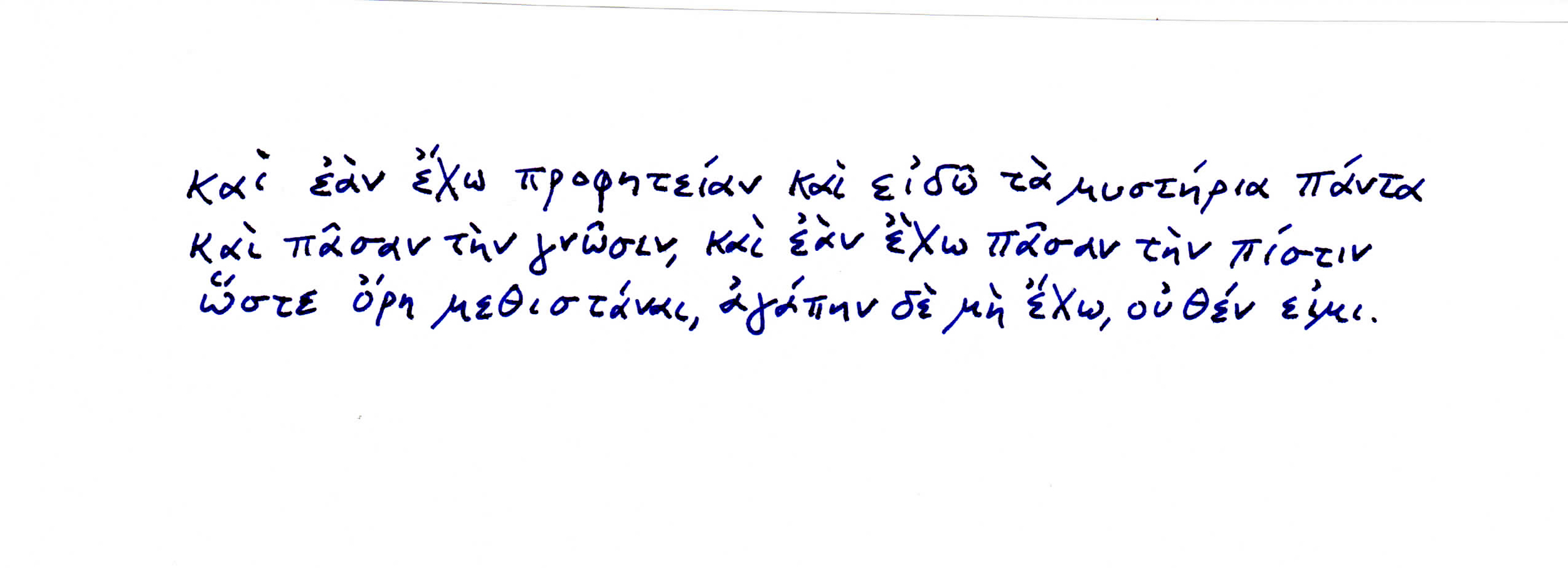
Linda caught wind of Rozanne Gold's column, Handwritten Recipes, which does something similar to her radio show: exploring the connections between food and language. For forty-five minutes, we chopped it up about handwriting, recipes, and secret ingredients. To date, Rozanne has curated 28 of these Handwritten Recipes, and we have no intentions of slowing down. This living cookbook has a life of its own.
To hear the podcast, click here. You can also see the podcast on iTunes. We hope you enjoy hearing more about the column, the origins of this site, and where we're headed.

Handwriting Continues to Prove Its Nimble Nature • A Conversation Mary Savig, with Curator of Manuscripts
"Technologies of communication, from telegrams to texting, have long threatened the written word. And yet, handwriting continues to prove its nimble nature."
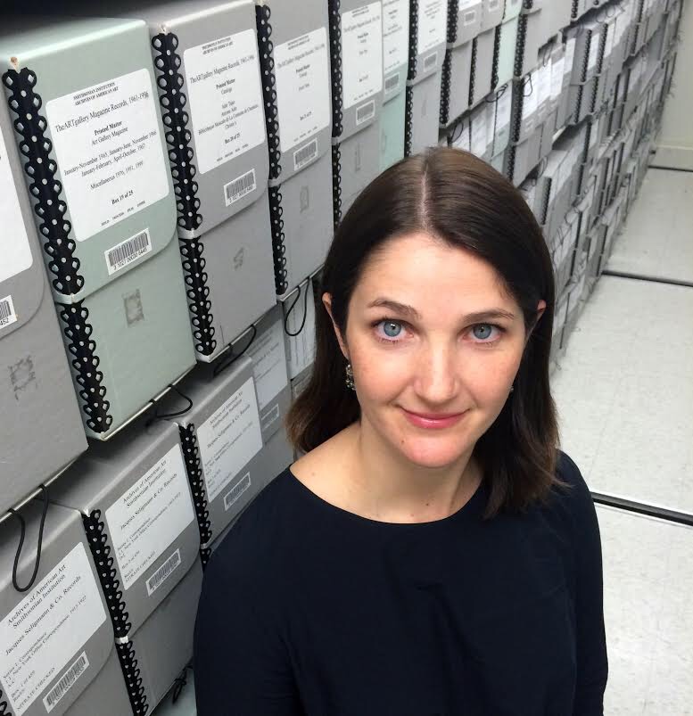
This conversation was a part of our collaboration with The Smithsonian's Archives of American Art, Pen to Panel. Here, we talk with Curator of Manuscripts Mary Savig about the creation of their latest anthology, which was the root of our collaboration, Pen to Paper.

SAY MADGES: I read in the review on the Smithsonian website that the idea for the exhibition and eventually this book came from a discussion amongst colleagues about how easily recognizable A.D. Reinhardt's handwriting is. Are there some other artists whose handwriting you can spot from across the room? Georgia O'Keefe's handwriting is so distinctive!
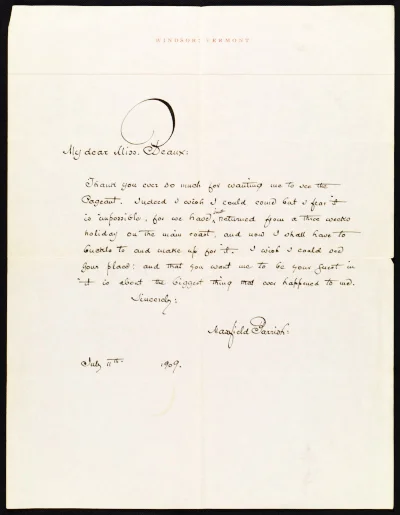
MARY SAVIG: Yes, Georgia O’Keeffe’s lyrical, bold handwriting shouts for attention and is impossible to forget. Hans Hofmann and Maxfield Parrish also boast distinct penmanship: Hofmann’s handwriting is twiggy but deliberate, and there is no confusing it for another artist’s hand. Parrish’s graceful penmanship doesn’t jump off the page like the others, but its inimitable elegance is as recognizable as his paintings.
SAY: What factored into your decision about which artists, and their letters, to feature?
MARY: The artist’s handwriting had to intrigue me. It was also important to represent the broad scope and scale of American art, from the nineteenth century through the present, as well as artists from different geographical regions who worked in various media, like sculpture, photography, graphic arts, abstract painting, landscape painting, and crafts. The book includes outsider artists and conceptual artists, feminists and immigrants, and more. As a whole, this selection reflects the depth of resources at the Archives of American Art.
SAY: In your introduction to the book you talk a lot about the historical development of handwriting in the U.S. Obviously you've researched this topic quite a bit — what was the most surprising or interesting thing you learned?
MARY: Much ink has been spilled on handwriting’s tenuous relationship with technology. “Once upon a time, before there were electronic typewriters, or tape records, or Xerox machines, boys and girls had to write by hand,” began a New York Times article lamenting the current state of penmanship in 1967. Technologies of communication, from telegrams to texting, have long threatened the written word. And yet, handwriting continues to prove its nimble nature. The craft of handwriting has flourished online, especially on social media. Artists, thinkers, and makers alike are experimenting with penmanship in innovative ways. Along these lines, the Archives continues to digitize and make our vast handwritten records available online for new generations to discover.
SAY: What's your favorite letter in the book?
MARY: Don’t make me choose! My answer really depends on the day and since it’s a sunny Friday morning, I’m thinking of a charming letter by the Reverend Howard Finster. Liza Kirwin, deputy director at the Archives of American Art, writes, “Reverend Howard Finster was a consummate entertainer and an old-timey Bible-belt evangelist. His handwriting, most often in block capitals, was like his preaching — purposeful, emphatic, and an integral part of his art, his “sermons in paint.” This description encapsulates the spirit of the book.
SAY: Who transcribed all of these letters? The book cites Transcription Center volunteers. How did people tackle the less legible ones?
MARY: Transcription Center volunteers helped with the bulk of transcriptions (a few of the letters had been previously transcribed). The volunteers are especially amazing at deciphering difficult hands. Many of them have compared translation to solving a puzzle: you have to be able to discern whether the faintest line might indicate a dash, a period, or a dotted i, while keeping in mind the bigger picture of the letter because it holds so many context clues.
SAY: You note that for this book the writers focused on visual content over verbal. Why was it important that they do that? What were you hoping would emerge in the contributors' essays as a result?
MARY: Many of the writers had spent months, often years, in the Archives of American Art scouring these letters for details like the locations of artworks, sale records, notable collaborations, and the like. The goal of this project was to get the writers to step back from the content and instead approach the letter as if it’s a painting or a sculpture. What might the curves, dashes, and density of line tell us about the artist? I was always fascinated and often surprised by the diversity of responses. What emerged from this project is that primary sources, and handwritten letters in particular, remain relevant and poised for interpretation. I hope this book prompts others to look at our materials with a fresh perspective.

Pen to Paper: Artists' Handwritten Letters • A Review by Say Madges
"Designed by Princeton Architectural Press, the book operates much like a gallery exhibition, privileging the visual over the verbal.”

BY SAY MADGES
Borne from an offhand observation between Smithsonian’s Archives of American Art colleagues about the instant recognizability of minimalist painter A.D. Reinhardt’s handwriting, Pen to Paper: Artists’ Handwritten Letters, inspires reverential curiosity. In this carefully considered book, Curator of Manuscripts Mary Savig regards letter-writing as an art, paying special attention to how each artist addresses formal properties of line and space, as well as what we can infer from these decisions about their creative processes and everyday lives.
Proceeding alphabetically from Bernice Abbott through Grant Wood, and spanning the decades from the 1830s to the 1970s, this thoughtful compendium tells the history of art in America in the words of the artists who shaped it: through correspondences both professional and personal, from negotiations with art collectors and curators to revelations about their art and attendant aspirations.


For this project, Savig sought out curators, professors, historians, artists, and archivists alike to read not just between the lines, but to read into each line, inviting 56 different minds to investigate the interplay between language and art in short essays included alongside each letter. As she explained in an interview with us: the goal was to get the writers (many of whom had previously pored over these manuscripts for citations in art catalogs and dissertations) “to step back from the content and instead approach the letter as if it’s a painting or a sculpture. What might the curves, dashes, and density of line tell us about the artist?”
She hoped that providing examples and interpretations of artists’ handwriting would offer new frameworks for understanding their work — and she was right. “What emerged from this project,” Savig summarized, “is that primary sources, and handwritten letters in particular, remain relevant and poised for interpretation.”

Designed by Princeton Architectural Press, the book operates much like a gallery exhibition, privileging the visual over the verbal so that we may take in the high quality images as art objects before reading the accompanying “wall text” that complements and situates them. While each entry deserves thoughtful consideration, their enigmatic, artistic value may be grasped in a glance, making the collection ripe for paging through at any pace and in any order. Full verbatim transcriptions are included in the back of the book so that readers may experience each letter’s gestalt before delving into character-based, historical, or cultural analysis.
In order to demonstrate just how closely intertwined the written word is with visual art, Savig selected a wide range of artists and traditions. Artists’ idiosyncrasies impress themselves on the page, leaving a tangible trace from which we may draw parallels between artist’s pen, personality, and practice. We see how, in a letter from Howard Finster, sketches of Mount Rushmore-ish busts of important figures punctuate the otherwise breathless string of blocky san serifs, recalling his emphatic speech as a Baptist preacher as well as what he termed his “sermons in paint.” Senior Curator at Smithsonian American Art Museum Eleanor Harvey notes how Frederic Edwin Church’s calligraphic pen strokes echo his brushwork, “in which the rapid back and forth of his brush delineates the contour of a landscape with lyrical flair.”
Seemingly trivial details such as the consistency of letterforms and their organization on the page, or the evident ease or burden with which each letter was composed communicate a surprising amount of personal information as well.
As Savig notes in the book’s introduction: “Artists often code their feelings through handwriting.” We can learn a great deal about the level of affection and familiarity between the letter writer and recipient, the writer’s emotional or professional investment in the contents, and even their current mood. Henry Ossawa Tanner’s anger radiates in his 1914 letter to Eunice Tietjens that responds to an article presuming Tanner’s racial identity and relating it to his success. “Now am I a Negro?” Tanner demands in determined script after a paragraph of underlined phrases, crossouts, and emphasized quotations that undermine that claim. In drafts of a condolence letter written between October 8 and 9, 1968 to Teeny Duchamp just one week after Marcel Duchamp’s death, Joseph Cornell’s handwriting chokes up with ineffable grief. Entire paragraphs are violently slashed out with vertical ink bars, and his script stutters through the recounting of a dream that marks the last time Cornell “saw” Marcel.


Pen to Paper's letters run the gamut from personal chronicles and affectionate notes to philosophical treatises and meditations on the intersection between race, gender, and class in the art world. Some comments are profound, such as Marcel Duchamp’s first utterance of “readymade” to explain his transformation of everyday objects into art to his sister, and others are more banal — “sending this by carrier moose,” Ivan Albright teasingly signs off a letter to Earle Ludgin. In some cases, the letters bear ignorance of their future significance.
When Grant Wood squiggled a frame around an ebullient, red-penciled “Hurray!” at the top of a letter to Zenobia Ness, he couldn’t have known he should be celebrating his imminent fame in addition to the fact that the Art Institute of Chicago decided to hang two of his paintings, including the iconic American Gothic. The parenthetical postscript “(How are you Jackson?)” in Lee Krasner’s aerogram to Jackson Pollock during their trial separation carries chillingly prophetic weight when considering it was likely their last communication before he died in a drunken car crash a few weeks later.
From the whimsical floral doodles surrounding the word “darling” in Rockwell Kent’s letter to his wife Sally to the Asian calligraphy-inspired characters of A.D. Reinhardt, these missives offer extensive proof of the expressive and aesthetic capabilities of handwriting, while engendering a unique familiarity with figures who previously loomed larger than life in our consciousnesses.
By preserving and presenting these ephemera, the book emphasizes process over product, with redactions and insertions of text betraying an artist working through ideas—evidence no longer available in a world dominated by digital modes of communication in which individuality is often obscured by the opacity of typed text. Additionally, the book’s smattering of penmanship styles reflect trends in handwriting, as the ornamental cursive of Thomas Eakins (above), son of a 19th century handwriting instructor, is replaced by the uniform efficiency of the Palmer Method, as seen in Andy Warhol’s comically curt biography offered to the managing editor of Harper’s.
This quiet collection poses a direct challenge to anyone who associates archival materials with must, dust, and irrelevance. The unmistakably human element of handwritten letters elevates what today may be merely cursory communication — an email or text message — to a kind of art that evokes the presence of the person who penned them, and leaves behind a physical relic of the relationship between letter writer, recipient, and the world at large. Appropriately in the book’s introduction, Savig encourages us not to ring the death knell of handwriting. Instead she invites us to “celebrate how imaginative correspondence now exists in material and digital forms,” providing new access and ways of thinking. Pen to Paper is a distillation of that celebration.

Let the Mind Rule the Eye • A Conversation with Tullis Johnson on Charles Burchfield
Working on Pen to Paper was interesting for me because it brought Burchfield’s handwriting into a larger context. While some artists took time and care in crafting letters to friends, Burchfield had little concern for the elegance and precision of the written word.


SAY MADGES: How did working on this project inform or change the way you think about handwriting?
TULLIS JOHNSON: Charles E. Burchfield wrote prolifically. He kept a journal for more than fifty years, which by the end of his life totaled more than ten thousand pages. He also wrote notes on his sketches for paintings and on loose sheets of paper that were kept in his studio. The letters he wrote to his friends and colleagues constitute a small fraction of the writing that he did throughout his life, and reveal only a small part of what we can learn by examining his handwriting.
Working on Pen to Paper was interesting for me because it brought Burchfield’s handwriting into a larger context. While some artists took time and care in crafting letters to friends, Burchfield had little concern for the elegance and precision of the written word. On August 19, 1914 he wrote in his journal about his feelings on the subject:
“Let the mind rule the writing not the eye! The mind should be so intent upon what it is saying, that it forgets the means of transferring it to paper. The artist does not see his brush. Be sure if what you are saying is worthwhile, someone will decipher your hieroglyphics. I do not mean that a man should adopt a crude handwriting to affect eccentricity. A man’s handwriting should be spontaneous. If we all wrote perfectly, there would be less variance of character. Of what avail is it, if a man perfect his handwriting, and [finds] that he has not perfected what he has to say? His only calling must be that of copyist.”
Burchfield was more interested in the content of his work, than on the methods of applying his medium. Reflecting on his experiences teaching, in 1959, he told interviewer John D. Morse at the Archives of American Art, “I couldn’t possibly tell anybody how to paint in watercolor….I told them: ‘Don’t think about the medium. What you’re trying to say is much more important than what you’re saying it with. And if you’re thinking about what you are trying to express, you may use watercolor like nobody else ever used it.”
SAY: Why do you think these letters are so important, and how did you choose which one to discuss? What were the other fan letter responses like?
TULLIS: The letters written by Burchfield, in the collection of the Archive of American Art, are important because they reveal much about the character of the man at various times in his career. The earliest letter, written to Paul Travis (1891-1975) in 1930, is more a letter to a friend than a response to a fan. Travis was a close friend to Burchfield during and after his time at the Cleveland School of Art, who would later accompany him on sketching trips along with other friends from his time in Cleveland.
Burchfield’s letters to Lawrence Fleischman (1925-1997) are even more revealing. Correspondences between these two men, in the collection of the Archives of American Art, span between the years of 1954 and 1964. 1954 was the same year that the Archives were founded, by Fleischman and others. In January and February of 1956, the Whitney Museum of American Art held a retrospective of Burchfield’s work. The letter I chose was written in March of the same year. The friendship that developed over those years, was an important one. Fleischman became an avid collector of Burchfield’s work, and eventually owned more than thirty of his paintings. Fleischman’s Kennedy Galleries would later represent Burchfield’s estate after the artist’s death.
SAY: Have you always suspected a link between an artist's handwriting and their art? If so, when did you first notice or consider this connection?
TULLIS: On October 8, 1913 Burchfield wrote in his journal:
“I often wonder what I am naturalist or artist, for the pursuit of one hinders the other - I seem always to be deciding which it shall be - Of course it must be an artist, for I must live, but I am hoping for a day when I can give myself entirely up to Nature.”
Burchfield’s handwriting has always been an important part of the study of his work. In an interview conducted at his home in 1959, John D. Morse inquired about whether the journals might eventually end up at the Archives of American Art. Burchfield declined, suggesting that they would end up with his estate. In 2000, more than ten thousands pages were donated, by the foundation set up in the artist’s name, to the Burchfield Penney Art Center in Buffalo, New York.
In 2006 an even larger collection of over 25,000 objects from the artist’s studio was donated as well. I took part in the inventory of a large part of that collection. Included are sketches and studies for paintings, but there are also a large number of notes, written in the artists hand on loose sheets of paper. The sketches themselves also include notes on changes that should be made to the final paintings.
Even Burchfield’s doodles contain handwriting, often revealing critical insights into the artist and his work. Some contain simple things, like a score for a card game played with his wife. One doodle includes the title of the book The Sense of Wonder by Rachel Carson. There has always been a link between Charles Burchfield’s handwriting and his art. He was aware of it early in his life, and scholars that study his work, during and after his lifetime, have been aware of it as well.
SAY: What do you think we can learn about Charles Burchfield from studying these letters that we couldn't from mere biographical record?
TULLIS: You can learn a lot about an artist by studying their writing, but different kinds of documents can reveal different things. Studio notes and notations on sketches are written as notes to one’s self. Journals and diaries are written with no particular audience in mind. They contain memories and musings on the activities of the day. They also present a great deal of autobiographical information about the writer. Correspondence however, are always written with a particular audience in mind, and each letter reveals something different about the character of the man.
SAY: You included Burchfield's quote about letting "the mind rule the writing, not the eye" in your essay in Pen to Paper, and again here. What do you think he meant by referring to his writing as "hieroglyphics"? Do you consider handwriting, in the sense that it is a drawn character system, to be visual art?
TULLIS: Handwriting surely can be visual art, and with certain artists it definitely is. In Charles Burchfield’s case, handwriting is a part of his art. It is most dramatically so with his monogram“CEB” which he used to sign his works starting in the 1920s. Handwriting is also an important part of many of his sketches, although the ideas that are communicated are more important than the handwriting itself. He wrote “Of what avail is it, if a man perfect his handwriting, and [finds] that he has not perfected what he has to say?” For Burchfield himself, handwriting itself was not visual art, but rather a means for communicating ideas. Viewers today however, often find his handwriting to be quite exciting and worthy of examination. In 2013 the Burchfield Penney Art Center commissioned Richard Kegler, co-founder of Buffalo based P22 Type Foundry to create a Burchfield font to honor the artist. Today the font is often used in exhibitions, to highlight many of the dramatic statements that Burchfield made in his journals, sketches or notes.
SAY: Where do you think we could find qualitatively similar information and insight about an artist and their work today now that people use snail mail for personal correspondence less frequently? Do you think there's a comparable medium or mode of communication in use?
TULLIS: Today the personal letter is quite rare, and the bulk of communication is done by digital means. This being the case, the best place to find qualitatively similar information on an artist and their ambitions is through social media. Many artists use Twitter and Instagram to share their work. In 2012 at the Burchfield Penney Art Center we launched a program on our website called “In His Own Words” where each day an entry from Burchfield’s journals is posted with an image of one of his paintings or drawings. In this way we are using contemporary communication tools to reach thousands and give them access to this otherwise inaccessible information from the past.


Tullis Johnson, curator and manager of archives at the Burchfield Penney Art Center, has organized multiple exhibitions of contemporary and historical significance, including the nationally touring exhibition, Charles Burchfield : Weather Event, which received the Award of Commendation at Museums in Conversation from the Museum Association of New York. Through his writing on Charles Burchfield, he is an emerging Burchfield Scholar. Respected for placing the work of Burchfield into a contemporary context, Johnson’s scholarship continues to break new ground in the understanding of the artist. His exhibition Blistering Vision: Charles E. Burchfield’s Sublime American Landscapes is currently on view at the Burchfield Penney Art Center in Buffalo, New York. Johnson received his B.F.A. from the Visual Studies Department at the University at Buffalo earning the Eugene Gaier Award for Excellence in Print Making.
James McNeill Whistler and Work-Effacing Work • A Conversation With Lee Glazer
“This project reminded me of the actual, physical connection between writing, writer, and words.”

James McNeill Whistler (153) letter to Charles Bowen Bigelow, October 5, 1891
BY SAY MADGES
American Impressionist and portraitist ex-pat James McNeill Whistler espoused that art should be "an effortless expression of aesthetic principles," and his loose scrawl seems to echo that claim. Lee Glazer, Associate Curator of American Art at the Freer Gallery of Art and Arthur M. Sackler Gallery, however, counters in Pen to Paper that these letters indicate a more controlling figure. Written in the early 1890s, the documents on display here formed part of Whistler's anti-piracy campaign that intended both to protect and promote his art and art criticism in The Gentle Art of Making Enemies.
This conversation was a part of our collaboration with The Smithsonian's Archives of American Art, Pen to Panel, which celebrated the launch of their latest anthology, Pen to Paper.

SAY MADGES: How did working on this project inform or change the way you think about handwriting?
LEE GLAZER: The entire Whistler correspondence—some 9000 documents—has been digitized, edited, and transcribed by the Whistler scholars at the University of Glasgow. I rely on that digital edition—so easy to search, to skim, to search! I rely on it in my day-to-day work as a curator of a collection (the Freer Gallery of Art) dominated by Whistler’s work. But this project reminded me of the actual, physical connection between writing, writer, and words. It’s especially telling in the context of someone like Whistler, who was such a clever writer and for whom words were his weapon of choice in his battles against the (to his mind, at least) unappreciative British public. His handwriting has this insouciant, off-the-cuff look that belies the careful thought and intense labor that preceded the final draft. Very similar, in fact, to his art, where, as he said, “work effaces work.”


MADGES: Why do you think these letters are so important, and how did you choose which to discuss?
GLAZER: These letters aren’t necessarily the most important in the Whistler corpus. They were more or less chosen for me, based on the holdings of the Archives of American Art. But, they are quite telling: written in the early 1890s, they were part of a concerted campaign that Whistler mounted to retain control over the publication and distribution of The Gentle Art of Making Enemies, a compendium of some of his pronouncements on art and art critics.
MADGES: What did you learn or what do you think others could learn about James McNeill Whistler from studying these letters that you couldn't from mere biographical record?
GLAZER: The handwriting in the letters is light and dashing, but beneath the surface is a determination to exert total control. They demonstrate Whistler’s idea that art should appear effortless, betraying no struggle or obvious strain of labor.
MADGES: Do you consider handwriting as visual art, writing, some combination, or something else entirely?
GLAZER: I don’t consider it visual art--but there is certainly a level or art and/or artifice about handwriting that makes it distinct from printed words. When we’re looking at printed words on a page, content and form exist as more or less at the conceptual level. The words themselves, as physical marks or presences recede--unless a lot of attention is paid to graphic design or there is a deliberately emotive use of typography. Handwriting certainly isn’t an unmediated form of personal expression – it conforms to certain conventions that change over time, it can be manipulated for effect, but I do think that it can tell us something about the writer that goes beyond the words themselves.
MADGES: Where do you think we could find qualitatively similar information and insight about an artist and their work today now that people use snail mail for personal correspondence less frequently? Do you think there's a comparable medium or mode of communication in use?
GLAZER: I think that we need look no farther than email and social media: the hand is absent, but there are lots of stylistic tics in “autograph” digital messages. Looking at patterns in these kinds of messages may well become the 21 st-century version of handwriting analysis.


Lee Glazer is curator of American art at the Smithsonian’s Freer Gallery of Art and Arthur M. Sackler Gallery where she has organized numerous exhibitions including, most recently, Chinamania and Peacock Room REMIX: Darren Waterston’s Filthy Lucre. She is the author of A Perfect Harmony: The American Collection in the Smithsonian’s Freer Gallery of Art and co-editor of James McNeill Whistler in Context, East West Interchanges in American Art, and Palaces of Art: Whistler and the Art Worlds of Aestheticism.
Dan Flavin's Art & Life • A Conversation with Tiffany Bell
"Flavin’s early text is so difficult to read, you almost feel shut out. He has all these flourishes, especially the way he ends a word. It’s very sad when this kind of information becomes inaccessible."

SARAH MADGES: How did you get involved with this project?
TIFFANY BELL: I got a call from Mary [Savig] because she noticed my work on the Dan Flavin catalogue raisonné. I make use of the archives on a regular basis and so she asked if I would write about one of Flavin's letters that they had because his writing is so unique.
MADGES: How did you decide which letter to talk about?
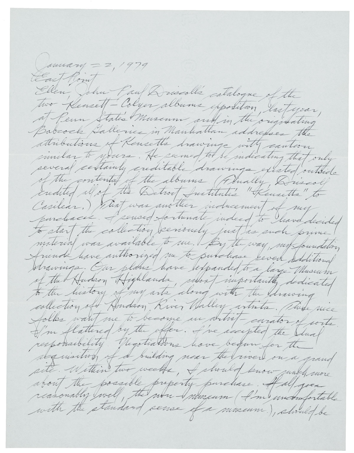
BELL: She [Savig] asked me to choose one and I was already familiar with this one because it was available online. I was also interested in it because the content of the letter reflected his handwriting. It describes his interest in 19th century drawings and landscape art, and Ellen [Ellen Johnson, the letter's recipient] had a collection of these John Frederick Kensett drawings.
His handwriting is quite formal considering how innovative his art is. It was interesting to me that it looked so perfect, exactly the way it had been taught to him.
I also knew the artist and knew he took writing seriously; he took serious care...I think he had some idea his letters would be studied at some point. He was interested in the collected writings of Cezanne and would use some of them in lectures. He was very interested in traditional writing like that, capturing the artist's life, and so I thought this letter projected that aspect of his personality.
MADGES: Why do you think archives should be public access? Why are these letters, these archival documents, important?
BELL: It’s invaluable for the kind of research I do. I think archives should absolutely be public access--and there is so much online now, which is so exciting. Even the postmarks on letters tell you where the artist was on a certain date. It’s invaluable for putting together someone’s biography.
But now, with all of these emails exchanged instead--I don't know if or how they will be saved. The quantity of material might be overwhelming to sift through. A lot was done through phone calls, so a lot has been lost there too. My work on Agnes Martin — although not entirely relevant to this conversation — her letters in the Archives of American Art are completely essential as far as learning who people in her circle were, what she thought about her art, and where she would show it. There's no other way to find this information out because she didn't keep a record of anything. Flavin kept his stuff as a record, knowing; he was prepared for people to access his writing.
MADGES: You noted in your essay that Flavin’s art resisted associations with the handmade, and yet he took such care with his penmanship. What were his journal entries like compared to his letters? You said that his letters were copied from what he wrote in his journal--did you notice any edits made between first and second draft?
BELL: His final page has no crossouts, and his letters were often typed. There are more crossouts and edits in his journals. You can really see him working through a thought.
MADGES: A kind of related question here, but what did you learn or what do you think others could learn about Dan Flavin from studying his letters that you couldn’t from biographical record?
BELL: Access to letters gives access and insight into thinking. You get to see how he presents himself to people.
MADGES: Did he write for the duration of his career?
BELL: He started in the 60s--the journals begin in 1961 or ‘62 and he kept them going through the 80s. As a young artist he was very interested in recording what he was doing as an artist. Early letters reach out to people who might be interested in buying or showing his work. I think he already knew Ellen Johnson when he wrote to her--when Flavin made his fluorescent light works they were always untitled, but were often dedicated to people. One of them was dedicated to Ellen Johnson.
MADGES: How do you feel about the fact that the U.S. Core Curriculum no longer requires handwriting instruction?
BELL: I was shocked. I even feel sorrow because I type so much now and I very much miss the way writing by hand connects you to your thought in a different way. When you actually write something down it enhances your ability to think through the idea. The fact that handwriting is slower means you stay with the thought longer.
It’s concerning that kids growing up today might not be able to read letters, read these manuscripts. Flavin’s early text is so difficult to read, you almost feel shut out. He has all these flourishes, especially the way he ends a word. It’s very sad when this kind of information becomes inaccessible.
MADGES: How did working on this project inform or change how you think about handwriting?
BELL: Well first of all, the book is really beautiful. I’m very pleased to be a part of it. It didn’t change how I think, but maybe it reinforced the idea of how wonderful handwritten letters are. Dan Flavin himself understood the beauty and great capacity of what you could convey in a handwritten letter. It’s interesting to look closely at them; you get more sense of personality, occasionally some humor. You can observe how he puts the date and place in each entry and fills the whole page, leaving no margins. He has this very meticulous handwriting that looks angular, even stylized, and always on unlined paper.
MADGES: Do you consider handwriting visual art, writing, or some combination?
BELL: For Flavin, I think it’s a lot like his drawings in some way. He used to carry a notebook around with him all the time and he would use the same pen to sketch. He collected drawings, like he mentioned in the letter: Kensett pieces. Kensett also did ink drawings on paper, often with little notes about where they were drawn and when. Flavin kind of took after him--he recorded the date and time. You can sense the connection to his past art, its influence on him.

I Live Everyday With the Fear of My Observer's Shame • Ty Douglas
A conversation with Ty Douglas, founder of Maybe U R Like Me, which connects people across borders of identification.

This interview capped off our month-long exhibition, Maybe U R Like Me, which featured a new image every single day. We were so excited when we first heard about this ongoing project by Ty Douglas. There is something magnetic about the images, but also the essence of the experiment: creating an exchange between two total strangers through a single sentence, and sentiment. Maybe U R Like Me connects people across borders of identification by establishing the possibility of a sameness, and similarity, that was otherwise unexpected. On each strip of paper is a confession of Ty's that he asks a passerby to draw from a bag. They vary in intimacy and seriousness, but are all relentlessly true. As Ty mentioned at the outset of the project, "We can dissolve fear by understanding that the things we don't commonly say are the things we have the most in common." To conclude the exhibition, we asked Ty a couple questions about the project, but also his sentiments about the then-recent events that took communities by the heart.

Handwritten: Your project is rooted in anonymity, and yet, it is deeply personal. You bring the private to the public, and this creates a powerful message. How did this pairing come about, and why is it important to you?
Ty Douglas: Honestly the idea came from the dark ether of last minute panic. I was signed up to be in a street art performance during Armory Week and I was planning on doing a live painting where I would make a poster that said "I am not afraid of you" whilst wearing a hot pink leotard and makeup. In my typical style I waited until the last minute to prepare and found myself without materials so I improvised something I thought would be fun and interesting. I had never had a single thought relating to Maybe U R Like Me specifically until the day of the show. It's funny how the pressure of time and procrastination is responsible for what I personally consider to be one of my best ideas yet.
Handwritten: In the wake of Orlando, the heart sinks. But as a society, we seem stuck in a continuous loop. How do you continue to rise after these incidents, and what can we do to interrupt this cycle of fear?
Douglas: It being so close to the incident, I'm not sure I have yet risen. The people lost in Orlando and the people who struggled with injuries were not just family members in my mind, they were/are me in a very direct way. The campaign slogan is "We are Orlando" and it's the first time one of those slogans has really hit a fundamental truth. We didn't lose 49 separate people that day, we lost 49 pieces of our own selves and I think I will be mourning them for a very long time and celebrating the medical victories of the survivors for just as long. Maybe U R Like Me, maybe u were killed by a broken person full of rage, maybe u survived. Maybe u will live more boldly and proudly in response.
Handwritten: It can be terrifying to put oneself in the public limelight. The internet can make easy targets of the visible. How comfortable are you in being seen, and have there been things that have changed how you approach your appearance, and appearing on stages or screens?
Douglass: This is a funny question because my online presence is very exposed and borderline obnoxious so people often get the impression that that's who I am, and even more, they get the impression that I'm free from fear. The truth really is that I live everyday with the fear of my observer's shame for me. I am ashamed of the shame other people hold for me for being who I am. Now of course the weight of this varies day to day but what I'd love for people to understand (maybe via this project) is that overcoming fear and shame isn't a matter of conquering, it's a matter of diligence, practice, and relating to the people around you. I don't believe in freedom of fear I just believe in consciousness.
Handwritten: Have there been any other recent events that have either inspired, or reminded, you to keep creating and connecting?
Douglas: I lived in Bed Stuy for maybe 3 months at the beginning of this year and was verbally harassed on the street quite a lot. I definitely don't have it as bad as others, but the fact that I couldn't feel safe once I walked out my door sparked the train of thought that I think led me to this idea. It's difficult to say that it wasn't personal because as a person...it feels personal, but I think ultimately the people who shouted things at me were harboring more pain in themselves than they were projecting at me so I forgive them and wish them well. But I did move.
Handwritten: What is one thing you hope Maybe U R Like makes people feel, think, or do?
Douglas: I'm not really sure to be honest. I think what I'm always looking for as an artist is just to connect with the people in front of me. There's a whole aspect that I haven't really revealed to anyone yet and that is the satisfaction of the hand to hand exchange of this. There is such a power in sharing confessions with strangers and having them recognize you by it. It's extremely vulnerable and it makes me nervous, but it's as intimate as real and true romance. So I suppose in a lot of ways it's a very selfish project.
Handwritten: At the end of this month-long exhibition, how will Maybe U R Like me continue?
Douglas: I'd love to continue it in it's very raw form. Appearing in public places and interacting with strangers. There has been a performative aspect of it on the Say Yes stage (find Say Yes Electric Collective on facebook) where I laid out big papers with the prompts "Living in New York is..." and "Being Queer is..." at the top and all the guests were invited to write their answers on the page. Other similar iterations of it will emerge I'm sure, but it's not a project that I feel needs a lot more to be effective so I will just give it my time and continue to put it on Instagram until the next wave comes. I will say though I am looking for a partner who is maybe interested in doing the photo and video documentation in a long term way so if any of you beauties out there are interested please email me at tydouglasart@gmail.com.
A special thanks as well to all of the strangers out there who's eyes met mine with understanding after picking their confession. That brief moment of real human intimacy means more to me that I would have ever predicted.
Lost Songs: A Conversation with My Father • Carly Butler

BY CARLY BUTER
My dad and I co-wrote a song together for the first time in March of 2015. Seeing the song come to life from the penciled pages of his handwritten notebook made me curious about the process, specifically in the earlier days of his songwriting. When I brought up the idea of being featured on Handwritten, he knew exactly what he wanted to share. Below is the conversation with my dad, Dale Butler, folk singer-songwriter and local celebrity of Leamington, Ontario.
CARLY: Where did you find these pieces of handwritten work?
DALE: I was cleaning up the basement and found them in a folder. One of them is a finished song that is handwritten, but most of them are a bunch of started and unfinished songs, a dog’s breakfast really. These were written on shopping bags that date back to 1977.
I was working up north at a camp at the time, so I probably got it from the liquor store. I thought it was nice paper that I could cut up into pages. I didn’t have paper with me so I used what I could find. You have to get creative sometimes. I’ve written on envelopes, napkins, things I find in the glove box, business cards, gum wrappers or packages, and I’ve even written songs on cigarette boxes (even though I don’t smoke).
This piece of paper here is from when I was in Florida in 1980. It’s a paper shopping bag that I found at my parents place there. It’s dated Friday April 11th, 1980. I was down at the water and I got writing about a fisherman. It’s a poem, not a song. I never ended up putting it to music but I kept it all these years. I wrote a thing here, “spoken words should be written words.”

This is a neat line, “no matter where you put them, in view or out of sight, they’ll turn to each other and start another fight.” I have no idea what that was about. It must have been about my parents arguing, or my brothers, or my brother and dad because they used to argue about everything. Some of this stuff is pretty amazing. “Till love saves the day, love is stronger than any man, love can take you by the hand, love can conquer any land.”
When you get looking at these scraps of paper, it’s funny what you write, because a lot of times things that are said are never documented. If you don’t write it down there’s a good chance it will be lost.

CARLY: I notice that you always use pencil. Why is that?
DALE: I write with pencil because I have trouble spelling and because you’re always rewriting. With a pencil it’s easy to erase and fix it. When you write with ink, you have to scratch it out and put the other word beside it.
CARLY: Don’t you ever worry that you’ll erase something good?
DALE: No. If it were good it wouldn’t have gotten erased. I have lots of things that are partly written. I found a few lines in this pile that I think are going to become a song that I want to finish. They’re kind of like lost songs that are going to come back to life some day. Some of it might just be one good line I wrote a long time ago that I think I could work with.
CARLY: When did you first start writing & what inspired you to write?
DALE: My next-door neighbor Dan and I started writing songs in 1972. We would always listen to music by Gordon Lightfoot, Seals and Crofts and James Taylor and we decided to try and write our own. I remember one particular song that Dan had started on a piece of paper that he left sitting on a stereo. I saw it, read it and told him how good it was. After finding out he was about to throw it away, I offered to take it home to work on it and it later became the song Sea Captain. Once I started songwriting, I couldn’t stop. The quest then became the next song and wondering if my songwriting was going to get better.

CARLY: Back then, if someone found these papers, how would you have felt? Do you have any songwriting advice?
DALE: Sometimes you’re embarrassed by what you write because it’s so personal and the fear is that others will maybe have the wrong interpretation of what you have written. It could be totally different than what you think you wrote.
I think when you first start you have lots to say, but you worry. As you get older, you are a little bit smarter with the use of words because you’ve done it quite a bit, and you can say just as much with less. It’s about picking the right words and the ability to convey what you wanted, with less.
Basically you need to start writing something. It can be anything. When you read it over again sometimes the words move you and other times they don’t. If it doesn’t you just set it aside and move on to something else. You can always come back to it 20 or 30 years later. I’m looking at this stuff that’s quite old and I’m realizing in this moment that it might have another life. I’ve written 99 songs in my lifetime, maybe these handwritten lyrics on scraps of paper from the 70’s and 80’s that I’ve saved after all these years, will help me reach my 100th song this year.

You Show Me Hard Work Like No One Else • Andres, 4th Grader

When we brought the story and letters from Deh'Subz, Afghanistan into 4th grade classrooms in Brooklyn, a magnetic chamber of energy opened, and we walked away that day thinking this: perhaps we should all be a little bit more child-like, and less child-ish. These 4th grade students are role models for the future, making us here at Handwritten think that perhaps we should be leading letter-writing sessions for the politicians.
Below are forty-one of the letters written, which we will be showcased at Pen + Brush on Saturday, March 5th, for our Handwriting Gala.


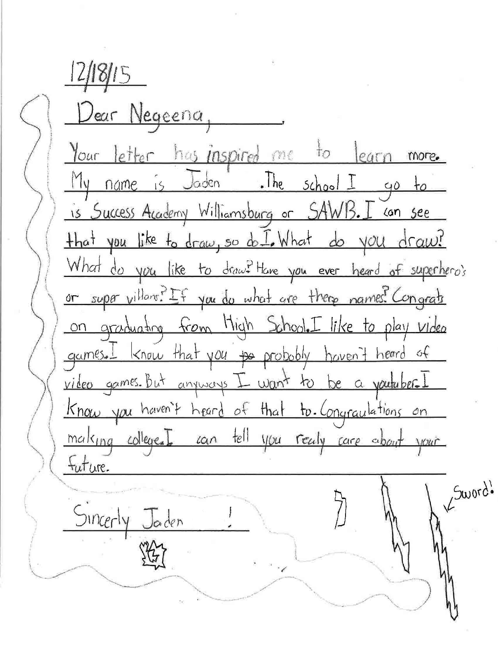
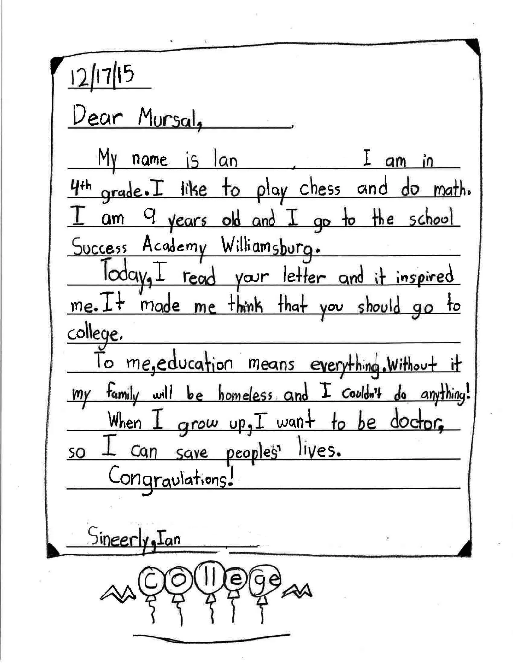


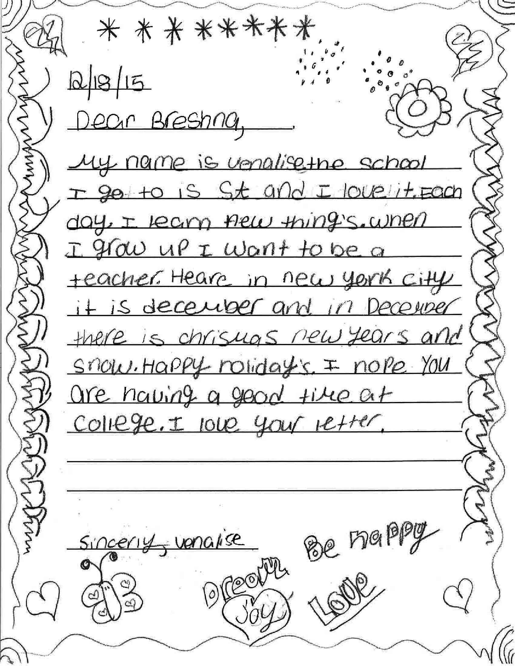

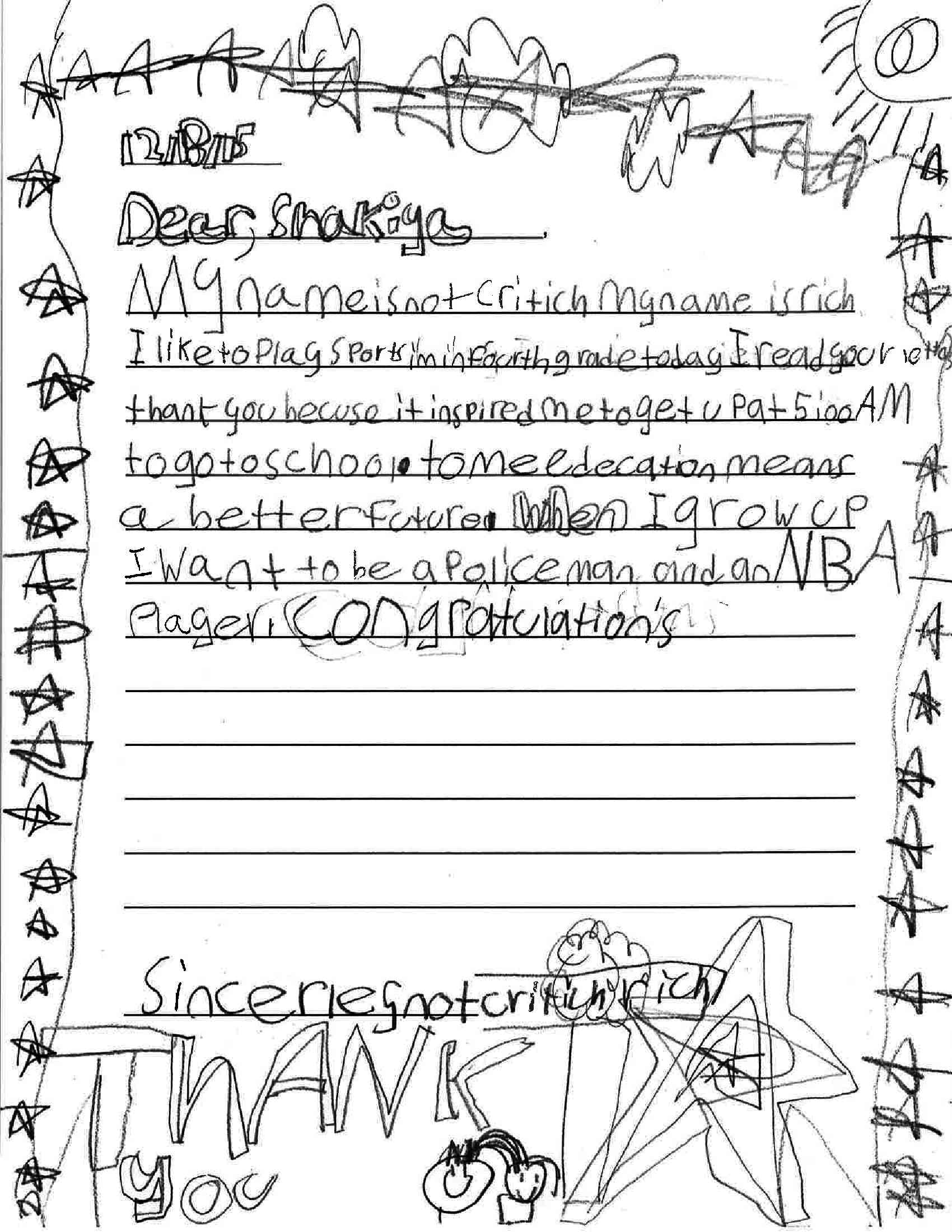


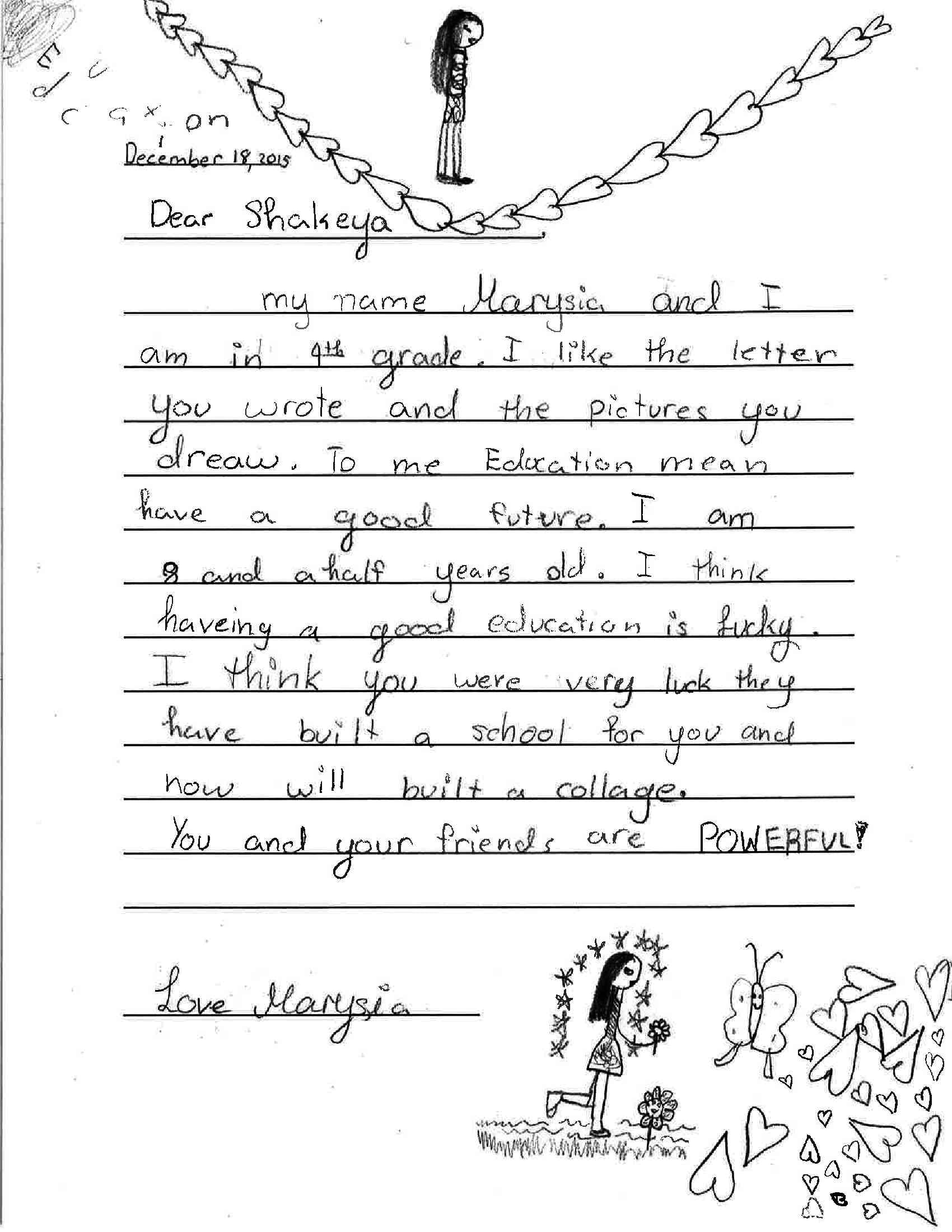
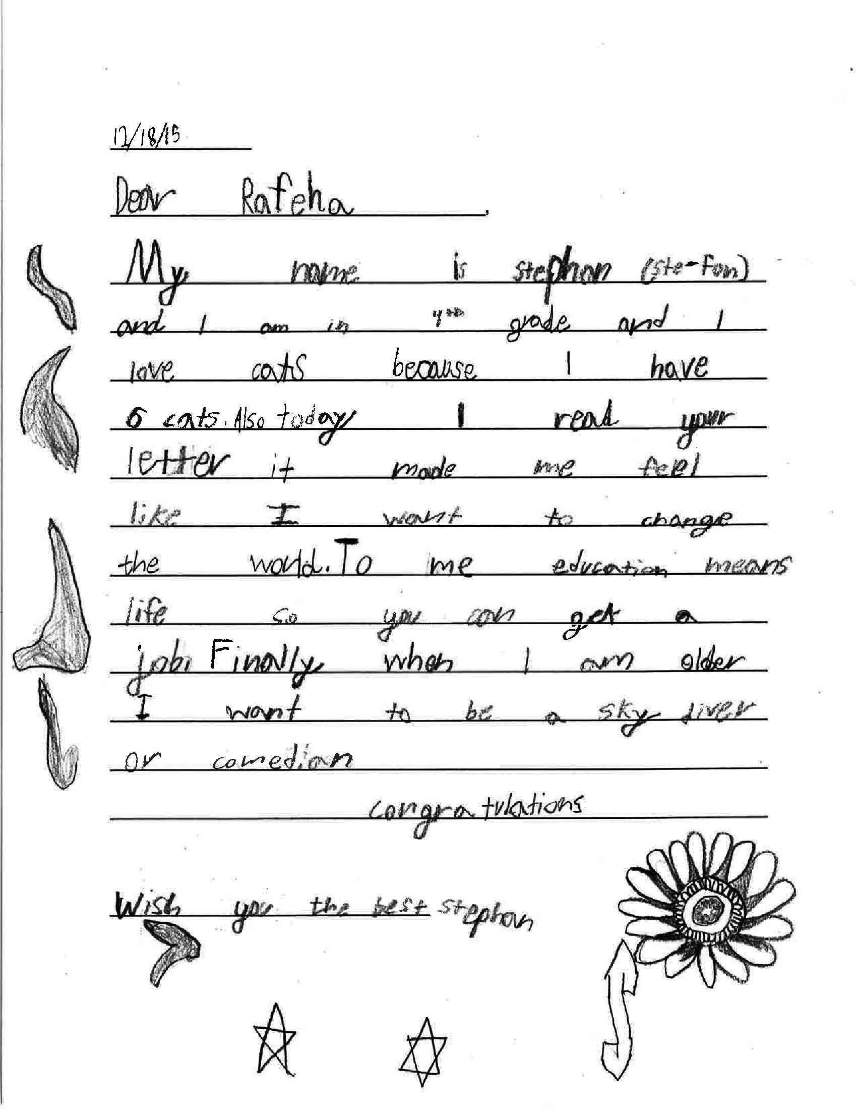


Do you want us to come visit your classroom and teach a letter-writing lesson? Get in touch. We customize the curriculum to your needs. Email us at info@handwrittenwork.com.
The Story Ribboned Forward, Inventing Itself • Karan Mahajan
For author Karan Mahajan, handwriting is a necessity, a fact almost. He writes every first draft by hand, and while he encourages everyone to as well, he doesn't care if you do. But we do, so read this interview and hear his fearless take on how handwriting cancels self-criticism, as well as helps you avoid getting needlessly attached to language and doubling backward into revision before a story is complete.

INTERVIEW BY DEMETRI RAFTOPOULOS
In eight sentences, Karan Mahajan had me silent. I had never read his words before, but there I was, re-reading a single paragraph over and over. It was a part of the series in Poets & Writers, where writers "recommend" a specific something. Later, I wondered how I even got there, but in the moment, I was captured by his voice, which was direct, almost demanding, but with elements of politeness and manners. A hard yet endearing shove into a specific direction: "Write first drafts by hand." He goes on:
This cancels self-criticism immediately; unless you have truly ugly, banged-up handwriting, everything you write will be visually and stylistically unified by ink. Better still, in an age of Internet-rehab apps like Freedom and SelfControl, nothing approaches the uncluttered nondigital quiet of a page. Take confidence in the fact that much of our canon was composed on paper. But mostly, when you achieve a flow, you're much less likely to break it on the page than on a screen—you'll be less tempted to double backwards into revision, checking e-mail, opening a tab. I found this to be true when I wrote the first complete draft of my second novel, The Association of Small Bombs. For years I'd been struggling to make progress, only to lapse back into revision. The minute I committed to paper, the story ribboned forward, inventing itself. I had never felt anything like it.”
This is something I have been contemplating deeply on my own. I was always a writer, but I recently began approaching projects by hand, often struggling to connect more with a blank screen than I was able to with a blank page. This past summer was the first time I ever wrote drafts by hand, let alone ever wrote in a journal. I uncovered something inside that journal that I haven't been able to express, but I see the feeling in Karan's words above. And so I set out to talk with Karan about the above, his process, the road bumps we often hit as writers, and how the handwritten words has shaped his craft.
* You can see his full bio at the bottom of this page, but Mahajan's second novel, The Association of Smalls Bombs (Vikings 2016), is forthcoming in March.

DEMETRI RAFTOPOULOS: You mention in Poets & Writers that you wrote one of your novels by hand. Do you always write first drafts by hand, or only certain kinds of things?
KARAN MAHAJAN: Increasingly, I write my first drafts of every kind of project by hand—fiction, non-fiction, reviews. Drafts are not a writing problem; they are an emotional problem. Usually, you haven’t broken through the material in the way you should have. When you type out first drafts, you get needlessly attached to the language you’ve used, and this keeps you from moving on.
Writing by hand also slows me down. I tend to write first drafts in a panic of excitement, and I’m calmed by the analogue action of handwriting.
DR: You said one reason you write first drafts by hand is specifically because it cancels self-criticism. Can you talk a little bit more about the idea of self-criticism, and how handwriting cancels that?
KM: Well, I’m experiencing this right now, as I type out the answer; my urge is to go back and correct a few words in the previous sentence. But, rather than fall into a loop of revision, I’d rather invest that energy forward.
DR: Do you think self-criticism, along with doubt and distraction, are forms of writer’s block?
KM: Yes—the main form of writer’s block. I was blocked in this way for about four years, but, because I was producing a ton of material and constantly revising—I have about 1,400 files in my “Association of Small Bombs” folder, most of them varying minutely from each other—I felt I was doing something. I wasn’t. Mailer says that writer’s block is a failure of the ego; I concur. And perfectionism can become a denial of your own humanity, of the languors, say, in a life or story.
DR: Has handwriting always been a large part of your life, or life as a writer?
KM: It hasn’t. I emigrated to the US in the Age of the Laptop. Coming to handwriting felt like a discovery—a holdover from journaling and note-taking.
DR: I'm curious about your process. At what point do you leave your drafts and begin typing? And how has your process of writing by hand -- drafts -- evolved over the years?
KM: It varies. If I feel confident that the story I’m writing is close to the final, I type it out as I go along—handwriting in the morning, typing in the afternoon. This keeps the work fresh in my memory when I attack it the next day. If I’m not yet confident the story’s going to unfurl to a conclusion, I’ll keep handwriting. If I reach some kind of end, I might type the whole thing out. But if the story dies midstream or I lose interest it’ll remain immured on paper.
DR: You mentioned that the minute you committed pen to paper in your second novel, The Association of Small Bombs, "the story ribboned forward and invented itself." What specifically came to you -- characters, plot, purpose?
KM: The plot of The Association of Small Bombs is entirely organic. I knew the downward direction the lives of the characters would take, and that Mansoor, one of the main characters, would come back from the US, but I didn’t know how any of the characters would connect, how their stories would play out in concert. It was the central challenge of writing a novel about terrorism. What do terrorists and victims really have to do with each other? The writing, which was instinctive, made these connections for me. When Ayub, my favorite character, appeared in the book, I was surprised. He allowed me to say, directly, many of the things I felt about terrorism without resorting to needless dramatization.
DR: You also said something else in Poets & Writers that stuck with me, “when you achieve a flow, you’re much less likely to break it on page than on a screen, you’ll be less tempted to double backwards into revision.” What was your revision process like then for The Association of Small Bombs. Did you find it to be easier? Less work?
KM: The key difficulty for me was to keep myself from destroying what I’d (hand)written. I tried once to rewrite the entire thing by hand, but simply didn’t have the drive or the interest; I’d said what I wanted to say. Then I tried rewriting almost every sentence on my computer. This was wasteful and idiotic, because each edit was only an elegant variation on what came before; it wasn’t improving the story or the scenes. The best editing advice I got—for the kind of writing I do—was to read it out loud. This sloughs off embarrassing and overwritten bits but doesn’t lead to a complete reworking of what you’ve offered the reader from your sub-conscious: which, in a way, is what the reader is after anyway.
DR: How did the experience of writing your second novel by hand compare to the experience of writing your first novel, Family Planning? Did you hand-write any of that novel?
KM: The storytelling in this novel is much better. Not much has been shifted around. Words and sentences remain where they first appeared in the flow of the story; the story is one giant thought. I’m proud of this. My main complaint about novels is that they lack unity; you get to the end and feel the writer forgot why he or she started. And almost no novel ends well; the project of getting to the end has defeated the novelist. Handwriting, zooming forward, allowed me to overcome this. And no, I didn’t handwrite any of Family Planning.
DR: The narrative, or at least parts, of both your novels is set in India, specifically New Delhi, where you grew up. How did your surroundings, or upbringing, impact the way in which you write? Obviously, it informed content, but what about form?
KM: It taught me to find my center, to achieve concentration, in the midst of a crowd.
DR: Do you have any handwriting rituals?
KM: I’ll sometimes warm myself up with journaling.
DR: When you look toward the future of handwriting, what do you see?
KM: A bleak future. And I’m fine with that. I’d rather keep this discovery to myself and let other writers be bewildered and broken by their fine machines.
Karan Mahajan was born in New Delhi. His second novel, The Association of Small Bombs, tells the story of two families in a world plagued by terrorism. Karan not only explores how terrorism shakes its victims, but how those responsible are affected as well. His debut novel, Family Planning, was published in nine different countries and won the Joseph Henry Jackson Award. His writing has also appeared in The New York Times, The Wall Street Journal, The New Yorker Online, Granta.com, and more. He resides in Austin, Texas, where he is currently diving into his third novel.










I See Students Who Crave the Opportunity to Work with Their Hands • A Conversation With Gail Anderson

Portrait of Gail Anderson, by Paul Davis
BY SARAH MADGES
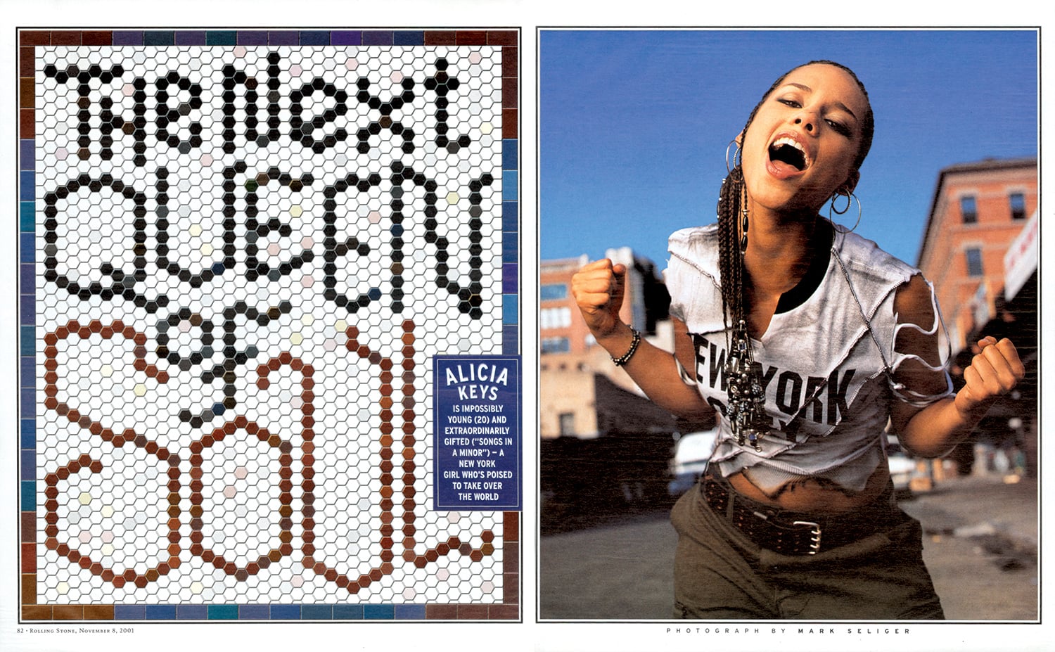
With decades of teaching, typography, and creative collaboration under her belt, New York-based designer and writer Gail Anderson has a CV worth calling home about — at least, it earned her the holy grail of graphic design achievements, the AIGA medal, in 2008. The design-ecstatic aesthete made her first layout years before her tenure as art director at Rolling Stone, literally cutting and pasting a magazine mockup of the Jackson Five in her childhood bedroom.
She’s been busy ever since, developing identity campaigns for Broadway shows, co-writing typography books with Steven Heller, teaching type fundamentals in the MFA program at SVA, and co-partnering with Joe Newton at their eponymous Anderson Newton Design firm for projects ranging from book jackets to outdoor installations. Despite the ease and efficiency of digital design technology, Anderson swears by taking time to untether from the laptop, insisting that craft is crucial to typography, and slowing down with a pencil and piece of paper is crucial to honing that craft. In November we reviewed her latest book, Outside the Box, which honors this DIY by-hand approach, following the hand-lettering trend from its individual, artful beginnings to its contemporary commercial ubiquity.
I had the chance to talk to her about the book’s composition, as well as handwriting and hand-lettering in general — how it plays into her life as a designer, and design as a whole.

Childhood Sketchpad


Design inspiration from childhood, 1974
SARAH MADGES: What role does the pen and notebook play in your life?
GAIL ANDERSON: I’ve grown increasingly particular about the pens and notebooks I use, since I really enjoy the physical act of writing. I’m a fan of black Pilot Varsity fountain pens and Pilot Precise V7s. And I was extremely loyal to those Japanese Oh Boy notebooks with the thick, ruled paper, even after Chronicle acquired them and put the Oh Boy logo on the front. I have two left that I’m saving for God knows what since they’re now out of production. I moved on to Muji, and then Moleskine, and am now working my way through some Field Notes steno pads. I even keep a paper date book, so clearly the art of writing still means a lot — possibly way too much — to me.
MADGES: You divided your book into four sections — DIY, art, craft, and artisanal. How did you come up with these four categories? Was it always clear you were going to organize the book this way?
ANDERSON: I knew I wanted to have some kind of system to categorize the material. I’ve learned a lot from working with Steve Heller for so many years, so I did what we always do with our books — I spread the work out with someone I trust and we let it sort of organize itself. It’s too confining to categorize stuff in the research stage, but you can’t wait till the design stage either. It was really fun to come up with section titles, and once my design partner, Joe Newton, and I got through that process, I felt like we had the contents of a real book in front of us.

Type Spread from Outside the Box.
MADGES: Do you see a significant difference between what’s considered handwriting and hand-lettering? How would you define the difference — is it intent? Actual artistic design and effort?
ANDERSON: I wrote out Debbie Millman’s foreword by hand and consider that to be handwriting rather than hand-lettering. When I look at it now, though, it seems so deliberate (and some folks have assumed it was a font). Maybe it does have something to do with intent — I’m not quite sure where the line in the sand is.
Broadway theater poster designed at SpotCo
MADGES: Why do you think people respond to hand-drawn lettering? Do you think there will always be a demand for it? Do you imagine it will lose popularity any time soon?
ANDERSON: People connect to branding and advertising that feels intimate and artisanal. It’s somehow less “corporate," even though hand-drawn type is used by just about everyone now. I think Andrew Gibbs from the Dieline said it best in the book’s intro: “In all my years of seeing packaging trends come and go, there is one style that has stood the ultimate test of time: hand-drawn.” I admit that a few years ago, I thought, “Well, how long will this last before we swing all the way back to Helvetica?” But in some form or another, hand-drawn type is here to stay.

Type Directors Club letterpress post card
MADGES: Do you see a similar resurgence in classic or vintage fonts in reaction to the digital age?
ANDERSON: I see students who crave the opportunity to work with their hands — kids who’ve pretty much grown up in front of a computer. While embracing technology is key to their success as designers, they don’t want to feel tied to their laptops. We did a hand-lettering class last week and the students actually started applauding at the end — that’s how hungry they are. And I think they are beginning to seek out classic and vintage fonts, which is such a relief after so many years of all those awful free fonts.
MADGES: Is there a distinct moment or brand that signaled the beginning of the hand-drawn movement’s resurgence? Or was this a gradual, inevitable change in response to an increase in digital and technological saturation?
ANDERSON: I wasn’t plugged in enough to recognize a particular moment, but it certainly seemed like everyone started drawing — and posting — around the same time. I think it’s all about Pinterest and the other sites and blogs where designers started strutting their stuff publicly. It sometimes felt like everyone jumped on the bandwagon without adding a new twist, but the best of the best have carved out their own niches. And yes, I do believe that it was a reaction to technological saturation and the desire to create something seemingly personal and unique.

Jackson Five scrapbook, 1972
MADGES: What first compelled you to typographic design? When did you first start collecting typefaces and fonts?
ANDERSON: I started designing magazine layouts as a child, first for The Jackson Five, and then for The Partridge Family. Even then, my pages were filled with my 12-year old version of typography, which was based on Spec and 16 magazines and their Letraset rub-down type. I started saving photostats of typefaces in college, but things really clicked when I worked at Rolling Stone with Fred Woodward. His good taste and sharp eye were instrumental to the growth of my own skills.


MADGES: Marketing research has found that the first piece of mail someone is likely to open has a handwritten address. Do you think this is because of handwriting’s scarcity that it’s perceived as more valuable? Is it more authentic? Personal?
ANDERSON: I’m not in a hurry to open anything that’s got a bulk rate stamp or a mailing label (I hate them on greeting cards). But I’ll give something that has a handwritten address on it a chance, though admittedly I’ve been fooled once or twice by handwriting fonts. I appreciate the idea of someone taking a few minutes to put pen to paper.

Hand-drawn lettering from a cross-stitch book that continues to inspire Anderson

Outside the Box: Hand-Drawn Packaging from Around the World
MADGES: You note in your book that hand-drawn lettering isn’t necessarily popular just because of the attendant sense of nostalgia, but rather because of its established historic design technique. What makes this technique more or less difficult to execute? What are the pros and cons?
ANDERSON: Drawing naive type is one thing—and often not as easy as it looks—but doing what Martin Schmetzer, for example, does just blows me away. There’s a tremendous degree of patience and utter stillness required, but there’s also a touch of genius that is at a whole other level. When I was editing through book images, there were times when I’d just stop in my tracks to stare at pencil sketches that were so incredible that they might as well have been finished pieces. And Martin thought his sketches were “rough”—seriously.
MADGES: I’m similarly amazed that a brand as huge as Chipotle uses handlettering. Do you think it is feasible for any even larger companies to follow that approach? How do you think consumers would respond if McDonalds rebranded with letterpress?
ANDERSON: The idea of a McDonald's “artisan” chicken sandwich rings about as true as the idea of a company like that rebranding with letterpress. But Chipotle’s pretty huge and their incredibly inviting branding brought in a lot of customers, including me. Hatch Show Print does McDonald’s! Ha.

New “Make it Here” SVA poster
MADGES: What does it mean for design and typography that the next generation might not be able to read cursive because it is no longer taught in schools?
ANDERSON: I guess we’ll see a lot more child-like lettering that isn’t an affectation! I see my nieces’ and nephews’ handwriting and it’s just terrifying. But I am a product of Catholic schools in the 1970s, where penmanship was paramount. On the other hand, I also see young designers who can make letterforms into magic on their computers, so perhaps it all evens out. As long as there are cursive typefaces to buy, they’ll just have to learn to read script even if they can’t write it.
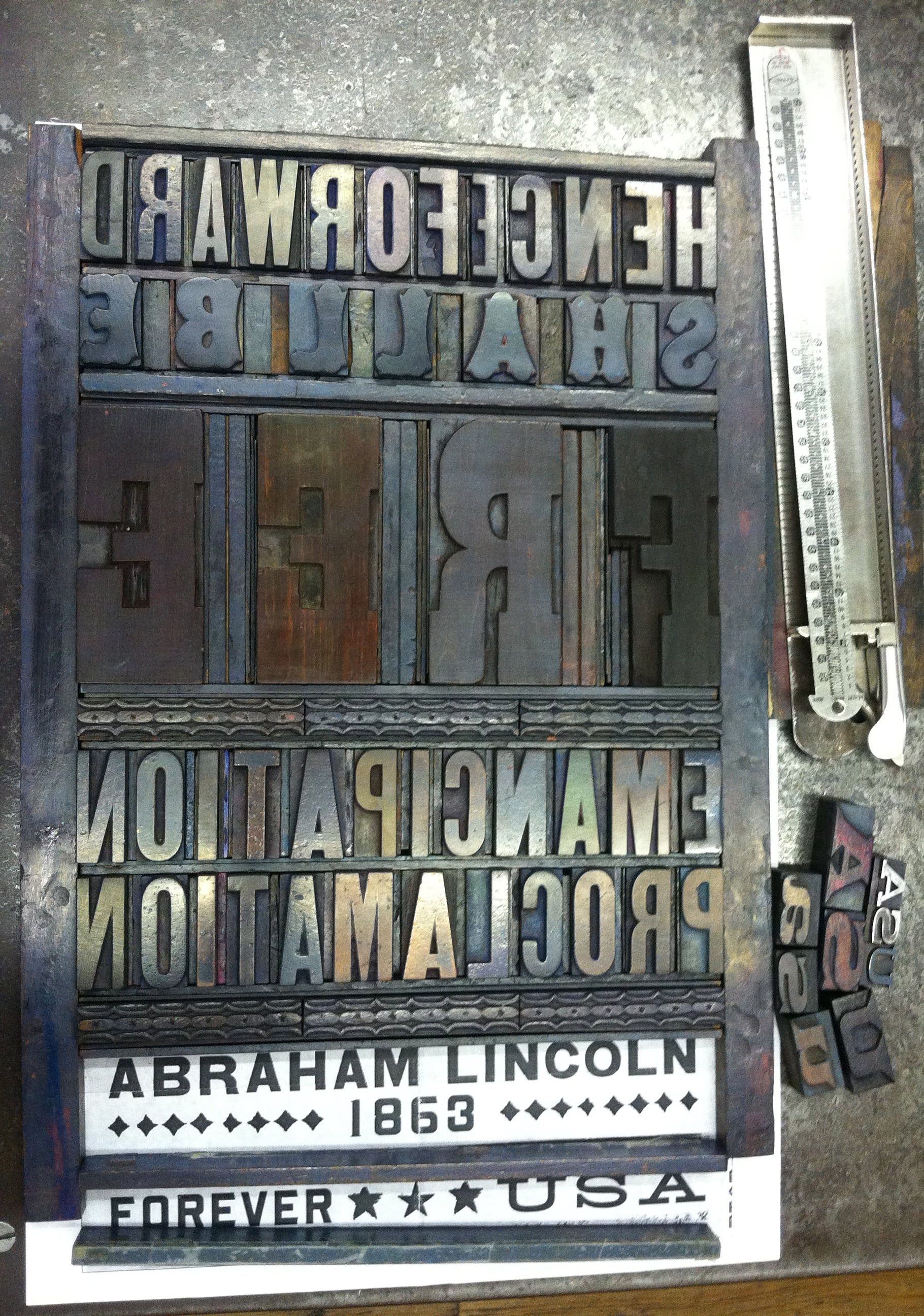
MADGES: Looking at your site, I’m impressed that you are an incredibly versatile and prolific designer. You’ve worked as Art Director at Rolling Stone, an educator at SVA, are on the board of TDC, you designed probably my favorite US Postal stamp — the Emancipation Proclamation. How do you take on these projects — what strings them together? And what’s next?
ANDERSON: I actually just started a new job recently that should keep me challenged for a good long time. I’m now the Director of Design and Digital Media at Visual Arts Press (SVA). My career is tied to a love of working with words, whether it’s designing them or writing them. The Emancipation Proclamation stamp may be my all-time favorite project. I got to design using a piece of history — the first words from the document itself, and was able to set the actual type at Hatch and watch Jim Sherraden print the poster that was then reduced to stamp size. It doesn’t get better than that.


Carly Butler Joins Handwritten as Curator of Life's Letters

Handwritten is wildly happy to announce its newest curator, Carly Butler, who will be heading up a new column called Life's Letters.
The column comes from a discovery, which turned into journey, blog, and premise for a book: 110 love letters written from her grandmother to her grandfather after a chance meeting during World War II. The trajectory of her life took an irreversible turn: she followed the letters and her heart to London, England, to retrace the steps of her grandmother's letters 67 years later.

At the outset, she didn't intend to write a book, but while in London, she realized something: she was writing her own Life's Letter with each step. So at the conclusion of the physical journey through this past, Carly set out to put down her experience, which has turned into the forthcoming memoir, Life's Letter.
Along the way, something else happened unexpectedly: as people began to find out about her journey through articles, interviews on television, and more, people started sharing their own life's letters with Carly, each as unique and moving. She started receiving requests from universities, organizations, and genealogy clubs to speak on behalf of the power of the pen, which only sent her in further examination of the connective tissue of the physical traces of a past and person. It shined a bright light on a simple truth: every family has a story. But what we don't realize without zooming out, is that so many of these stories are preserved in pen. And so, this is what her column with Handwritten will be about: the stories told through letters about life, lives, and living.
The first post will be on Sunday, January 17th, which aligns with time: the first letter of her grandma's is dated January 17th, 1947. It will also be the first time Carly has published a single, entire letter of her grandmother's. In this column, her own life's letter will provide the base for others, and create a space to collect and recollect unforgettable lives through letters.
We welcome Cary Butler to the Handwritten team, and cannot wait to watch her column unfold.
To tell Carly your story, and submit to her column, you can reach her at: lifesletter@gmail.com.


Carly Butler currently lives in British Columbia, Canada with her husband Adam. She is a photographer and writer by passion, and a customer relations coordinator at a bank by profession. She has a degree from the University of Guelph in International Development and Economics. Her story has been featured in media outlets such as BBC Breakfast, The Times, London's Evening Standard, BuzzFeed, Huffington Post, Today Show, Good Morning America, the Global News, and dozens of other publications.
The Best Work is Work You Don’t Understand Fully • A Conversation with Special Forces Medic & Poet Graham Barnhart

BY DEMETRI RAFTOPOULOS
Graham Barnhart is from Titusville, Pennsylvania, the birthplace of the oil industry. He is an 18D, Special Forces medical sergeant, and has been deployed twice: once in Iraq for nine months, and the other for seven months in Afghanistan. I didn’t know all this when I met him at Hotel El Greco in Thessaloniki. All I knew was that Graham Barnhart was a poet and my roommate for the summer. We were the only two men taking part in Writing Workshops in Greece on the island of Thassos. It being my first time living away from home and having a roommate other than my parents, there were a lot of question marks in my eyes.
The day we were to meet, I went for a long walk along the port to the White Tower and other landmarks drenched in Greek history. In between monuments, I wondered if Graham and I were searching for the same thing; if we would be capable of having a good time with a beer in one hand and a pen in the other; and if we could mix the sentimental with the comical, the work and the play. A few hours later when I returned to our hotel and skipped up the flights of stairs, I was stopped by an unfamiliar, familiar face. I wasn’t sure what Graham looked like—his Facebook profile picture was a black and white image of a random old bearded fisherman—but something told me this was him.
“You’re Graham,” I said, almost accusatory.
“That’s me,” he replied.
I would learn this to be his normal, quiet, calm exterior. I would also learn that he wildly records his surroundings, almost instantly rendering them into lines of expression. One of our first nights, we sat in the restaurant beneath our rooms, watching locals throw napkins over the others dancing to the live music. When Graham asked why they did this, I told him it was a sign of respect, to the musicians and to the dancers. During the first student reading, Graham read a poem about his time in the military and in Greece that centered around the image of the napkins.. He had this uncanny ability to live in the moment, to inhale all that was around him and let it all sink onto a page, and a poem, as he exhaled.
Throughout our time together, I learned something else about Graham — he handwrites wherever he goes. This makes sense, as he is always on the move in the military, but I wondered how he balances the two worlds — the military and literary. We caught up recently and talked about this: his time overseas, balancing the military world and the literary world, and his thoughts on the handwritten word.

DEMETRI RAFTOPOULOS: In Thassos, you carried around your notebook everywhere, especially on our excursions to other towns. What kinds of things were you writing?
GRAHAM BARNHART: I write down a mixture of notes and poems, usually more notes and lines than full ideas for a piece. I try to pursue an idea as far as I can in that first jotting, to get everything out as it occurs to me. I try not to list off ideas for what the poem will be about. That feels like a shying away from the sometimes (often) daunting moment of inspiration. That moment when you can feel but not yet articulate all the potential of the idea that has struck you. It’s too easy to try to categorize or outline that idea than put it aside. That avoids all the hard work and limits the creative potential to what you already understand or can conceive of.
The best work is work you don’t understand fully until you’ve written it. It’s better for me to have the image or handful of lines so that I can come back to them, hopefully experiencing again whatever it was that made me want to write them in the first place. A good idea or plan for a poem can sometimes turn into a trap.
RAFTOPOULOS: Yeah, I don’t think I ever fully follow through with an “idea” the way I thought I would when it first hits me. Always lands on the page differently than it does in my head. What’s your process like?
BARNHART: I tend to start by hand though I don’t usually think of my handwritten work as a first draft until it hits a computer. On paper I might complete a poem but keep marking it up, fussing with it really, until I get motivated enough to actually type it up. That’s when I know I have a draft rising up out of all the daily notes and scribbles that I really want to pursue.
Handwritten work feels more in-progress to me, like I haven’t quite found the right configuration of ideas and images to call it a poem. Once those components are present I do most of the finer tuning on a screen. That’s when I start thinking about outlining or diagraming the piece and when I add notes for further revision. The handwritten phase is not always a requirement, but it serves as a permanent record and a well of all the ideas and lines that might otherwise be forgotten. I love to flip through my current and older notebooks as a way to warm up to writing. I don’t always ending up working on the piece I sat down to revise but something usually happens. That’s all I can ask for sometimes.
RAFTOPOULOS: Absolutely. Do you always use the same notebook, or do you have different ones for different purposes?
BARNHART: I’ve always kept some sort of a notebook, though kept might mean that it sat in my room or desk for weeks without being used. I have a bad habit of writing down ideas in whatever paper is handy rather than using my designated writing notebooks. So I end up with notes and drafts scattered through everything else.
Having a pen and paper handy is a big deal in the military. There is always information being put out, whether it’s the time of the next formation, how many rounds of ammunition you’re drawing for the range, or a casualty description for a medevac request. It’s considered unprofessional to show up for a briefing or class without something to write with and on. That comes in handy when trying to take poetry notes. No one really questions what I’m doing. Not that writing poetry would be a problem, but explaining my writing to a soldier would be about as long and complicated a conversation as explaining what I do in the military to a civilian. It’s just easier most days for everyone to think I’m noting the effect range of a 60mm mortar.
RAFTOPOULOS: And one notebook specifically that you described to me as a “writeintherain” notebook.
BARNHART: Yes. Recently — the last 15 years maybe — little flipbooks kept in zip lock bags have been replaced with waterproof notebooks made by a company called “Rite in the Rain.” They have thick, waxy pages and only work with regular, old ballpoint pens, rather than the fine tip pilot pens I really like. In fact the notebooks even come with an “all weather pen” which is just a short, steel ballpoint.
RAFTOPOULOS: How about your handwriting — does it change from notebook to notebook? I imagine writing in the rain could “weather” your penmanship.
BARNHART: I don’t make the handwriting look different on purpose, but because of the materials used it just does. It actually feels harder to write on the all weather paper, kind of like the notebook is resisting anything not specifically military. Though of course it’s also a pain to write military stuff. That material tends to be short notes and lists rather than lines and stanzas.
I mentioned not being very good at keeping my writing consolidated. So on top of half filled moleskins lying around I also have a bunch of waterproof notebooks filled with operation orders, mortar targeting grids and the occasional poetry stanza. I don’t try to keep these things separate in the notebooks though. I like the juxtaposition.
RAFTOPOULOS: You have experience teaching and I know you want to teach in the future. Do you think you’ll assign writing prompts in class, just so your students are forced to write by hand as you sometimes are?
BARNHART: I think in class writing prompts are fantastic, especially when they’re handwritten. That format forces a sense of urgency but also of care. You have to physically create each letter, but you may only have 5 minutes, or 10. For me this frees me from my normal analytical and self-editing process. I just get something out there that follows whatever external guidelines the prompt demands. Some people don’t like prompts feeling they stifle their own creative process. I rather think that prompts free your creative process from you, if you are diligent and faithful to the restrictions. So in short, yes, I will absolutely assign handwritten prompts.
RAFTOPOULOS: How did you decide on pursuing an MFA?
BARNHART: I decided on the MFA in undergrad and actually started the application process before I decided to enlist. It seemed like the best way to pursue a writing career and avoid student loans for as long as possible. I knew I wanted to write and didn't much care what sort of real life job I ended up with so an MFA seemed like the right way to go.
RAFTOPOULOS: What was it like writing or attempting to write in places like Iraq and Afghanistan?
BARNHART: I wrote very little digitally during deployments. In fact I didn’t write much at all. I took sporadic handwritten notes when an image caught my attention, sometimes even a full poem but I didn’t spend much time actually working. I regret that now of course, I wish I had at least kept better daily logs.
On both trips I did have my own room with a desk, a bed and some books. I wouldn’t take my laptop out on patrols or missions of course but it was around. I always had a notebook in my pocket though. Actually it was in a pouch on my body armor. I kept pen and paper, some caffeine pills and a little iPod shuffle that was plugged into my ballistic hearing protection. The pouch was intended to hold shotgun shells so it had little elastic loops sewn all over the inside.
RAFTOPOULOS: How were you able to balance both of these worlds — military and literary?
BARNHART: Most days if I ended up with some notes or lines, I felt like that was a success. It was a sufficient sign that I hadn’t given up or lost writing which was a big concern for me post undergrad. I went from learning to write in an environment structured to support that to one structured to support a very different goal. I was also learning and studying in the military, but of course none of it was directly poetry related. It helped to think of it, especially the miserable stuff, as material.
RAFTOPOULOS: Were you ever worried that you would stop writing completely?
BARNHART: There was a point during the medical training when I actually thought I would. That course was intensive. We did physical training from 6:30-8:00, and then we were in class from 9:00-5:00. Afterwards, we spent three to four hours studying. There were written and practical tests every week. Learning that much medicine that fast pushed everything else out of my head. I completely forgot all of the Arabic I had spent the last six month learning. I didn’t feel like I had the capacity for any other kind of thinking.
RAFTOPOULOS: I can imagine. I’m happy you haven’t stopped writing. How much of your poetry is inspired by your time overseas?
BARNHART: Much of my writing is loosely inspired by my deployments, mainly Afghanistan because it was more combat-oriented and also more recent. Many of my poems are set there, though I prefer to rely on an ambiguity that implies the setting alludes to it. I think of the war and my military time in general as a useful context for exploring ideas in poetry but I don’t think many of them as “about” the war, or at least, the ones I find more interesting to write are not.
Then again, my time in the military is relatively short compared to most of the guys I worked with. Some of them have been to Afghanistan more than ten times, though some of those trips were as contractors. I’m hesitant to talk about what the war is like because I only know about my brief experience, leaving out the long history of this conflict, not to mention that largely silent or unheard voices of the people who actually live there. I never want to say this is what Afghanistan is like. I can only say this is what I saw in Afghanistan while I was there as an American soldier.

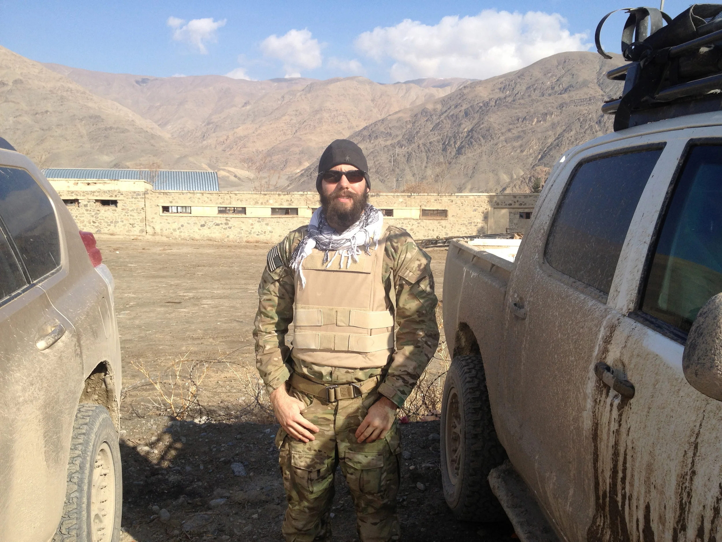
Graham Barnhart is an 18D, Special Forces medical sergeant, and is an MFA in Creative Writing candidate at The Ohio State University. His writing has appeared in the Beloit Poetry Journal, the Sycamore Review where he was a finalist for their 2014 Wabash prize, Subtropics, The Gettysburg Review, and Sewanee Review. He is also a finalist for the Indiana Review's poetry prize and the Iowa Review's Jeff Scharlett Memorial award for veterans. And is hoping to be back in Greece next summer so Demetri can continue drinking tsipouro with him and translating Greek for him.
The Best Investment of Time and Money • A Conversation with Calligrapher Kathy Orf

BY SARAH MADGES
Kathy Orf is a calligrapher living and creating in St. Louis, MO. She has been practicing a “morning writing” ritual in which she sits down and draws in calligraphy without any prior planning for just a few minutes each day, a 365 project that allows her to continually approach her work in fresh ways. I had the chance to talk to her about what exactly calligraphy is, how it relates to handwriting, and how she became so invested in the art.

SARAH MADGES: How and when did you first become interested in calligraphy? How did you come to make a career out of it?
KATHY ORF: I had a “decorative arts” class in high school that included calligraphy and — I’m really dating myself here — macramé! Then in college, I majored in graphic design and had a whole semester of calligraphy, which was really rare. After graduation, I worked in graphic design until my second son (Alex) was born and then decided I should stay home and do calligraphy part time. I had started trying to sell my work at arts and crafts shows just 3 months after my first son was born and thought I would continue that. I’m not sure I would call it a “career,” maybe more of a passion or a creative outlet…It is really hard to support yourself doing calligraphy and luckily I never had to. That said, I’ve been doing calligraphy for 30 years.
MADGES: When people hear the word calligraphy, they tend to think “beautifully ornate handwriting” or “wedding invitations.” How do you characterize calligraphy — is it an art form, a process of symbol arrangement, pimped-out handwriting? What are calligraphy’s essential elements? What makes it different from handwriting?
ORF: I think calligraphy can be different things depending on how it is used. It can definitely be an art form…something which has been a struggle to achieve in other’s eyes. But it can be very utilitarian when it is used to address envelopes or fill in names on pre-printed certificates. I do not consider calligraphy to be hand-writing in any sense of the word. It takes years of practice and good instruction and some talent to reach a certain skill level. Calligraphy is not fast in learning it or its execution. The letters may look like they’ve been written quickly, but many times it is more deliberate than you might think. And the funny thing is, one important part of hand-lettering is consistency, but whenever I look at printed lettering, I look to see if the letters are identical to determine whether it is hand-done or a typeface. So, even though you strive for consistency, you also want it to look organic, like it came from someone’s hand and not a machine.


MADGES: Does your handwriting resemble your calligraphy? Have you always had good handwriting?
ORF: My handwriting is the worst…just ask my husband. But I think it is because I am always in a hurry when I am writing something and using a ballpoint pen. Put a calligraphy nib in my hand and it’s a different story. It’s almost like my hand knows what to do at that point.
MADGES: Do you have one main mode of calligraphy, or are you always inventing and adapting the letters and symbols to their specific purpose and environment?
ORF: I know many different hands…italic, uncial, blackletter, foundational, romans, copperplate…and variations of them all. But I tend to get in ruts and use the same personalized style all of the time. I guess you could call this style my “calligraphic handwriting” because that is what I use to write with most of the time. My tool of choice to create this lettering is a pointed pen…Brause EF66. It is very flexible and can be used to write very tiny or even letters up to an inch tall. Every morning, I pick up my Brause, a piece of paper that I had already painted and just write a saying using this “handwriting,” although it does not resemble my actual handwriting at all. But, when I sit down to do a finished piece, I might think more about what I want it to look like, and what style I should use, and even use a chiseled nib, like a Mitchell.
MADGES: What are your most common assignments — and what kind of clients do you attract? How long do you spend working on individual pieces?
ORF: Most of my work of late is just doing sayings for friends. I don’t advertise, except through word of mouth. I have some certificate work for Washington University in the spring and fall, and will do a wedding or two a year, but usually just for friends, as I’ve never really enjoyed the rote nature of the work. I also create pieces to sell at fairs using my photographs of things that look like letters that I combine with my calligraphy. I can usually do a simple lettering job in a couple of hours. If I am creating a background and lettering a larger piece, it takes maybe 6 to 8 hours — it really depends on so many variables.
MADGES: What do you think about the diminishment of handwriting and cursive lessons in U.S. schools? Have you noticed any change in the demand for and reception of calligraphy as handwriting diminishes in use and popularity?
ORF: I think it is terrible that they are trying to stop teaching handwriting in schools. I think it is one of those things that they will later decide was detrimental to cognitive development. I’m not sure diminished use of handwriting has affected the popularity of calligraphy as much as the increase in fonts that look like it!
MADGES: What are some of your favorite examples of calligraphy in general — historical, global, etc.?
ORF: I just went to see the Book of Kells this summer at Trinity College in Dublin and it was amazing. I also love the work that Donald Jackson did on the St. John’s Bible that he just completed a couple of years ago for St. John’s Abbey and University in Minnesota. But I am mostly drawn to and excited by contemporary calligraphy.
MADGES: Why do people respond to it? Do you think there will always be a demand or desire for calligraphy?
ORF: I think people respond to calligraphic work because it so often interprets words in a way that touches them. Sometimes it’s because it is something they “wouldn’t have the patience for” — I hear this very often. And sometimes just because it is beautiful! I think there will always be a desire to do calligraphy as art, maybe not as much of a demand for invitations and such, although the whole retro movement may help, like it has for letterpress printing! But to survive, I think it will have to grow more into the realm of art and it has been doing that for a while now.
MADGES: Any advice for calligraphy enthusiasts out there?
ORF: Join your local calligraphy guild. Learn from good teachers and don’t just take a class and never do it again…practice or do homework if it is assigned. The best thing I ever did was to take a year-long class taught by a calligrapher named Reggie Ezell. He travels to four different cities for one weekend of every month of the year teaching almost everything you need to know. The great thing is that there was homework each month, and I DID THE HOMEWORK…and that made all of the difference! Unfortunately, Reggie is retiring after next year. But that was the best investment of time and money I ever spent.
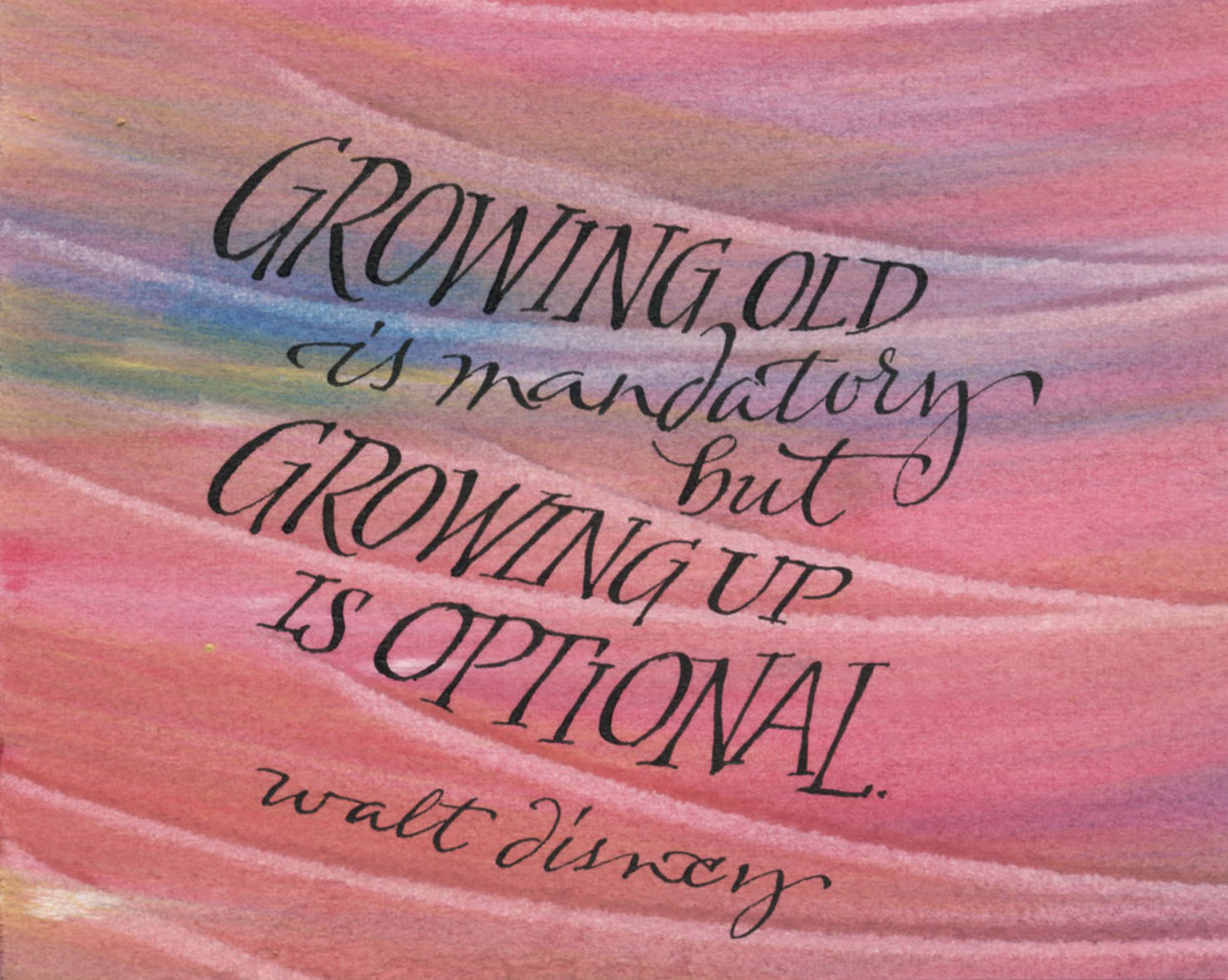

It Starts to Look Like a Timeline, Not a Journal • A Conversation with Angela Flournoy

BY SARAH MADGES
Angela Flournoy and her debut novel, The Turner House, are igniting the literary scene with their unassuming eloquence and nuanced commentary on the deleterious effects of the 2008 housing bubble and the black American diaspora, whose interrelated history subsumes the 13 members of the Turner family as they navigate a crumbling Detroit.
Garnering significant attention and accolades for a debut novelist, Flournoy is a finalist for the National Book Awards in Fiction, and was named a “5 under 35” writer, designations that left Flournoy nearly tweetless, only able to write “whaaaat” in response. Despite this rapid success, when we saw her during an intimate conversation hosted by CLMP at the New School, there was an easygoing magnetism to her speech, posture, and perspective. Although Flournoy is the first to admit her excitement for the book’s positive reception, watching her speak, it seemed clear that we are in the presence of a person who has remained rooted at the center of the spinning wheel.
So when we found out that Flournoy wrote the entire first draft of The Turner House by hand, we went wild with theories — perhaps the handwritten word explains why she is so grounded, or has enabled her to access memories of her father’s Detroit childhood, etc. Thankfully, Sarah Madges from Handwritten spoke with Angela about writing The Turner House by hand, thereby recusing us of the need to go on any longer. We wish Angela the very best this week, and hope everyone who reads this here will read her book, and then handwrite their own.

SARAH MADGES: So I wanted to talk to you about your process, how handwriting figures into it, and how you came to incorporate it into your process:
ANGELA FLOURNOY: Handwriting has always been a part of my process. I got my first journal when I was eight years old — I don’t have them with me or I’d check, they are at my mother’s house. I’ve always worked out ideas or feelings through handwriting.
For most of my academic life I was writing papers on the computer and generally typing things, and it didn’t seem like the most natural way to work on something that was not like a term paper. When I was first writing short stories in undergrad most were written on a computer first, but when I got to Iowa, one thing that was an issue for me was procrastination. I didn’t have the smartest of phones, I was always a couple generations behind — now that’s an issue — but I figured if I left the house I’d focus more. So I would sit in the coffee shop and sit on my laptop hanging around on the Internet instead of writing, even after downloading Self Control, because you could still override it.
So I returned to handwriting to focus — there were not as many distractions. Especially when you’re working on something historical, you want to look everything up on Google, which is useful in revision, but it gets in the way of writing when you stop and end up in a Wikipedia rabbit hole. Writing longhand made me focus, and slow down.
MADGES: Has your writing always been historical in the way The Turner House is, or written about, for example, a city you never lived in, but know about?
FLOURNOY: History is always a part of the way that I envision stories. This novel, especially, but I had written 70 pages of another novel based in a city I never lived in and it was a similar process.
MADGES: How would you get yourself to push through the writing instead of succumbing to the kneejerk reaction to look things up — would you leave notes like “look up later” and just keep going?
FLOURNOY: Well I would put an asterisk next to what I wasn’t sure was right. The thing about literary fiction is that it’s not one of those things — I’m not writing a civil war period piece that heavily relies on research and that people are so into it and will feel betrayed if they feel it’s inaccurately portrayed, like, “That’s not what happened at Gettysburg!” That’s not the burden of the kind of fiction I write. You just need to have a foundation with reality. I would just write in the margin: Look this up!
MADGES: You said you started writing in a journal when you were around eight years old. Did someone encourage you to do that, or did you sort of come to that naturally?
FLOURNOY: Well, it was a Christmas present from an aunt of mine and so then it was just, there. And I’ve always been a person who, as soon as I learned how to read, read a lot, so it was like of course I would do this thing. No one was telling me I have to do it, and there wasn’t much else to do. Now, we live in a time of distraction, so it might be different. People talk about wanting to pick it up as a practice.
MADGES: Did you always prefer to write by hand? Have you found greater success this way, or did you notice yourself writing/editing differently with a word processor?
FLOURNOY: I feel like I’m a lot less apt to take risks when I’m typing out a story because it’s so easy to delete things; whereas, when you’re writing by hand you have to get to a certain critical mass before you “x” something out. It’s too easy to reread every sentence, go backwards rather than forward.
The editing process should be the editing process. You handicap yourself when you keep cutting down your own ideas. One on its own might not be great, but they might all make sense in concert with themselves. When there’s that blinking cursor encouraging you to cut them down, you might lose what the idea was really supposed to be.
MADGES: Right! And once you delete them there’s no evidence of those ideas, at least in a notebook you can usually still read the words you crossed out. So how does handwriting figure into your writing process? What role did it play in writing the Turner House?
FLOURNOY: One benefit of writing longhand, I’m more gentle with myself on first drafts. It hurts to scratch out all the pages you wrote in the day.
I usually write the first draft longhand with notes in the margins and sometimes rudimentary edits as they fit on the page. For this novel, I wrote maybe a couple chapters at a time, then I would go and type them into this master novel document. That’s already two editing processes: on the page in the margins, and then of course I’m not going to transcribe something that is terrible, so again when I type. And because I’m not rereading everything in the document, that document lives separately, it ends up getting sort of built up and I’m able to look at what’s there, what’s working and what’s not, and change it later. It allows me to have a base, and provides some time between writing something and wanting to jump into revising it and moving, structurally, whole chapters around. Once I finished a notebook I would assess: where are we actually in the larger narrative? Some of the notebooks are half writing prose, half notes. It took about seven college ruled Moleskine notebooks.
MADGES: How long would it take you? Did you find yourself having to stop because you couldn’t physically write anymore, or…?
FLOURNOY: No, I’m not a fast writer. On some days, it might have been more staring and thinking and I maybe only wrote five actual pages in my notebook. On other days, I could very easily look up and there’d be 15 pages in front of me. And even though handwriting is larger, those 15 pages would end up being 20 pages because I would think of things to add or subtract when transcribing. I don’t really remember my hand cramping. I wish I was one of those people who could really get a lot out of writing for three hours every day. For me, I have “writing seasons” and I have “thinking about writing seasons,” and when I am in the writing season, I just hunker down. I wake up early. If I don’t have a block of four hours, I feel like the time is already gone. I am not a fast writer. I was working at a D.C. public library, and I would have a shift from 5-9pm. So I would get to the coffee shop at noon and I would try to finish, or start a chapter.
MADGES: Do you keep a journal, or carry a notebook and pen around with you?
FLOURNOY: I have a journal but I don’t write in it much. When I was writing short stories, I would sometimes journal, but when I was writing this novel, I think the last thing I wanted to do was pick up another book and write in that book, too. I have slowed down journaling for myself. Now, I use it more for marking moments, or milestones.
MADGES: How do you feel about the fact that cursive is no longer required teaching in U.S. elementary schools?
FLOURNOY: I am terrible at cursive — I have terrible handwriting — but I can read cursive. But say, how can you even read archival documents if you can’t read cursive? You have to trust someone else’s transcription of it. It’s as if you’ve lost a language if you can’t read it for yourself and that is dangerous because people can say that any document says anything. It’s bad enough I only know one language fluently — I can at least read and write in Spanish — but it’s bad enough that most people in the U.S. don’t even have reading proficiency in a second language. But to not even have that proficiency in the language you were raised with? We’re not even going to be a monolingual culture anymore — we’re going to be whatever half of monolingual is.
MADGES: Well, you had a very successful debut! How do you feel about being shortlisted for the National Book Award? Were you surprised?
FLOURNOY: Yes, I was surprised. A sort of big moment for me was being on the long list, because who thinks that’s going to happen? I was in my apartment and I had sorted out my clothes and was going to take them to the laundromat and my phone started vibrating. This is stuff your younger writer self doesn’t dare fantasize about. I never really fantasized about publishing my book in general. It’s been great — it’s opened up all these different opportunities. I’m going to be teaching at The New School in the spring, which is exciting.
MADGES: Did you write about that in your journal?
FLOURNOY: [laughs] Yes, the last thing I wrote was in, like, August, and then: “I got on the shortlist!” It starts to look like a timeline, not a journal. Baby steps. I’ll get there.


From her site: ANGELA FLOURNOY is the author of The Turner House, which is a finalist for the National Book Award and the Center for Fiction First Novel Prize, a Summer 2015 Barnes & Noble Discover Great New Writers selection, and a New York Times Sunday Book Review Editors' Choice. She is a National Book Foundation "5 Under 35" Honoree for 2015. Her fiction has appeared in The Paris Review, and she has written for The New York Times, The New Republic and The Los Angeles Times.
A graduate of the Iowa Writers' Workshop, Flournoy received her undergraduate degree from the University of Southern California. She has taught at the University of Iowa and The Writer's Foundry at St. Joseph's College in Brooklyn. She is joining the faculty at Southern New Hampshire University's low-residency MFA program in Spring 2016.
Outside the Box • A Handwritten Review

BY BRETT RAWSON
I have my preferences and loyalties, but when it comes to certain moods or weather, the sirens of style can call like the crow's caw. Most often, this happens when I am rushing to a dinner party and have been tasked with "bring wine," a beverage I only know in passing. Pacing up and down the aisle in a panic, I curse my small wine-brain, and am left with no other option than to choose the bottle that speaks to me the most: meaning, the one with the best label, or name, or both for the win.
Though it plays an important role in my purchasing decisions, it is not something I had thought about at calm length. But some weeks back, I came across an object that contains enough energy for the imagination to implode: Outside the Box: Hand-Drawn Packaging from Around the World by New York-based designer, writer, and educator Gail Anderson. And for some unknown amount of time, I flipped through continents of creatives, as Anderson hand-picked forty individuals who sit in the front-seats of this growing industry of home-grown, artistic designs.
While this collection showcases a diverse portfolio of people, typography, and expressions, it simultaneously illuminates Anderson's own vast depth and eye for creative representation, as she weaves together interviews, images, brand origins, and routines of forty of our most prolific hand-artists today. Outside the Box peels back the label, uncovering what has gone into some of the most well-known brands. I'm not often one for book summaries, but this one leaves the door ajar:
In an age of slick, computer-generated type and Photoshopped perfection, hand-drawn packing is enjoying a global resurgence. As shorthand for something more authentic, homegrown, handmade, or crafted, hand-drawn packaging is found on everything from supermarket eggs to Chipotle drink cups. In this exhaustive and lavishly illustrated survey, organized by four types—DIY, art, craft, and artisanal—Gail Anderson pulls back the curtain on the working processes and inspirations of forty letterers, illustrators, and designers from all around the world through insightful interviews, process sketches, and her infectious love of the medium.
And since this site and platform is dedicated to process, let's promote the people responsible for publishing the beautiful pages: Princeton Architectural Press, who have eyes, hands, and hearts on this visual culture of ours. So, just what is inside Outside the Box? Below is a splash of the beauty in between these covers (click on the images to see them in full and then hover over the full-sized images to get a description of what they're about):


The next time you're scanning the aisle, either in eagerness or ease, take a look at the difference between those items handwritten and otherwise. You'll see an air of energy around the handwritten and hand-drawn designs. Sure, it's the inside that you're going for, but don't forget to enjoy the outside.
It's So Un-Special, It's Special • A Conversation with the Bill Keaggy on Artfulness, Sloppiness, and Interestingness

St. Louis-based Bill Keaggy is king of “generating content.” A wildly prolific artist and collector, he was an erstwhile magazine designer and photo editor at the St. Louis Dispatch before launching his self-proclaimed purposeless website of “visual indiscretions,” the eponymous www.keaggy.com.
His goal is to make things interesting by helping people appreciate what’s right in front of them—which he more than accomplished with projects such as Milk Eggs Vodka, a tome of anonymous and abandoned grocery lists he first uploaded to his site as a simple photo collection entitled “Grocery Lists,” before piquing a publisher’s interest and organizing them into snarky categories such as “Eating Wrong,” or “Bad Spellrs.”
By compiling such miscellaneous marginalia, Keaggy imbues the ephemeral both with an otherwise lost fixity, and a sort of imaginative narrative history. As he put it, “I considered my work to be ‘art’ in the lowercase form of the term. It’s so un-special, it’s special.” These special un-special projects have been featured in places like the New York Times, The L.A. Times, Chicago Tribune, The Guardian, HOW Magazine, and even Jimmy Kimmel Live. Should you want a more concise and chronologically organized autobiography, his documentary impulse has produced a timeline of his entire life, including everything from his first sip of PBR in 1972 to his NY Times Magazine interview in 2004, here: http://keaggy.com/about-me/.

SARAH MADGES: Have you always been a collector, of marginalia or otherwise?
BILL KEAGGY: I think so. Not in a hoarder kind of way, but yes, I think I’ve always had an interest in collections of things. When I was 10 or so I had a pretty big key chain collection, although now I’m not sure why, but I soon realized that it was far more interesting to collect things that were never meant to be collected. Things that other people had lost interest in or saw as useless.
MADGES: This project must have required incredible patience and dedication. At any point did you consider quitting? What convinced you to keep going, and to eventually get the collection published in a book?
KEAGGY: The grocery list collection started small and stayed small for a very long time. But I never approached it in a “Must. Add. Lists. Every. Day!” kind of way. I’m not naturally a patient person, but in this case I just let it grow naturally, adding a list every few weeks or so. Then around 2000 I put it online, and back then being a novelty online actually was novel, so it got linked around a lot and people started to ask how they could contribute. Since then, the collection has been fueled 99% by friends and strangers sending me lists. It sort of has a life of its own now and I update the site a few times a year at most. So, no, I never considered quitting because it was difficult. The collection has grown big in the same way people grow old — suddenly you’re not young anymore and you look back and wonder how the hell that happened.
I’d thought about how I might turn it into a book but never acted on it. The truth is that I had the luxury of the publisher contacting me to see if I wanted to make a book. Of course I did. It was a good way to breathe new life into the project, to think about the collection in a different way and give it depth, and help other people think about the lists in different ways.


MADGES: In an increasingly tech- and text-based world, handwriting has lost some of its former relevance and ubiquity — cursive is no longer even required in U.S. school curricula, and thousands of people have never written or received a letter in their entire life. How important is the handwritten aspect of these grocery lists to you? Do you still write by hand?
KEAGGY: The handwritten lists usually are the best — they have more character, personality, quirks, artfulness, sloppiness, and interestingness to them. Not just because of the handwriting but also because of the writing material — you can’t run weird, repurposed scraps of paper or cardboard or magazine through a printer but you can tear a piece off of something and write on it. And I’m a designer so I have this innate interest in letterforms and layout and organization, and everyone brings their own approach to these things in handwritten lists.
That said, I obviously get more and more typed lists now, but fewer lists overall because so many people do keep their lists on their phones. I do, because like everyone else I always have my phone with me. I only occasionally write a grocery list out by hand but the truth is I don’t feel too nostalgic over this change. I still do a lot of writing, sketching, and designing on paper, so it’s still part of my daily life.
MADGES: Many people, editorial reviewers and regular folks (ie, Amazon.com customers) alike, have commented on Milk Egg Vodka's humor, which comes in part from the original content of the various grocery lists collected, but mostly from your insightful and playfully snarky commentary. There's also the obvious fact that the Library of Congress designated it as a "Humor" book. When you started collecting these lists, were you mostly compelled by the comic opportunities they provided? Or was it more about the voyeuristic element of finding discarded personal notes, the various examples of penmanship and spelling, their value as art objects, something you couldn't quite name? A more concise question: was humor the intended goal, or a natural and happy accident?
KEAGGY: Yes, the funny lists were what made the collection really interesting to me, and I think to most people. Aside from the fact that they’re an anonymous, unguarded peek into other people’s lives, and, truthfully, are mostly normal and boring, it was when you’d find that needle in the haystack — that weird, WTF list with odd combinations of items or really poor spelling or funny notes. It was those moments that made the project worthwhile and I realized early on that I should highlight them for people, so I made Top 10 lists, which became the backbone of the book. Finding funny lists wasn’t the original goal — I just thought it was interesting to pick up something someone else had thrown away — but the humor aspect was a funny bonus that only became apparent after sticking at it for a while. I don’t know which of the lists was the very first one I found, but I do know it wasn’t funny. It was typical.
The funny ones are few and far between, but do make it all worthwhile are are probably the main reason people find the collection weird and interesting.


MADGES: Separate, but related question: how do you characterize your work? What are you hoping people will notice or take away from it?
KEAGGY: I don’t think I have a good answer to this question. I very purposely don’t tell people how to feel or what they should get out of looking at my various projects. I might explain how *I* feel about them, or why I did something, but I just put things out there and hope that they take *anything* away from it. I want their reactions to be legitimate and pure, whether it’s “Wow, I never thought about waste that way” or “This guy is an idiot." Telling people how to feel about these projects and art in general is like saying, “Get it? It’s funny because…” at the end of a joke. In the past I’ve characterized my work as being about “the life behind the things we leave behind,” and I think that’s enough for people to go on.
MADGES: After MEV, you published a similarly-minded book in 2008 called 50 Sad Chairs, which critiqued and poked fun at consumer culture while artfully cataloguing a bunch of forlorn furniture. What have you been up to since then? What projects are driving you right now, and how have your previous works prepared you for or led you to them?
KEAGGY: After “50 SAD CHAIRS” I did a lot of other “collecting with photography” projects. I’d stumble on a theme and make dozens or hundreds or thousands of photos that catalogued a particular idea. Trees growing out of old abandoned buildings. Basketball hoops in alleys. Rust stains. Curse words. Lots of decay porn, which has become a genre unto itself. Recently in my photo collections I’ve been leaning more toward seeing everyday things in other everyday things. In February I challenged myself to find the shapes of all 50 U.S. states in the world around me and in June I collected the letters of the alphabet from dead worms on the sidewalk. People really liked the states project and were really grossed out by the worms. But what I do more and more of now is actually *make* things from other things—working with found and repurposed objects instead of simply collecting them. After so many years of working digitally I really felt the need to go analog. But the idea of appreciating—or at least considering—and/or re-using “junk” and little, broken, forgotten, ugly, ignored things is what ties most of my projects together.

You Can Stop Cursing at Cursive Writing Now • A Handwritten Review

HANDLED BY HANDWRITTEN

Meet Linda Shrewsbury and Prisca LeCroy, the mother-daughter team who has changed the world of cursive writing. Literally and figuratively, they have reshaped the way children, and adults, learn cursive writing: not in alphabetical order, but by shape. And in less than one week, their second campaign comes to a close. Their first, a Kickstarter last year, was successfully funded and raised $33,000.
This helped bring CursiveLogic, the workbook you see below, into existence, and now, Shrewsbury and LeCroy are set on taking it into the classroom with their new campaign, Cursive2Class.
What exactly is CursiveLogic's method? It reorders the alphabet into four shape-groups (oval, loop, swing, and mound), color-codes them with visual and audio cues, and fits into a single workbook that has — prepare yourself for this — regular paper and dry erase worksheets. Heaven, we know. Whereas old models required students to sit in place and etch the alphabet in order and silence onto recycled and photocopied sheets of paper, this four-lesson workbook takes students through each similarly-shaped group of letters, while at the same time teaching how to write full-length words. This model, workbook, and business is the absolute example of how, coupled with new technologies, we are finding more effective ways of teaching children the fundamental skills and knowledge necessary for cognitive development.


This is the answer the core curriculum has been waiting for, not to mention Town Hall Meetings and online forums. Cursive writing has been disappearing from the classrooms, but that is because the way it was being taught had not changed with the ways in which students are learning, and expected to learn, in the twenty-first century. We are preparing students for jobs that don't exist yet because we are still inventing them. But the thing most people don't see is that when cursive handwriting goes, a lot of other things we cannot see or feel vanish with it as well, including reading comprehension, articulation, writing and sensory motor skills.
The old model wasn't working. We live in a technological world, and one that is constantly changing, which means we have to change with it. And CursiveLogic is not just keeping up, but it is ahead of the curve: they have side-stepped the political impasse and built their own business, a patent-pending approach, in fact, and instead of arguing back and forth with adults, they were sitting down with students and watching them work. Ever since their model surfaced, they have been gaining support from handwriting experts, educators, politicians, psychologists, and scientists around the country.
You might be thinking, this looks great, but not for me. We understand not everyone will want to relearn cursive writing, though we actually encourage you to do so (we have bought their workbooks and are going through it ourselves), but there is still something you can do: spread the word, sponsor a workbook, and help CursiveLogic make its way into the classroom. Join us and participate in their Indiegogo Campaign. We selected the "Get One and Give One" option, which we recommend, but if you want to Give Two, then do your thing.
The next time you hear someone up in arms about cursive writing, you can pat them on the shoulder, hold the cursive book you bring with you everywhere just in case you feel the urge to loop or swirl, and say, "You can stop cursing at cursive writing now."
Follow the links below to help support the remaining days of their campaign (Cursive2Class) and help a kid. Spread the love by liking them on Facebook, and check out their story in their words.
We Might be the Last Generation of Letter Writers • A Conversation with Sociologist Michelle Janning

Sociologist and Professor, Michelle Janning
I never really know why I do it, but there I will be on various afternoons throughout the year, sitting on the wooden floor in front of my closet, peeling tape off a slightly battered box. On the top flap of this box is two words in uppercase letters and permanent pen: DEEP STORAGE.
I've come across a lot of people who have the same — a box or ten of memories sitting on closet shelves — and people who do the same: thumb through this deep storage from time to time. The effects are not always the same, as the very reason for the impulse to sift through the past can vary, but there can often be a combination of emotions —nostalgia mixed with regret, or warmth mixed with emptiness. Albeit peripherally, I think it might have something to do with what Adam Phillips explores in Missing Out: In Praise of the Unlived Life, where there can be a strong sense of constant reflection: wondering what was, what could have been, and what could be. But I also think quickly to Joan Didion's "On Keeping a Notebook," which speaks to the importance of recording life and keeping a close proximity to the past.
One item that many seem to hold onto are letters of past love. But why do we keep a hold of these romantic reminders, especially of ones long gone? We found an inkling of an answer in an article recently, "Why Love Letters Matter, Even After You Break Up." It features words by sociologist Michelle Janning, who happens to be a professor at the college I attended, Whitman College. A lot of her research has looked at concepts of "betweenness," and romantic correspondence surely qualifies as that. But she has also looked at another intersection: the differences between digital vs. handwritten romantic correspondence. When asked why we hold onto these records of our romantic past, Janning replies: "They represent who we were, which is part of who we are. They become our relationship counselors, reminding us of what to avoid in future relationships and what to rekindle."
We recently spoke with Janning about her research and work, but also about her own experience and relationship to her deep storages and handwriting.

BRETT RAWSON: What led you to studying the divide between handwritten vs. digital correspondence in romantic relationships?
MICHELLE JANNING: I was cleaning out a closet and found the box of letters I'd stored from high school and college. After reading through them I talked with my husband, and we (college grads in the mid-90s just after email started and just before the internet) figured we might be the last generation of letter writers. Then lunch with friends of different generations (one who had a folder in her phone labeled "texts from cute boys") made me wonder further. Full story in the publication attached.
RAWSON: What did you find from your study that you didn't expect? Did anything surprise you, did new patterns emerge, did you find any contradictions between what people say and what they do? If you were to extend this research, what would be next?
JANNING: The most surprising thing I found was that, while women are more likely to save letters and mementos from relationships than men (and to save more of them), men tend to look at or "visit" their saved love letters more frequently than women. And men tend to store them in more accessible places (as opposed to closets, under the bed, or in storage).
Some of this may be because women tend to be tasked with household organization more, and spend more time than men on creating a storage location that is decorated or made special in some way. Right now I'm trying to figure out if it'd be worth studying the data to look at generational difference. The hard task here is that technologies change so fast that I'm not sure I can capture both age differences and technological change simultaneously (because change in one can falsely suggest change in the other).
My big project now is writing a book that uncovers how the objects and spaces in our homes tell us something about family relationships. Love letter storage will be part of the chapter on dating, sex, and paths to family formation.
RAWSON: Between-ness seems central to your focus. Aside from technology, what else comes in between us and handwriting?
JANNING: Good question. For me, between-ness is about internal conversation when I find myself unable to agree with polarized claims. Relating this to handwriting means that I am neither a huge fan nor critic of handwriting. I can see the importance of keeping it in order to foster all the good things that can stem from it (like the aesthetic, the handcrafted, the thoughtfulness, the non-reliance on non-human technologies).
But I also shy away from romanticizing anything that hearkens back to a fictitious past when our present (privileged) perception is that it was somehow better then than now. This is true when I think of gender roles, intergenerational relations, religion, or even medicine.
RAWSON: What is your own experience with handwriting?
JANNING: My dad had a brain tumor after college but before I was born that rendered him physically disabled such that he lost hearing in one ear, had partial paralysis in his face, and had to switch hands for writing. He had grown up ambidextrous. I have vivid memories of watching him sign his name with the most bizarre pen strokes, which took an inordinately long time, but which never seemed to make me feel impatient.
This matters because I am an impatient person. I also have looked at his musical compositions from college (he was a music major), which were all handwritten. Since the pre-tumor writing was different from what I saw him do, I always thought about his life as having two segments. Only now do I think that maybe the visual representation of his handwriting may have had something to do with that perception. Add to this the fact that my mother has handwriting that is like a flawless art piece, and no wonder I'm intrigued.
I learned calligraphy as a 10-year-old, and taught my son to do it when he was younger. I love examining how the aesthetic world can tell us something about human relations. I have always spent time shopping for interesting pens, inks, and papers, especially when we'd stay with cousins in Germany as a child. In high school and college, I would pride myself on the clever use of colored ink to help with anything from chemical compounds to calculus formulas, and from maps to poems. I recently was asked to write a book review for an academic journal, and I decided to hand-write both the notes and initial draft. I did this because I bought a new fountain pen in Germany this summer. The final draft (which was then crafted on the computer) went more quickly than anything I've ever written, and it was accepted without a single revision (complete with both a formal and informal note from the editors telling me how amazing it was).
RAWSON: Are you concerned that handwriting / cursive lessons are being eclipsed by keyboard proficiency lessons in the U.S. school system?
JANNING: Yes and no. I see the use of keyboarding as necessary for the work that my students do in college, and that it is most certainly an efficient way for me to do my own writing. (Again, I'm impatient). But because I find myself grateful that my son was on the cusp of cursive instruction (he received some in Denmark when we lived there, he did a little in 3rd grade just before the school moved to a greater focus on Chromebook instruction), I must think it's a good thing.
My bigger concern with the Chromebooks has more to do with the increase in standardized testing, which I presume may be exacerbated by virtue of the fact that students are getting quicker at keyboarding. This makes testing more efficient. What I liked about my son's teachers last year was that, especially in writing (Hooray for Mrs. Hartford!), the kids would draft things by hand, learn to navigate and edit on a computer, and be allowed lots of time for crafting stories. So, as far as the creative writing process goes, I think his teacher struck a good balance.
Other than the aesthetic coolness of nice handwriting, I am concerned that students will not be able to READ handwriting, which limits our ability to learn things from historical texts.
RAWSON: When you think of your own handwritten correspondences, what comes to mind?
JANNING: How little I do this. I am not a letter writer. I think of little notes to my son, or drafting my writing by hand. That's funny I suppose.
RAWSON: Phenomenologists have argued that the self falls away when we are engaged in an intense activity, usually one that collapses the sense of the mind-body split by activating both elements. Do you think the writing implement of choice could act as a bodily extension, and that writing by hand helps combine subject and object in ways that promote intimacy with a text, whereas typing into a word document promotes separateness of subject and object?
JANNING: I am not sure, because I have felt precisely this way while crafting my writing on a computer screen. For my aging body, the times when I am most likely to feel the mind-body split is when I am in pain. For typing, it's in my shoulder and my eyes. For handwriting, it's in my wrist.