

We Are Going Fishing While They Build Their Empires on Scotch • Jim Landwehr

Huffy, by Jim Landwehr

Remnants, by Jim Landwehr
Alphabet in Kurrentschrift • Sarah Madges
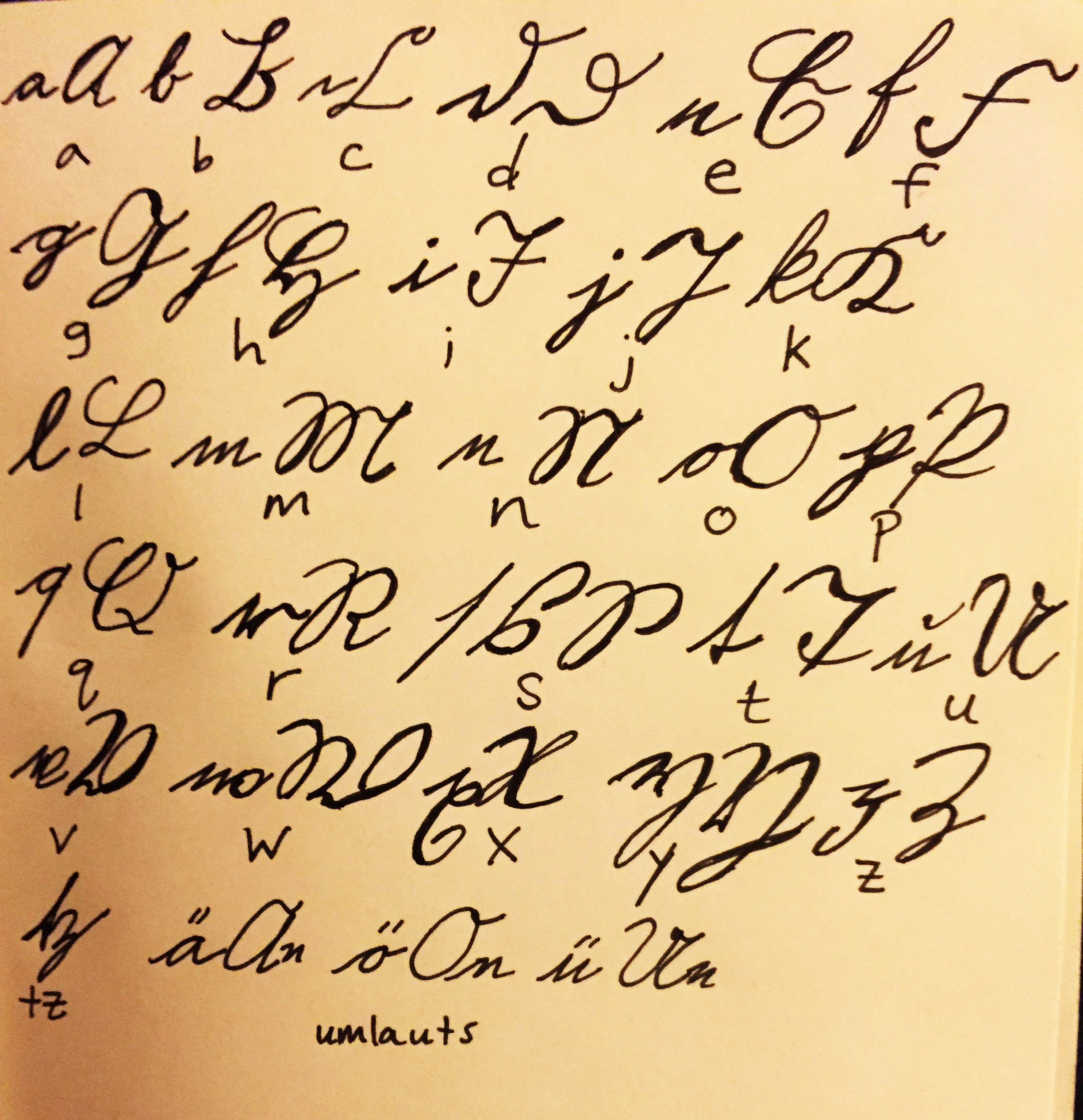
Kurrentschrift: German in medieval style handwriting, this particular style circa 1865
I Don't Create With Any Intention of Meaning • Tatiana Roumelioti
It'd odd how the simple coordination of individual strokes leads to the immediate recognition of meaning. But what happens when those strokes are combined new lines? Artist Tatiana Roumelioti has been exploring the bridge between art and words. You could say she's invented an alphabet, but that would be putting meaning where there is none. And so, we leave her words as they are, and their meaning up to you.

By Tatiana Roumelioti
Born on November 9th, 1988, in Athens, Greece,
I am a self taught artist,
and I am fascinated by both art and writing.
I love to bridge the two by using my imagination
to invent letters, glyphs, symbols, scripts.
I don't create with any intention of meaning about them,
so I cannot give
translation of my work.
However, it can speak by itself
on a personal level,
like any other form of Art.

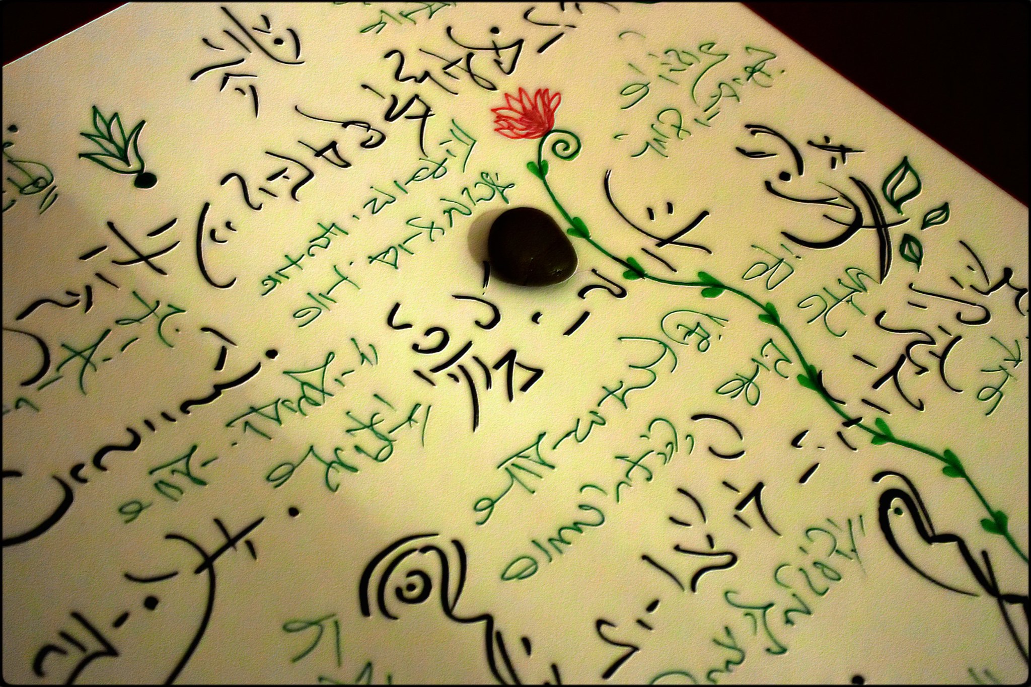


Conquered by Sadness, Soon Was Filled with Gloom • Satya Vadlamani

BY SATYA VADLAMANI
Expectations are more
But hope is less
Conquered by sadness
Soon was filled with gloom
Becos,
The intention was to write
But the refill in my pen exhausted
*the last word in my original script reflected the writing when the refill exhausted*
The Power and Weight of the Mind Which is Not Enough • LB Thompson
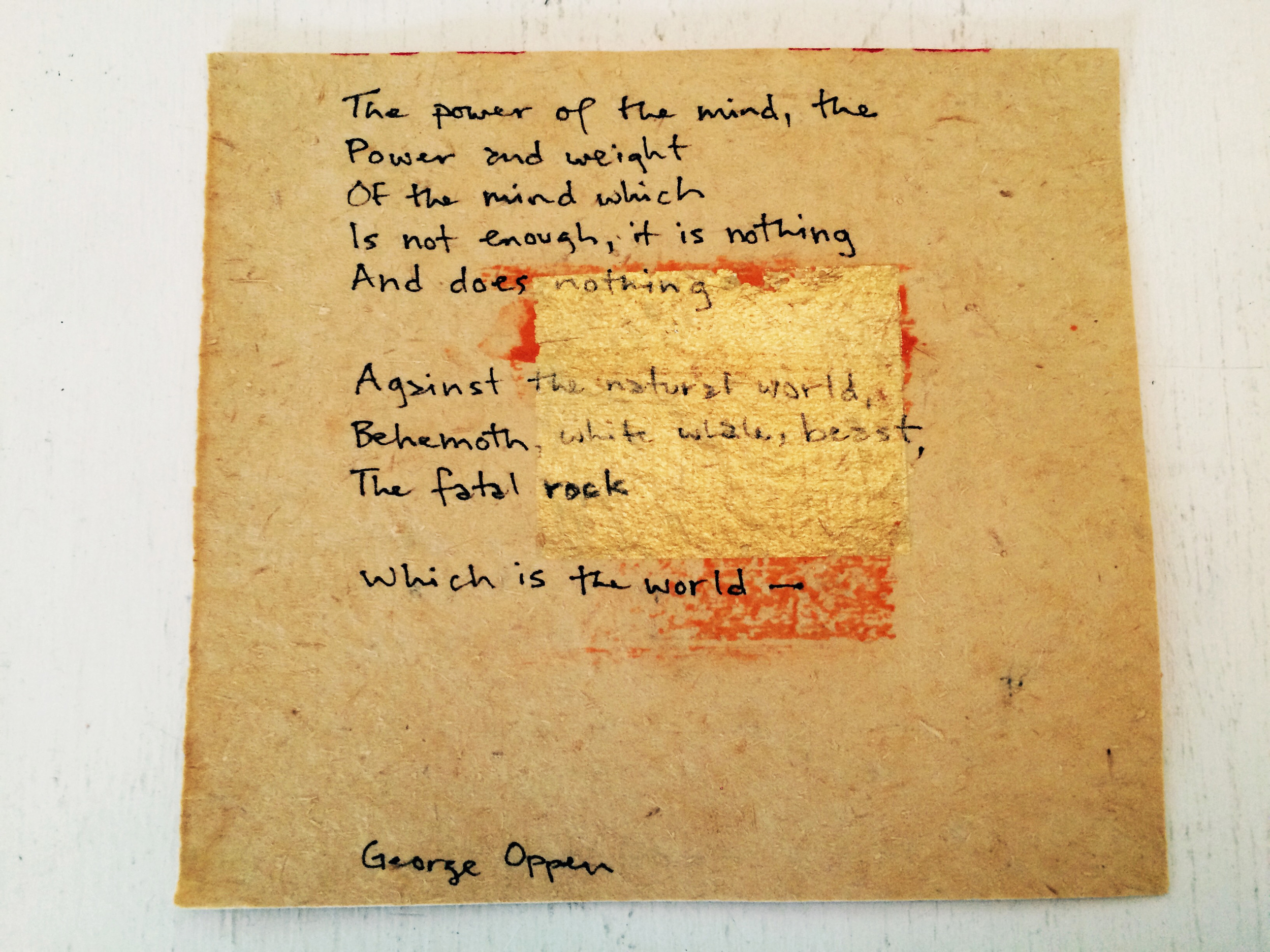
The paper is from Chinatown, and the quote is from poet George Oppen

A 22-Month Project Using the American Sign Lanuage Alphabet as a Platform for Inner Reflection • Sarah Haskell

Each square is 9" by 9". Embroidered on antique linens. 2014 - 2015
Now: Letters by Hand, An illustrated Inner Life
A 22 month project using the American Sign Language alphabet as a platform for inner reflection.
26 letters stitched on antique linens over 22 months
Project initiated in Tamil Nadu, India (January 2014)
Completed in Rabun Gap, GA, USA (November 2015)
If I Have Prophetic Powers • Dr. Williams Madges

And if I have prophetic powers, and understand all mysteries and and all knowledge, and if I have all faith so as to remove mountains, but do not have love, I am nothing.
- New Testament, First letter to the Corinthians, Chapter 13, Verse Two. Written in Greek.

Rozanne Gold Joins Handwritten as Curator of Handwritten Recipes

Handwritten is full of happiness to announce its newest curator, world-renowned chef and food-writer Rozanne Gold, to the team. She will be dishing up a new column, Handwritten Recipes.
The column comes from a lifetime of experience: from the age of five, Rozanne was rarely without a cookbook in hand. Fast forwarding to now, she has written thirteen of her own, earning her international recognition, a collection of awards, and thousands of original recipes.

Rozanne Gold with Mayor Ed Koch, 1980
She's worked in some of the most legendary kitchens in New York City, such as Rainbow Room atop Rockefeller Center and Windows of the World, and just so happened to be the first executive chef for New York Mayor Ed Koch when she was only twenty-four years of age.
She's done just about everything, from creating her own catering business (Catering Artistique) to cooking up trend-setting concepts: as Chef-Director of Baum + Whiteman worldwide, she created the three-star Hudson River Club, New York's first pan-Mediterranean restaurant Cafe Greco, the highly-sought after "Cocktails and Little Meals" at the Rainbow Room, and her book Recipes 1-2-3, which gave rise to "The Minimalist Column" in The New York Times, turned into the internationally acclaimed series of 1-2-3 cookbooks. Her writing and recipes have surfaced in The New York Times, Wall Street Journal, Gourmet, Oprah, Bon Appetit, FoodArts and More), and she doesn't seem to be letting up: she's currently a guest columnist for Cooking Light and blogger for Huffington Post. It isn't surprising then to know Rozanne has been described as "New York's first lady of food" and "the food expert's expert."
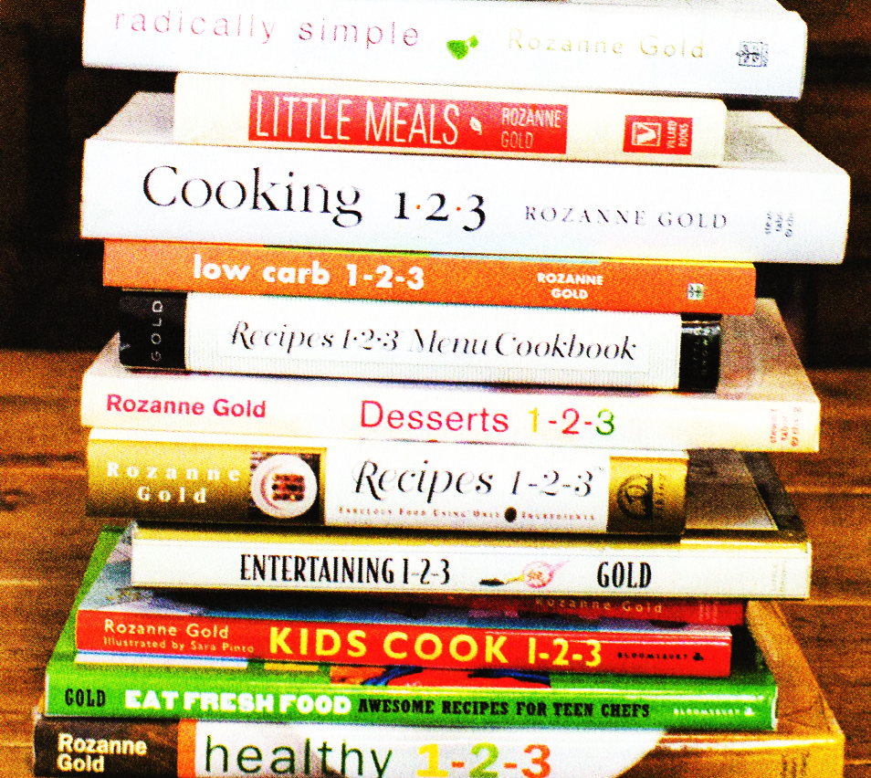
Rozanne's Recipes, stacked together.
On top of all this, Rozanne is an end-of-life doula, philanthropist, trustee of The New York Zen Center for Contemplative Care, and a poet. She is currently finishing up an MFA at The New School Creative Writing Program. Where she finds the time to make so many meals, we wish to know: a frequent guest on National Public Radio (earning Leonard Lopate a James Beard Award), Rozanne is a sought-after moderator – most recently of the New School’s 2015 program “Gotham on a Plate,” and “The Next Big Bite,” created by Les Dames d’Escoffier, a professional organization of women in food and wine, where Rozanne is a past President.
She's also a philanthropist: she saved Gourmet magazine's library by purchasing it and donating it to NYU, and after Hurricane Sandy, she established up a pop-up kitchen in Brooklyn to prepare and deliver 185,000 meals to those in need. Believing in the power of food to create community, she was one of Israel’s first “Women Chefs for Peace” and the recipient of the Jewish National Fund’s “Olive Tree Award” for her efforts in promoting Israel’s food and wine industry.
As creator and curator of this column, Handwritten Recipes, Rozanne hopes to re-ignite the connection between generations through the exploration of food, cooking, and memory — most profoundly and poignantly though the power of the pen. The first recipe will launch February 1st. What will it be? A caramel custard, which she wrote in 1980 for her mother.
To sign up for Rozanne's column, enter your email address below, and prepare your inbox for delicious, handwritten treats. Or, to submit your own recipe to Handwritten Recipes, email Rozanne at rozannegold@mindspring.com.

Seventy Years Ago Today

By Carly Butler
It was while moving my grandfather into a retirement home that we stumbled upon 110 love letters written from my grandmother to my grandfather just after WWII. They were dated January to July of 1946, and they were tucked away in the back of a cupboard next to a slew of VHS tapes of recorded British sitcoms. My Grama had been gone for over 10 years at this point. She died when I was 13.
When we first found the letters, they were simply a precious family memento — an heirloom that we’d keep in a drawer the few years that followed their discovery. It wasn’t until 2012 that I found myself in front of the RMS Queen Mary docked in Long Beach, California, the ship that my Grama sailed on in 1946 towards her new life, that an idea started to form. I would move to England from January to July of 2013 to retrace my Grama's steps. I would knock on the door of the house she wrote the letters from, I would visit the places she visited and I would write home to my love, just as she did.
The journey of retracing my Grama’s letters 67 years later changed my life. It has led me to this exact moment, drafting up my first entry for this column on Handwritten. If someone were to have told me that a bundle of love letters would change the course of my life, bring incredible people into my path, be the foundation of a love that I have with the perfect man for me, and create a connection to my Grama, someone who left this world almost 20 years ago, I’m not sure I would have believed it.
What I've come to realize is that my gratitude for having these letters is far beyond the grand gesture or epic journey. The most meaningful part of having found my Grama’s letters is that they give me a window into a life-story of an incredible woman who walked before me. Her handwritten words allow me to get to know her as a 26 year-old women embarking on a major life decision, leaving behind everything she knew, putting her faith in love and living life the way it’s meant to be lived. Her words bring me strength when I feel weak, courage when I feel scared, belief when I am in doubt, and chutzpah to live the life of my dream, seventy years later.
Her first letter, shared below for the first time, is dated January 17, 1946, just over seventy years ago today.

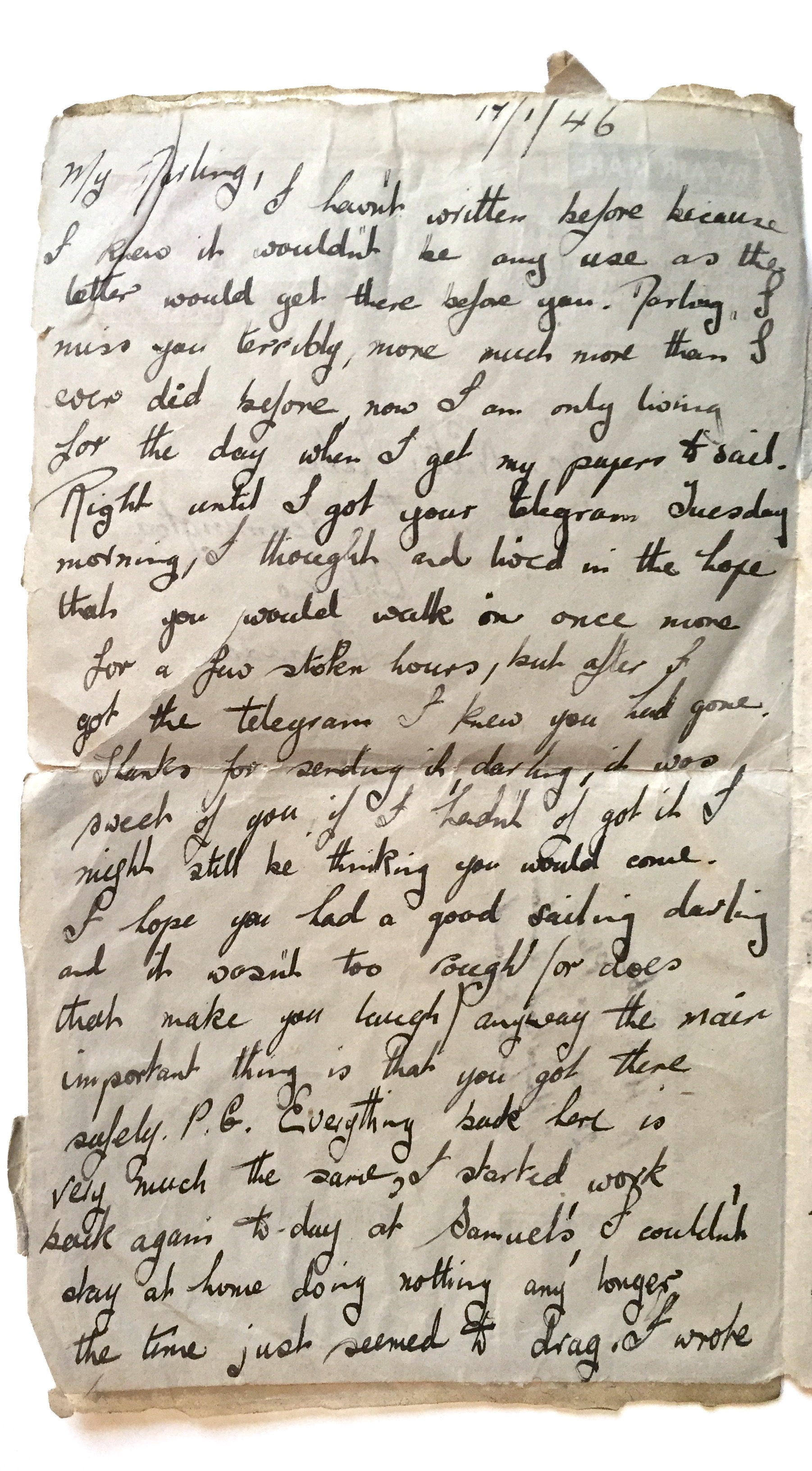
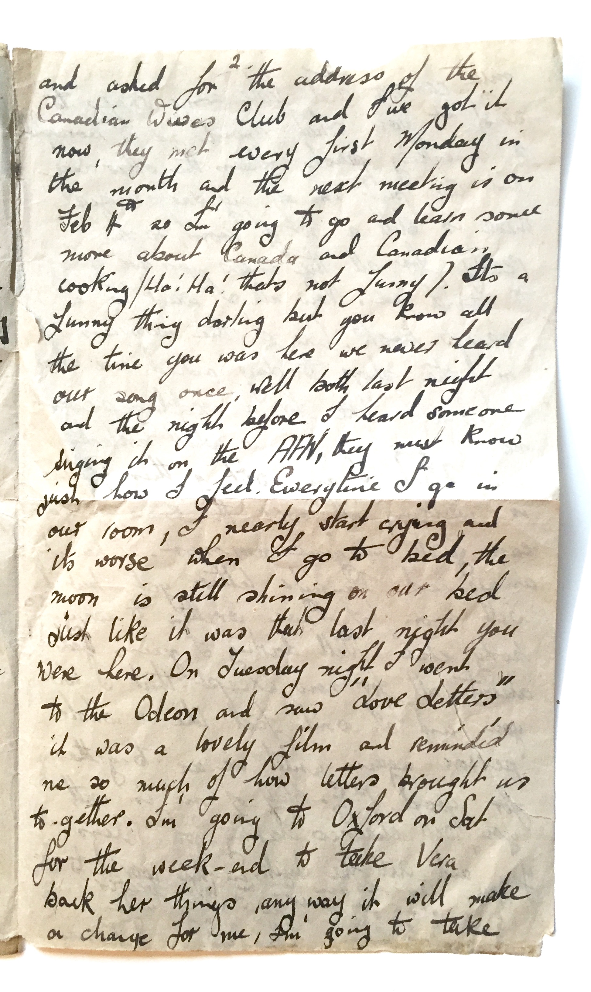
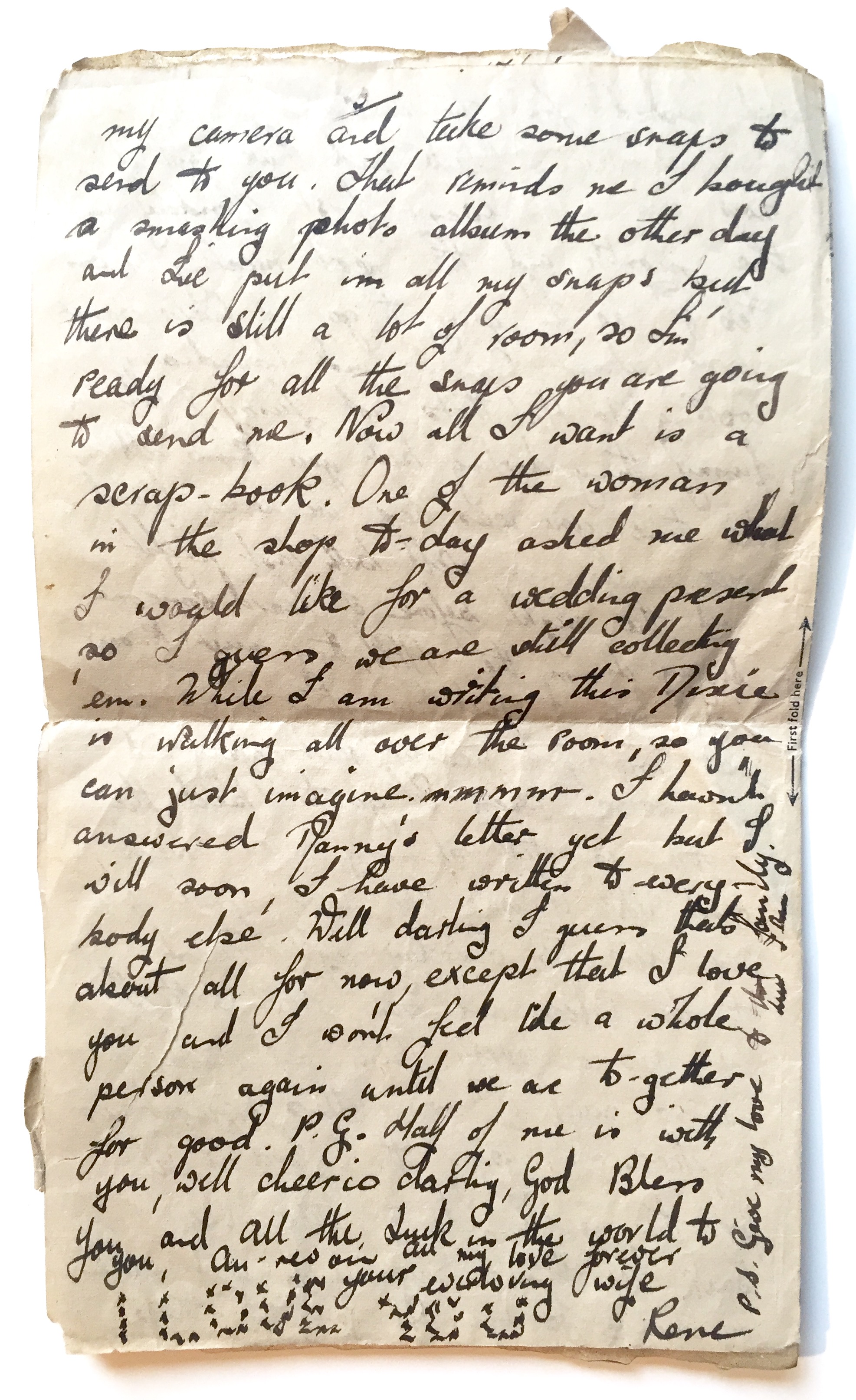
TRANSCRIPTION:
January 17, 1946
My Darling,
I haven't written before because I knew it wouldn't be any use as the letter would get there before you. Darling, I miss you terribly, much more than I ever did before, now I am only living for the day when I get my papers to sail. Right until I got your telegram Tuesday morning, I thought and lived in the hope that you would walk in once more for a few stolen hours, but after I got the telegram I knew you had gone. Thanks for sending it, darling, it was sweet of you, if I hadn't of got it I might still be thinking you would come.
I hope you had a good sailing darling and it wasn't too rough (or does that make you laugh) anyway the main important thing is that you got there safely. P.G. Everything back here is very much the same, I started work back again today at Samuel’s, I couldn't stay at home doing nothing any longer the time just seem to drag.
I wrote and asked for the address of the Canadian wives club and I've got it now, they meet every first Monday in the month and the next meeting is on Feb 4th so I'm going to go and learn some more about Canada and Canadian cooking (Ha! Ha! That's not funny).
It's a funny thing darling but you know all the time you were here we never heard our song once, well both last night and the night before I heard someone singing it on the AFN, they must know just how I feel. Every time I go in our room, I nearly start crying and it's worse when I go to bed, the moon is still shining on our bed just like it was that last night you were here.
On Tuesday night I went to the Odeon and saw "Love Letters" it was a lovely film and reminded me so much of how letters brought us together. I'm going to Oxford on Saturday for the weekend to take Vera back her things, anyway it will make a change for me, I'm going to take my camera and take some snaps to send to you. That reminds me I bought a smashing photo album the other day and I've put in all my snaps but there is still a lot of room, so I'm ready for all the snaps you are going to send me. Now all I want is a scrapbook.
One of the women in the shop today asked me what I would like for a wedding present so I guess we are still collecting 'em. While I am writing this Dixie is walking all over the room, so you can just imagine. mmmm. I have an answer Danny's letter yet but I will soon, I have written to everybody else. Well darling I guess that's about all for now except that I love you and I won't feel like a whole person again until we are together for good. P.G.
Half of me is with you, well cheerio darling, God Bless You and All the Luck in the world to you, Au revoir. All my love forever your ever loving wife,
Rene
I love you – in x’s
P.S. Give my love to the family. Love Rene.
I Saw in My Mind a Vision of them Sparkling with Joy • Adrienne Harvitz
This micro-insight from Adrienne Harvitz reminds us of an important tradition: to create brand new ones. Ignoring the standard "To" and "From," Adrienne created gifts out of the paper wrapped around the presents for her children. Did most end up in the recycling bin? Sure, but one didn't.

By Adrienne Harvitz
This Hannukah, when I got to wrapping gifts for my kids, a sort of sinking feeling settled into chest when I reflected on what I was teaching and feeding them through the process of honoring a sacred ceremony of gratitude and reverence with consumerism, AKA "presents."
The receiving of objects feeds an egoic entity — a little green-eyed gremlin — that lives deep within the belly of every child. The gremlin has with an insatiable appetite for ownership, stuff and covetousness, and grows hungrier and more snarly, shouting words like "mine!" and "don't touch my stuff!" and "mom, can't I open another one?" to family members and siblings with more vigor and chutzpah per every present opened.
This is the process whereby the giving of presents takes precedence over the act of being present and defeats the true goal of holiday season: to share love, gratitude, joy, story, and meaning with our families. So this year, when I got that feeling that I was feeding the green-eyed gremlin, I stopped, took a breath, and asked myself what I really wanted to feed and how to do so. I realized I wanted to feed my children positive beliefs about themselves, and the intention of love and appreciation for life that was behind each gift I bought for them. When I imagined them playing with or using each gift I bought them, I saw in my mind a vision of them sparkling with joy, or shining the light of their unique talents, abilities, and delights out into the world. So I decided to give my children the gift of meaning and conscious words with their gifts, writing on the plain foil and recycled newspaper wrapping paper messages to them about just how I love them, wishes, and dreams I have for them, how I hoped they would enjoy their gift or use it to share their inner gifts and joy with the world, or some positive affirmation about them each as an individual.
In the end, most of my words ended up in the recycling, but my son did pin up one of the wrapping paper messages on his wall, and I know that they heard the words from their mama's heart, and not just the sound of shredding gift-wrap echoing in their minds after the candles burned down each night of Hannukah.

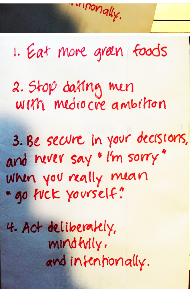
Resolution #2: Stop Dating Men with Mediocre Ambition • Kaitlin Kominski
If you haven't made any resolutions this year, here are four great places to start. May your resolutions be short, sweet, and sharp.
I See Students Who Crave the Opportunity to Work with Their Hands • A Conversation With Gail Anderson

Portrait of Gail Anderson, by Paul Davis
BY SARAH MADGES
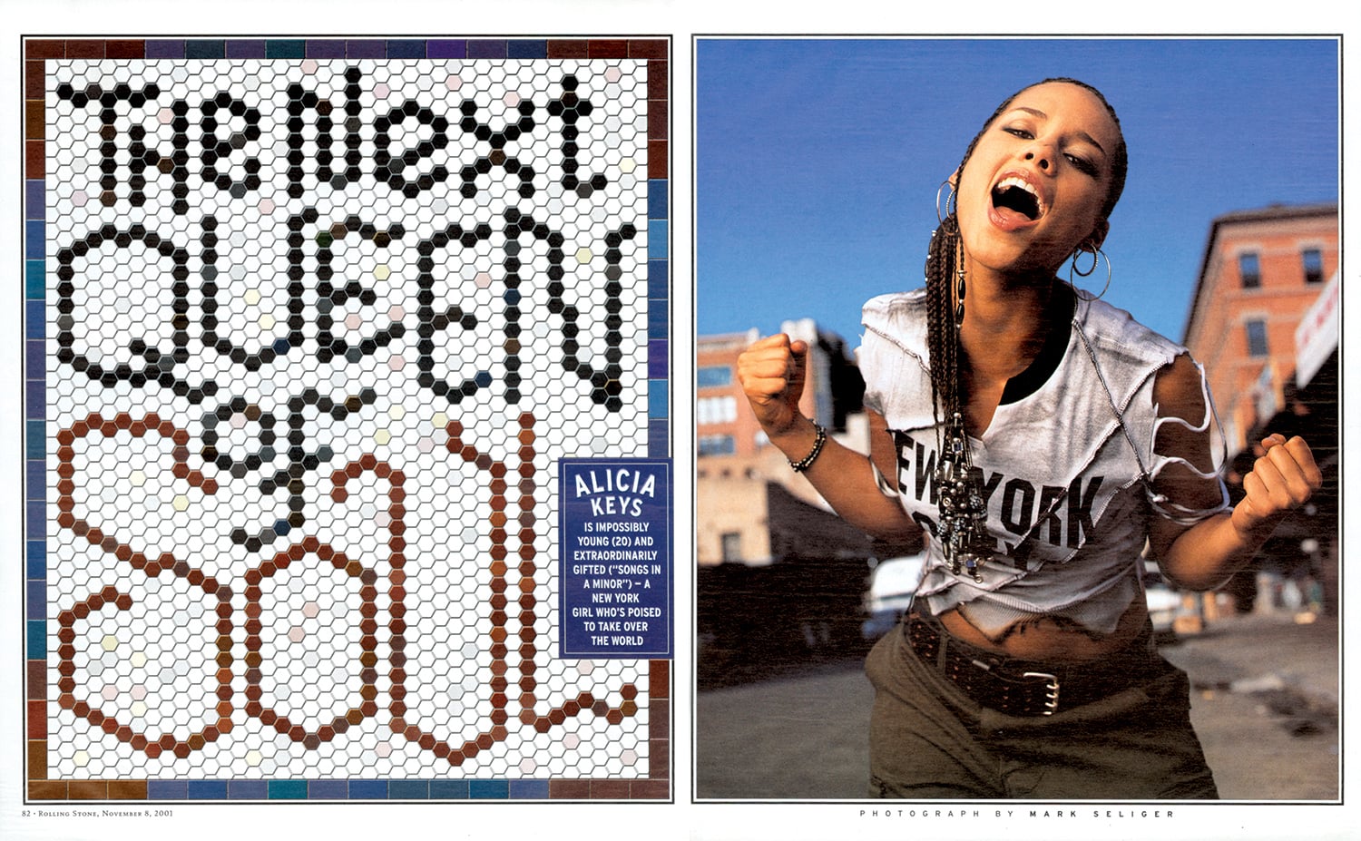
With decades of teaching, typography, and creative collaboration under her belt, New York-based designer and writer Gail Anderson has a CV worth calling home about — at least, it earned her the holy grail of graphic design achievements, the AIGA medal, in 2008. The design-ecstatic aesthete made her first layout years before her tenure as art director at Rolling Stone, literally cutting and pasting a magazine mockup of the Jackson Five in her childhood bedroom.
She’s been busy ever since, developing identity campaigns for Broadway shows, co-writing typography books with Steven Heller, teaching type fundamentals in the MFA program at SVA, and co-partnering with Joe Newton at their eponymous Anderson Newton Design firm for projects ranging from book jackets to outdoor installations. Despite the ease and efficiency of digital design technology, Anderson swears by taking time to untether from the laptop, insisting that craft is crucial to typography, and slowing down with a pencil and piece of paper is crucial to honing that craft. In November we reviewed her latest book, Outside the Box, which honors this DIY by-hand approach, following the hand-lettering trend from its individual, artful beginnings to its contemporary commercial ubiquity.
I had the chance to talk to her about the book’s composition, as well as handwriting and hand-lettering in general — how it plays into her life as a designer, and design as a whole.

Childhood Sketchpad


Design inspiration from childhood, 1974
SARAH MADGES: What role does the pen and notebook play in your life?
GAIL ANDERSON: I’ve grown increasingly particular about the pens and notebooks I use, since I really enjoy the physical act of writing. I’m a fan of black Pilot Varsity fountain pens and Pilot Precise V7s. And I was extremely loyal to those Japanese Oh Boy notebooks with the thick, ruled paper, even after Chronicle acquired them and put the Oh Boy logo on the front. I have two left that I’m saving for God knows what since they’re now out of production. I moved on to Muji, and then Moleskine, and am now working my way through some Field Notes steno pads. I even keep a paper date book, so clearly the art of writing still means a lot — possibly way too much — to me.
MADGES: You divided your book into four sections — DIY, art, craft, and artisanal. How did you come up with these four categories? Was it always clear you were going to organize the book this way?
ANDERSON: I knew I wanted to have some kind of system to categorize the material. I’ve learned a lot from working with Steve Heller for so many years, so I did what we always do with our books — I spread the work out with someone I trust and we let it sort of organize itself. It’s too confining to categorize stuff in the research stage, but you can’t wait till the design stage either. It was really fun to come up with section titles, and once my design partner, Joe Newton, and I got through that process, I felt like we had the contents of a real book in front of us.

Type Spread from Outside the Box.
MADGES: Do you see a significant difference between what’s considered handwriting and hand-lettering? How would you define the difference — is it intent? Actual artistic design and effort?
ANDERSON: I wrote out Debbie Millman’s foreword by hand and consider that to be handwriting rather than hand-lettering. When I look at it now, though, it seems so deliberate (and some folks have assumed it was a font). Maybe it does have something to do with intent — I’m not quite sure where the line in the sand is.
Broadway theater poster designed at SpotCo
MADGES: Why do you think people respond to hand-drawn lettering? Do you think there will always be a demand for it? Do you imagine it will lose popularity any time soon?
ANDERSON: People connect to branding and advertising that feels intimate and artisanal. It’s somehow less “corporate," even though hand-drawn type is used by just about everyone now. I think Andrew Gibbs from the Dieline said it best in the book’s intro: “In all my years of seeing packaging trends come and go, there is one style that has stood the ultimate test of time: hand-drawn.” I admit that a few years ago, I thought, “Well, how long will this last before we swing all the way back to Helvetica?” But in some form or another, hand-drawn type is here to stay.

Type Directors Club letterpress post card
MADGES: Do you see a similar resurgence in classic or vintage fonts in reaction to the digital age?
ANDERSON: I see students who crave the opportunity to work with their hands — kids who’ve pretty much grown up in front of a computer. While embracing technology is key to their success as designers, they don’t want to feel tied to their laptops. We did a hand-lettering class last week and the students actually started applauding at the end — that’s how hungry they are. And I think they are beginning to seek out classic and vintage fonts, which is such a relief after so many years of all those awful free fonts.
MADGES: Is there a distinct moment or brand that signaled the beginning of the hand-drawn movement’s resurgence? Or was this a gradual, inevitable change in response to an increase in digital and technological saturation?
ANDERSON: I wasn’t plugged in enough to recognize a particular moment, but it certainly seemed like everyone started drawing — and posting — around the same time. I think it’s all about Pinterest and the other sites and blogs where designers started strutting their stuff publicly. It sometimes felt like everyone jumped on the bandwagon without adding a new twist, but the best of the best have carved out their own niches. And yes, I do believe that it was a reaction to technological saturation and the desire to create something seemingly personal and unique.

Jackson Five scrapbook, 1972
MADGES: What first compelled you to typographic design? When did you first start collecting typefaces and fonts?
ANDERSON: I started designing magazine layouts as a child, first for The Jackson Five, and then for The Partridge Family. Even then, my pages were filled with my 12-year old version of typography, which was based on Spec and 16 magazines and their Letraset rub-down type. I started saving photostats of typefaces in college, but things really clicked when I worked at Rolling Stone with Fred Woodward. His good taste and sharp eye were instrumental to the growth of my own skills.


MADGES: Marketing research has found that the first piece of mail someone is likely to open has a handwritten address. Do you think this is because of handwriting’s scarcity that it’s perceived as more valuable? Is it more authentic? Personal?
ANDERSON: I’m not in a hurry to open anything that’s got a bulk rate stamp or a mailing label (I hate them on greeting cards). But I’ll give something that has a handwritten address on it a chance, though admittedly I’ve been fooled once or twice by handwriting fonts. I appreciate the idea of someone taking a few minutes to put pen to paper.

Hand-drawn lettering from a cross-stitch book that continues to inspire Anderson

Outside the Box: Hand-Drawn Packaging from Around the World
MADGES: You note in your book that hand-drawn lettering isn’t necessarily popular just because of the attendant sense of nostalgia, but rather because of its established historic design technique. What makes this technique more or less difficult to execute? What are the pros and cons?
ANDERSON: Drawing naive type is one thing—and often not as easy as it looks—but doing what Martin Schmetzer, for example, does just blows me away. There’s a tremendous degree of patience and utter stillness required, but there’s also a touch of genius that is at a whole other level. When I was editing through book images, there were times when I’d just stop in my tracks to stare at pencil sketches that were so incredible that they might as well have been finished pieces. And Martin thought his sketches were “rough”—seriously.
MADGES: I’m similarly amazed that a brand as huge as Chipotle uses handlettering. Do you think it is feasible for any even larger companies to follow that approach? How do you think consumers would respond if McDonalds rebranded with letterpress?
ANDERSON: The idea of a McDonald's “artisan” chicken sandwich rings about as true as the idea of a company like that rebranding with letterpress. But Chipotle’s pretty huge and their incredibly inviting branding brought in a lot of customers, including me. Hatch Show Print does McDonald’s! Ha.

New “Make it Here” SVA poster
MADGES: What does it mean for design and typography that the next generation might not be able to read cursive because it is no longer taught in schools?
ANDERSON: I guess we’ll see a lot more child-like lettering that isn’t an affectation! I see my nieces’ and nephews’ handwriting and it’s just terrifying. But I am a product of Catholic schools in the 1970s, where penmanship was paramount. On the other hand, I also see young designers who can make letterforms into magic on their computers, so perhaps it all evens out. As long as there are cursive typefaces to buy, they’ll just have to learn to read script even if they can’t write it.
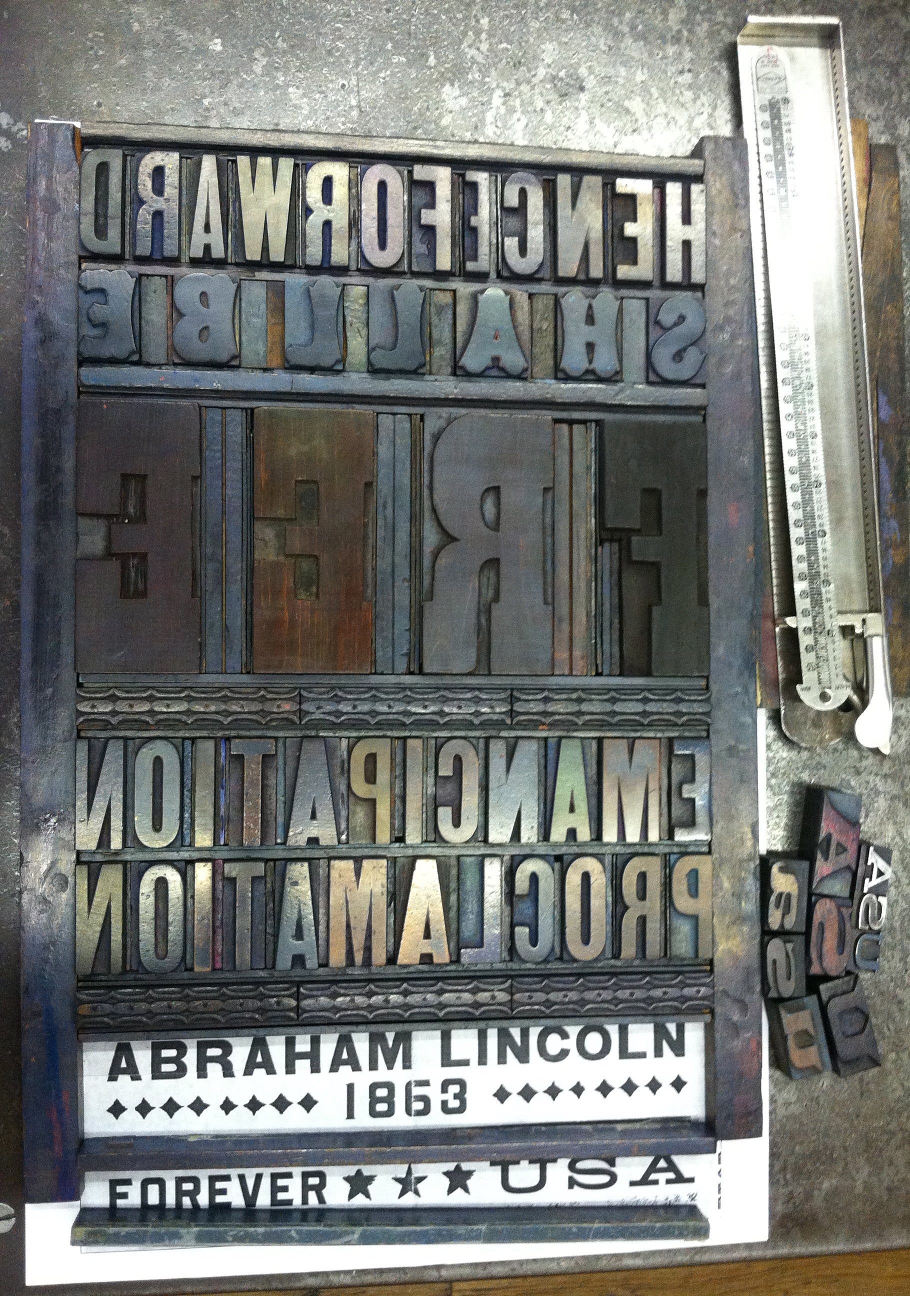
MADGES: Looking at your site, I’m impressed that you are an incredibly versatile and prolific designer. You’ve worked as Art Director at Rolling Stone, an educator at SVA, are on the board of TDC, you designed probably my favorite US Postal stamp — the Emancipation Proclamation. How do you take on these projects — what strings them together? And what’s next?
ANDERSON: I actually just started a new job recently that should keep me challenged for a good long time. I’m now the Director of Design and Digital Media at Visual Arts Press (SVA). My career is tied to a love of working with words, whether it’s designing them or writing them. The Emancipation Proclamation stamp may be my all-time favorite project. I got to design using a piece of history — the first words from the document itself, and was able to set the actual type at Hatch and watch Jim Sherraden print the poster that was then reduced to stamp size. It doesn’t get better than that.


I Ate a Stick, Lord Help My Colon

HAND-DONE BY ABBY TROTT
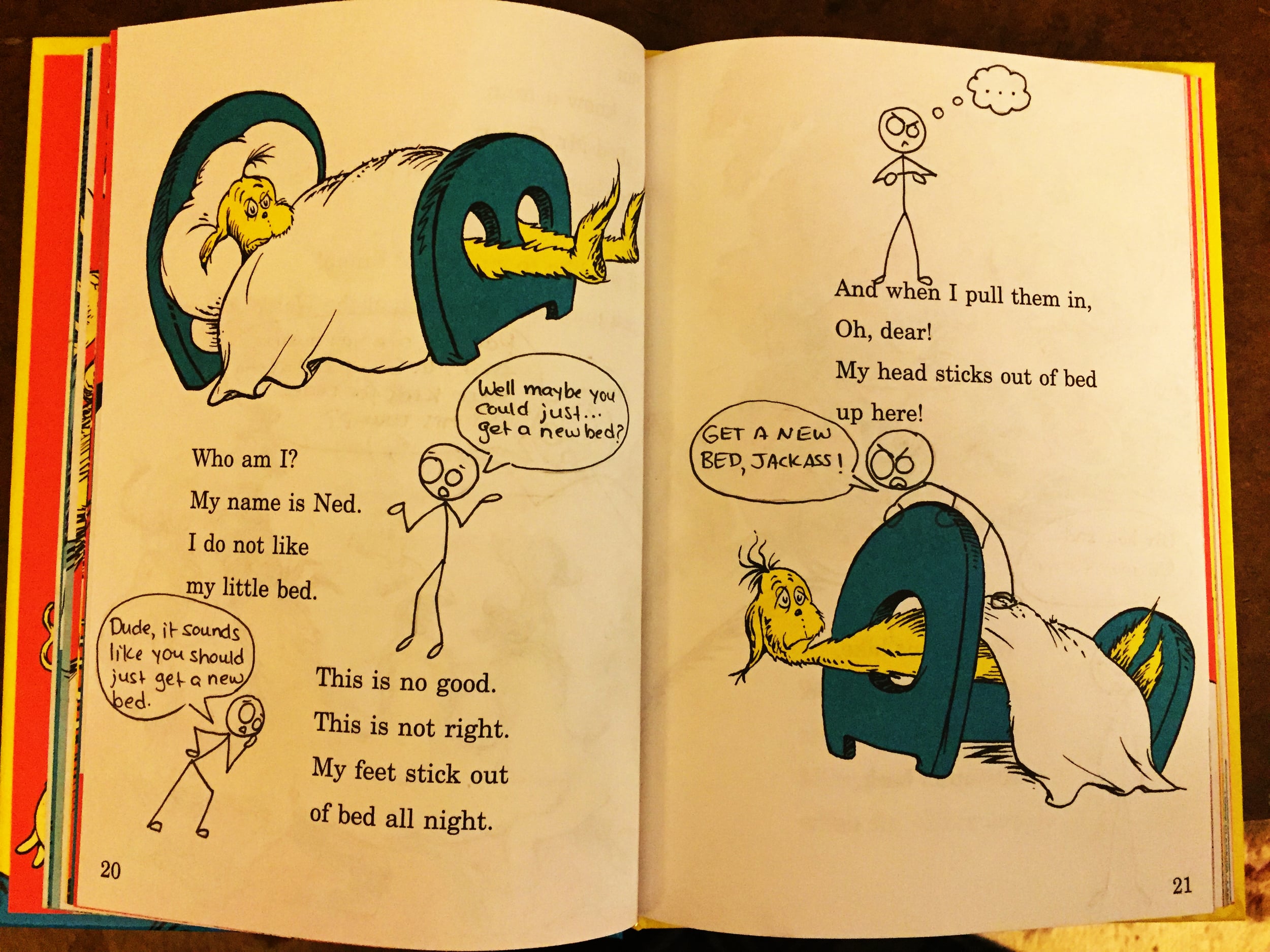
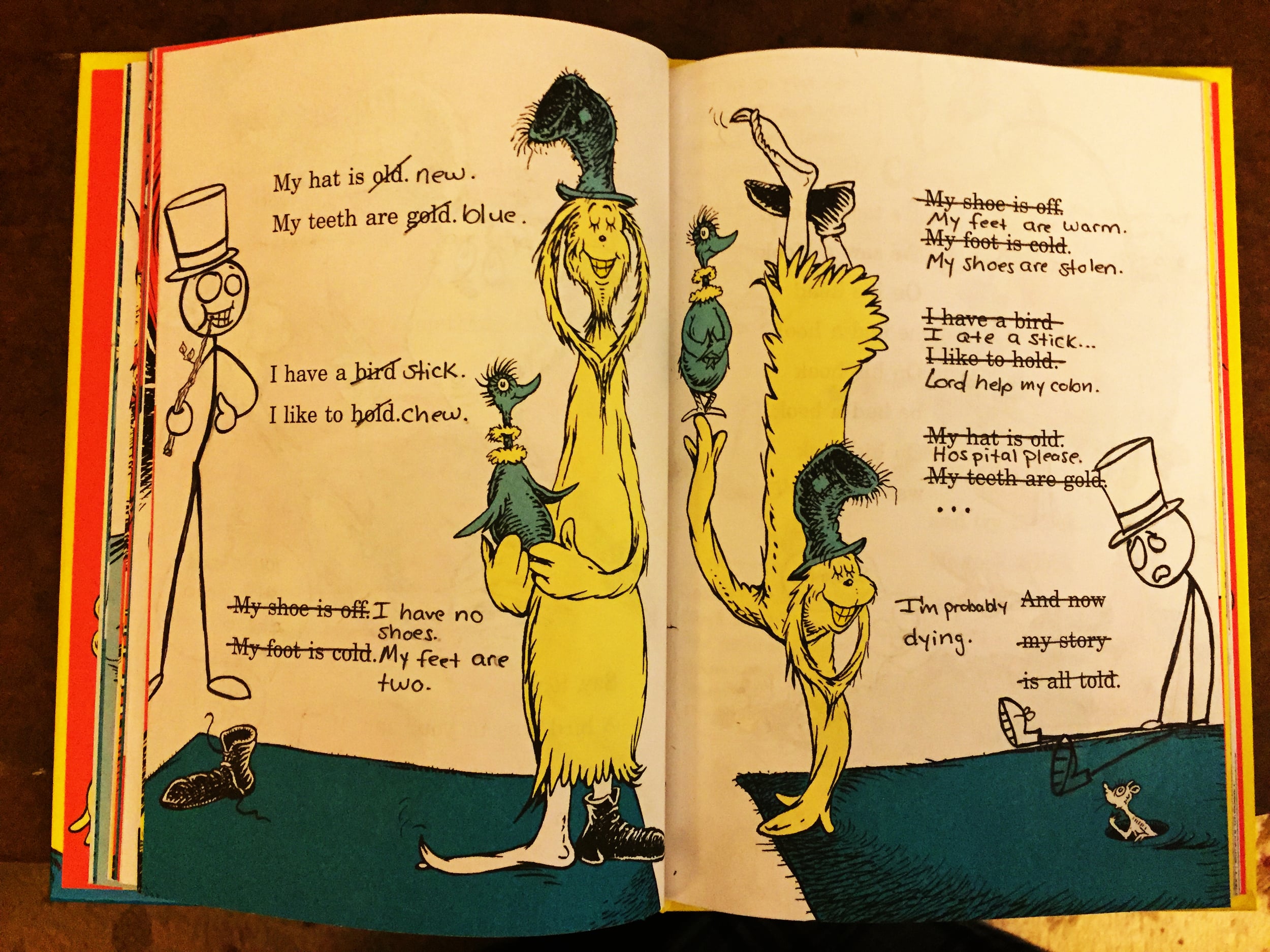
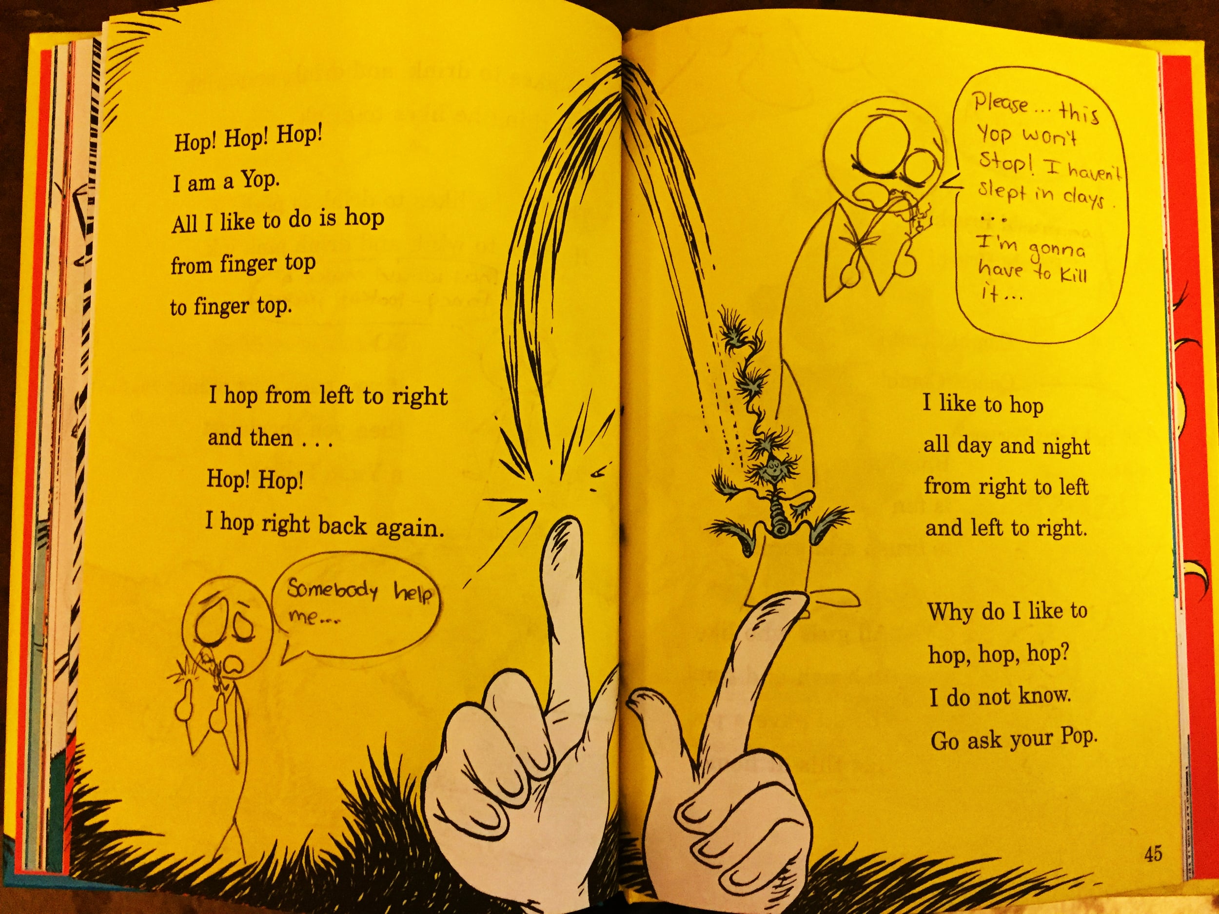
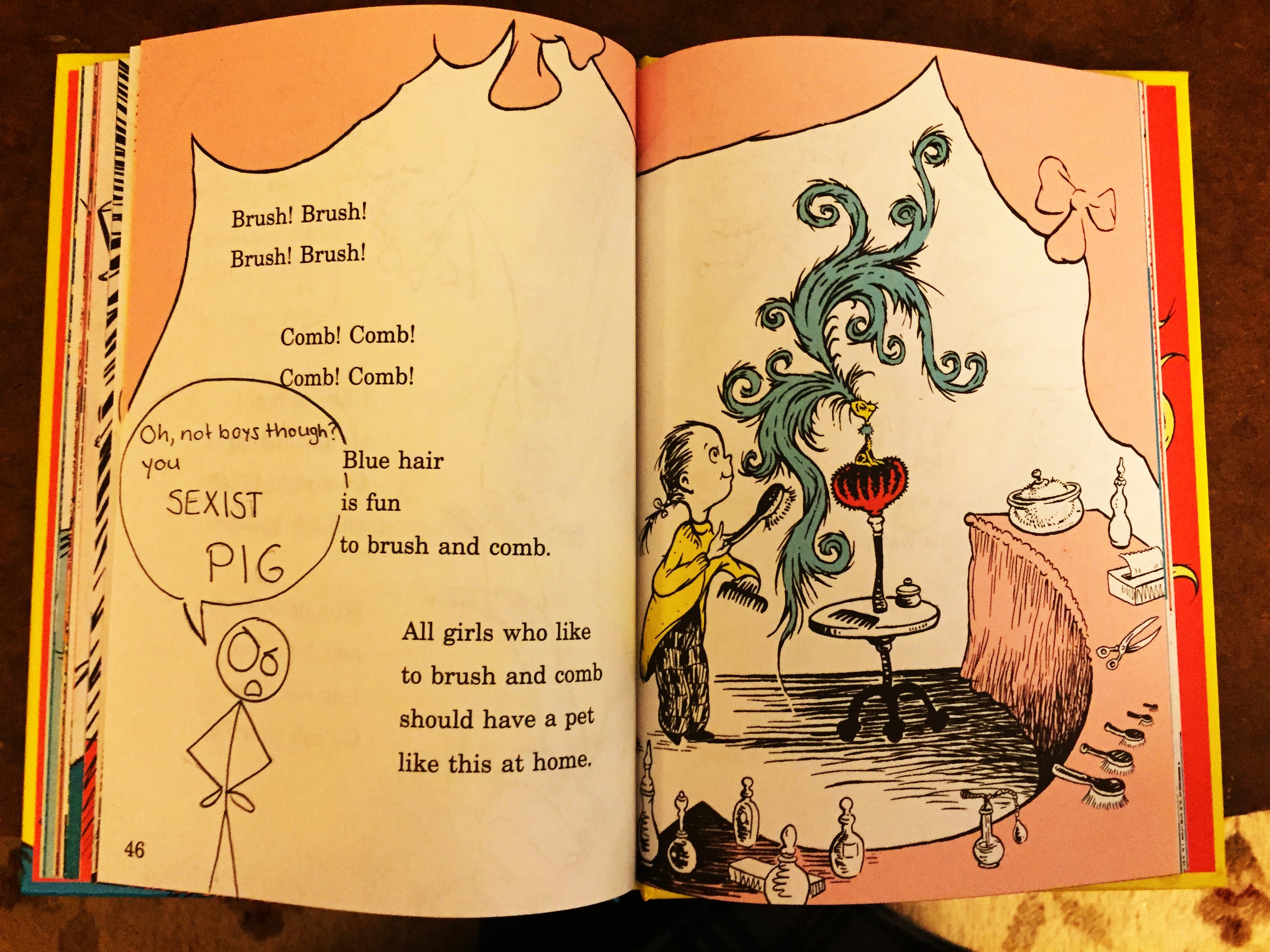
Warpo Man, as this misshapen stick-hero is called, was the result of a bored teenager (me) and an old school 90’s version of Microsoft Paint. He was designed to be a character who is as warped in personality as he is physically; Warpo Man unapologetically (and often unfortunately) speaks his mind without filter.


After being forgotten for a number of years, Warpo Man resurfaced in my college notes. He served as a sort of visual outlet to enhance lectures and help me focus, but would often end up taking over my notes entirely.


I moved to Japan after graduating, and my parents ensured that I didn’t forget about Warpo Man by sending me photos of my childhood drawings. I hung them to remind me of his two biggest fans. Warpo Man has made appearances in books, birthday cards, and various gifts over the years. “One Fish, Two Fish, Red Fish, Blue Fish Me!” was specially edited for me dear ole muddah this year.
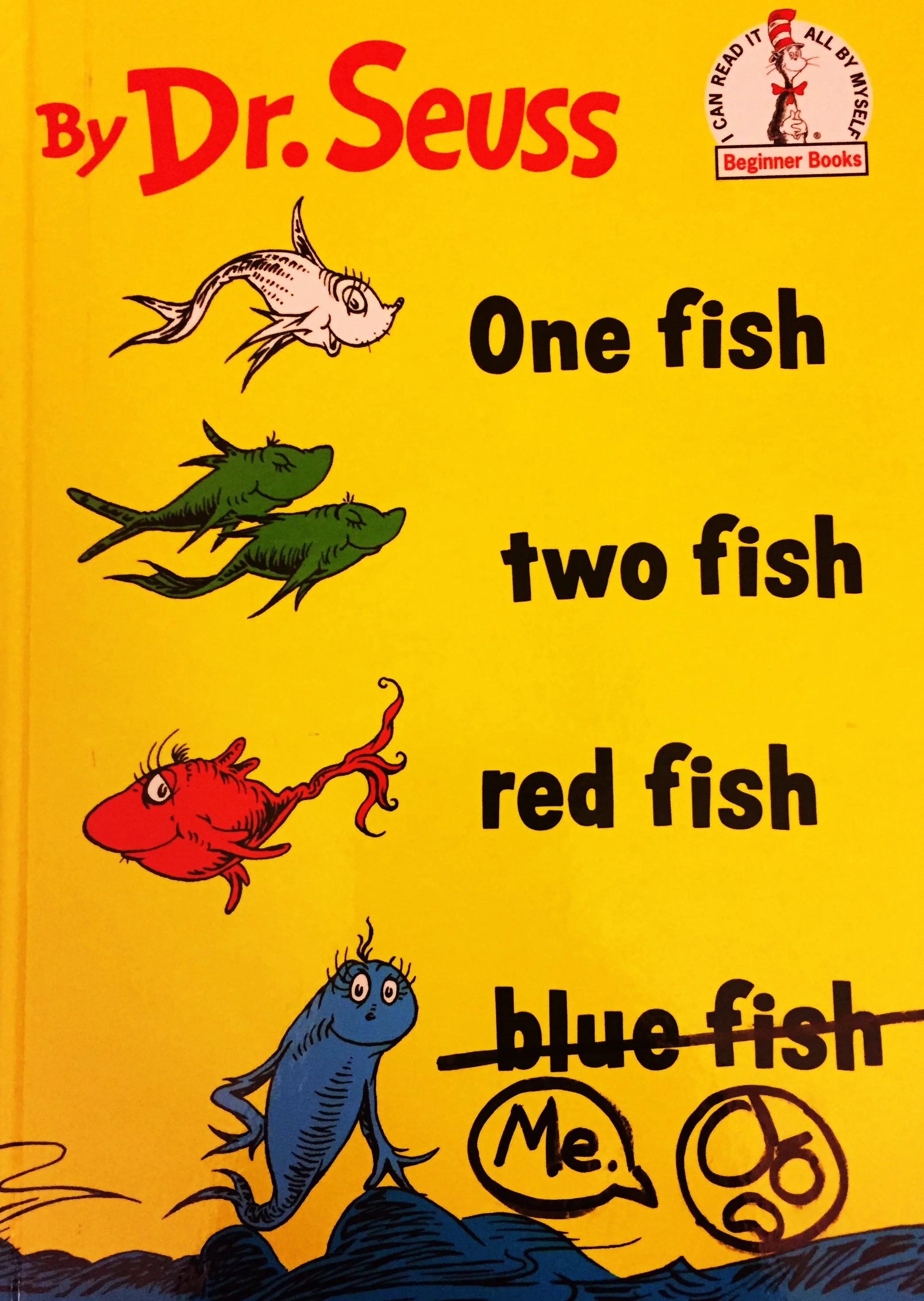
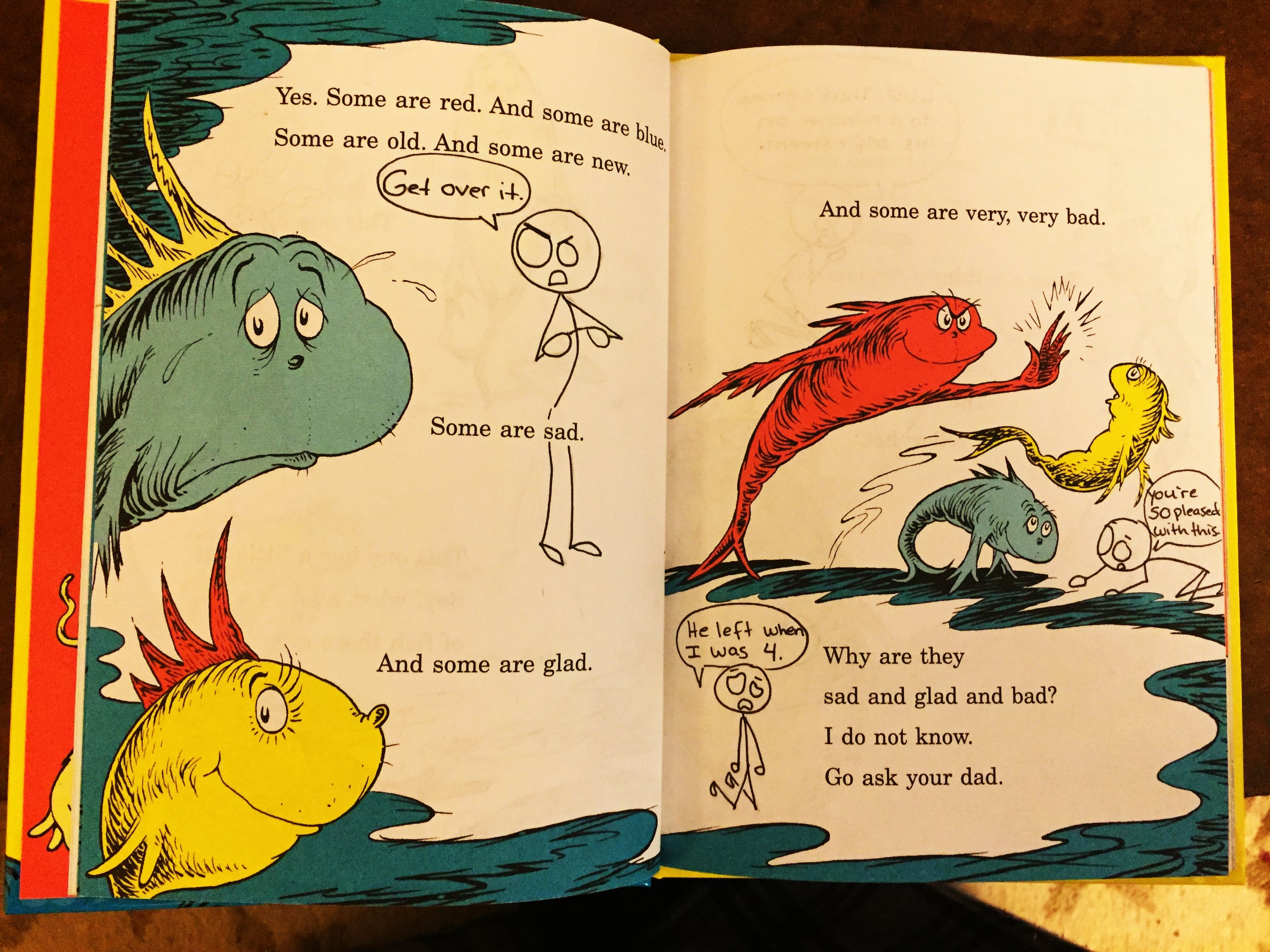
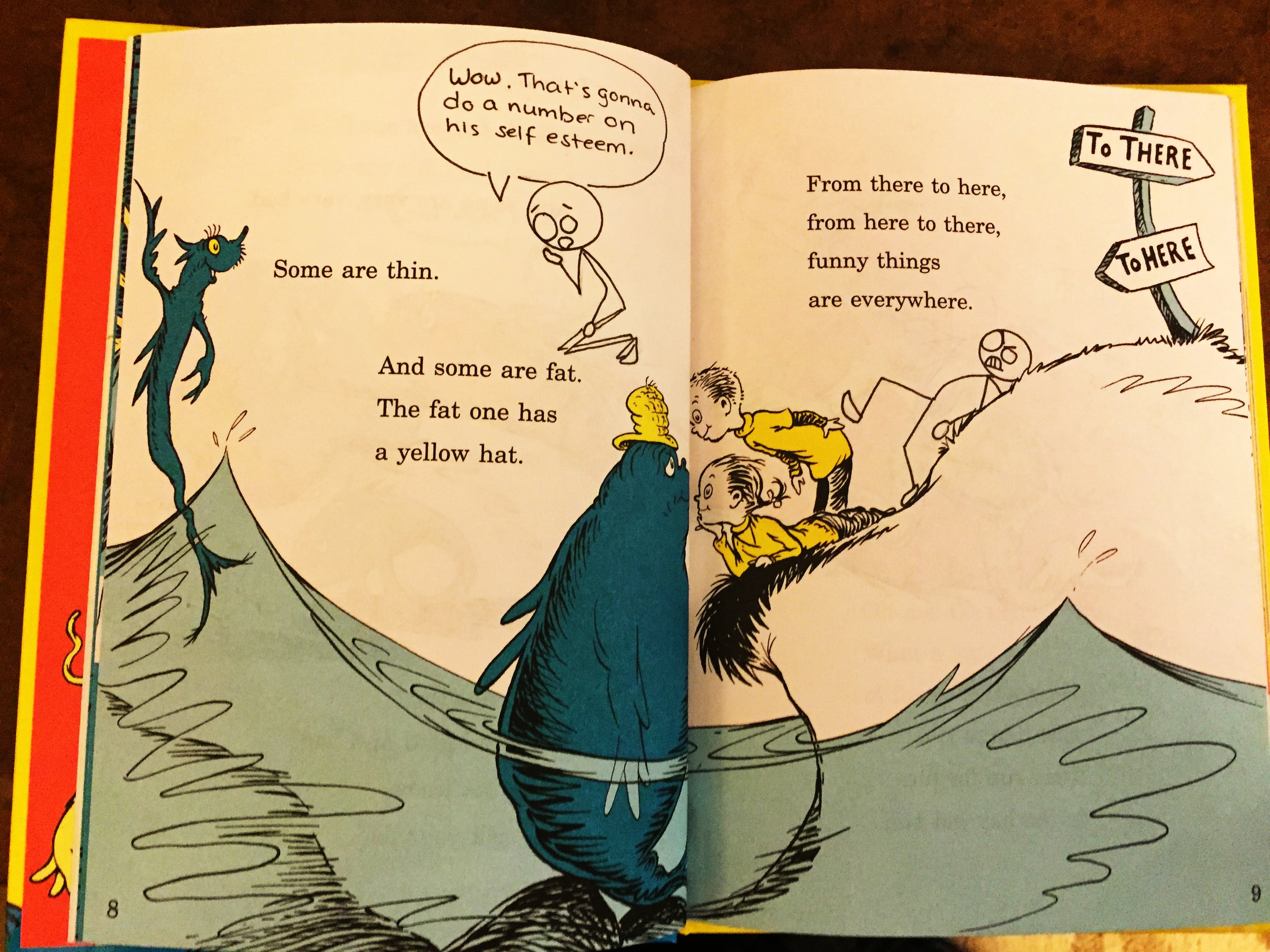
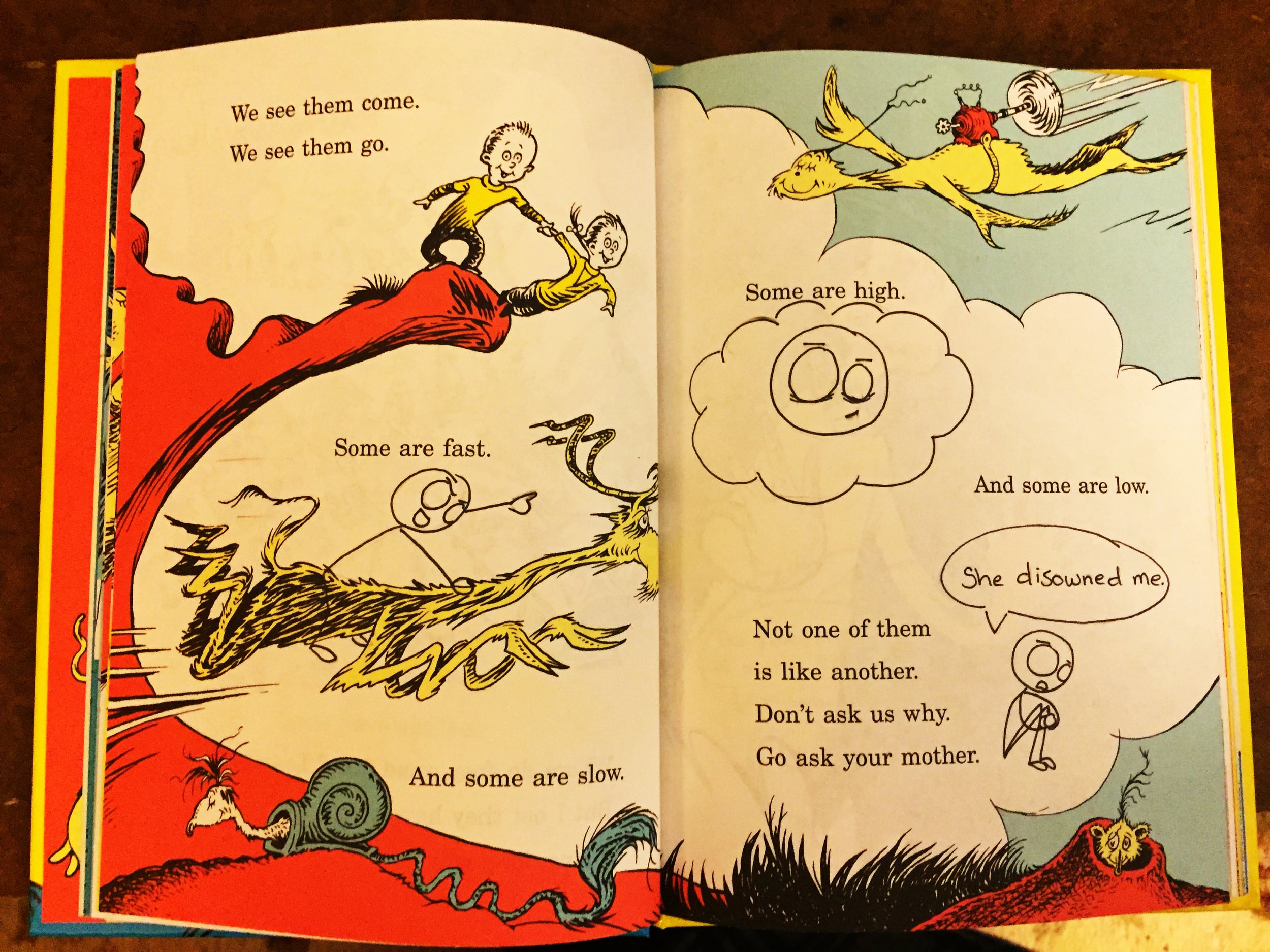
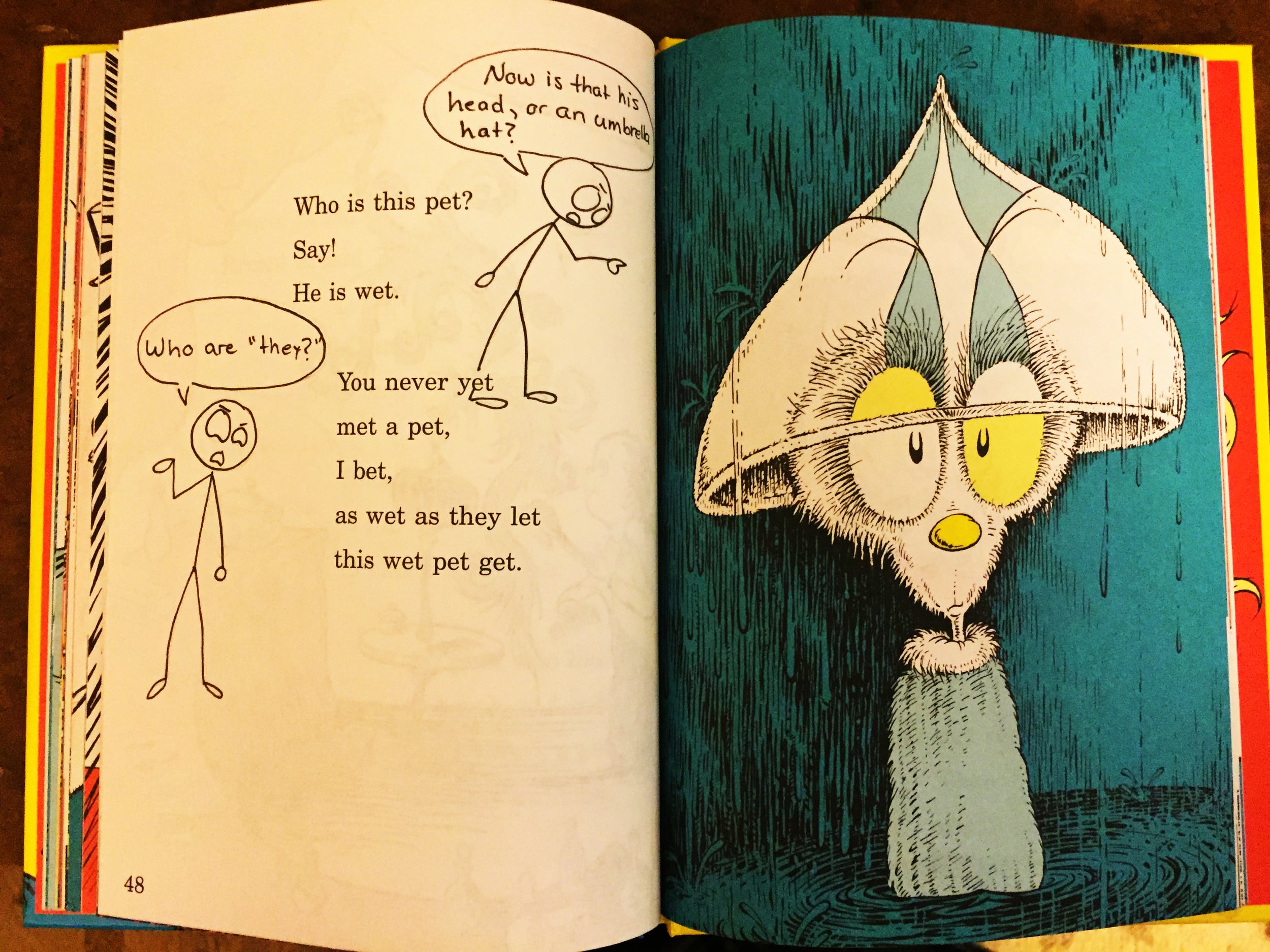
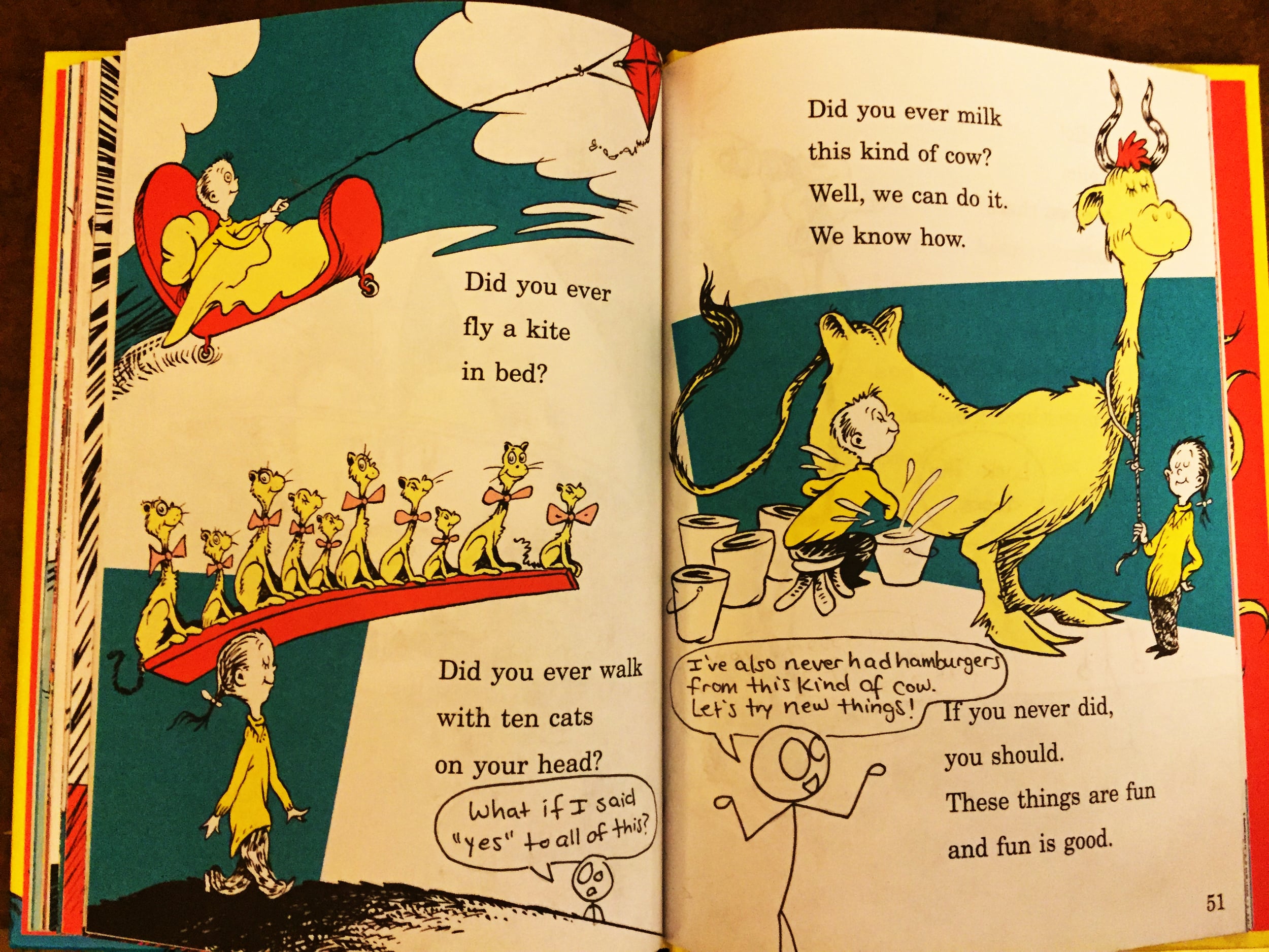
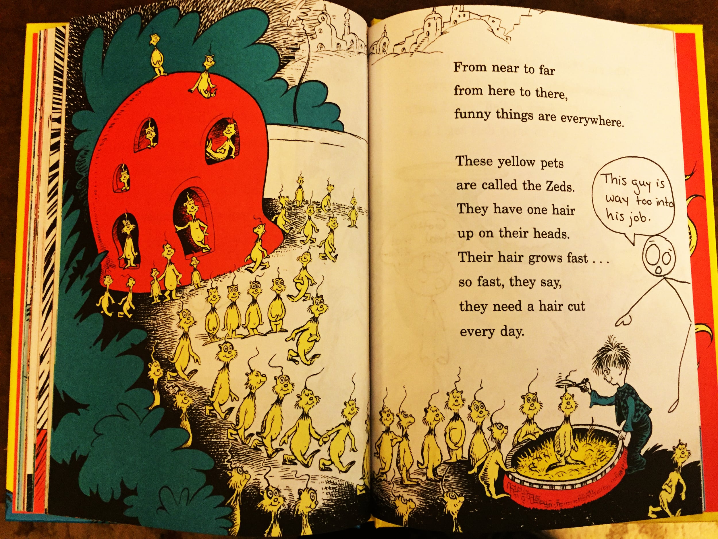
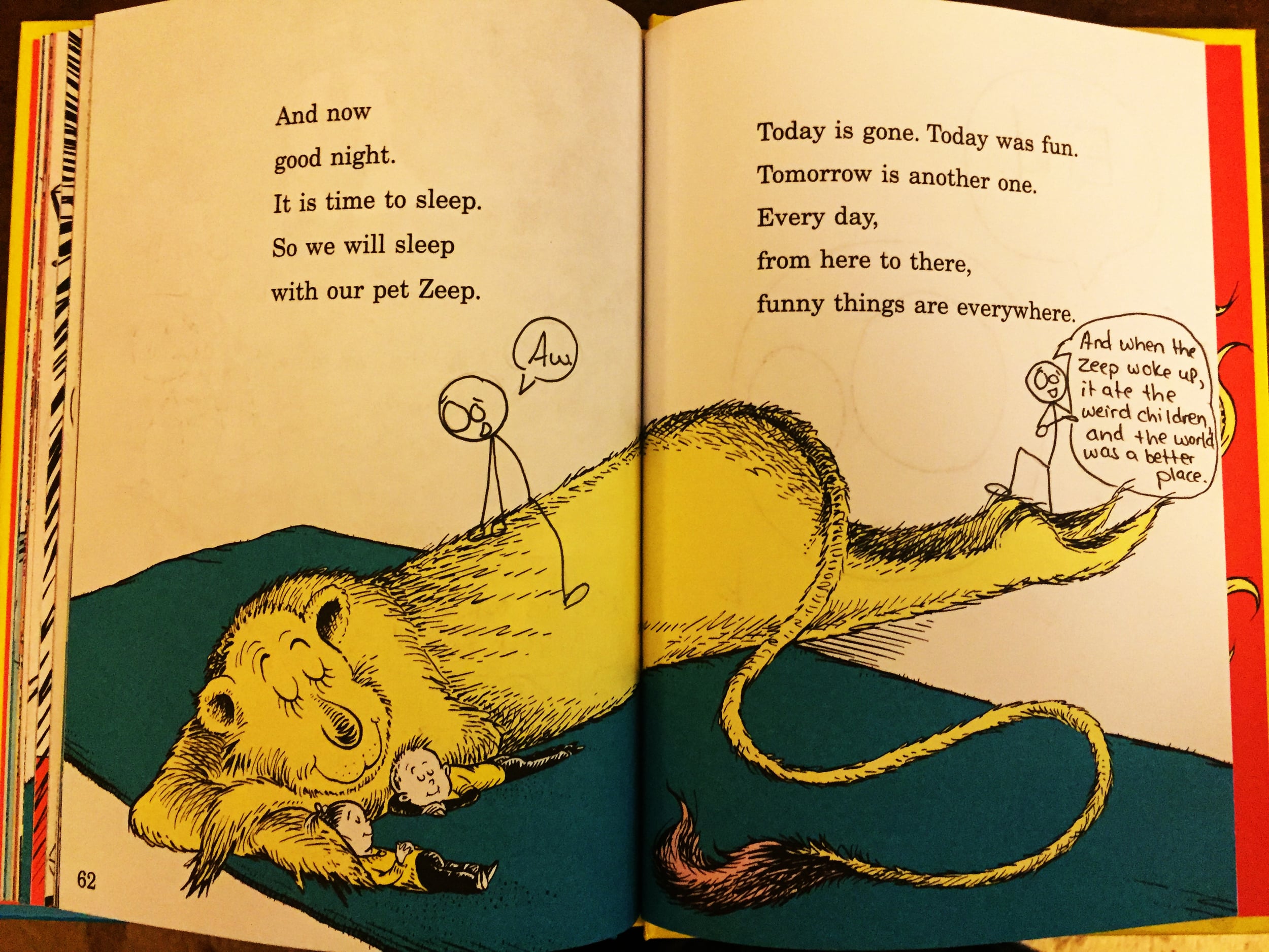
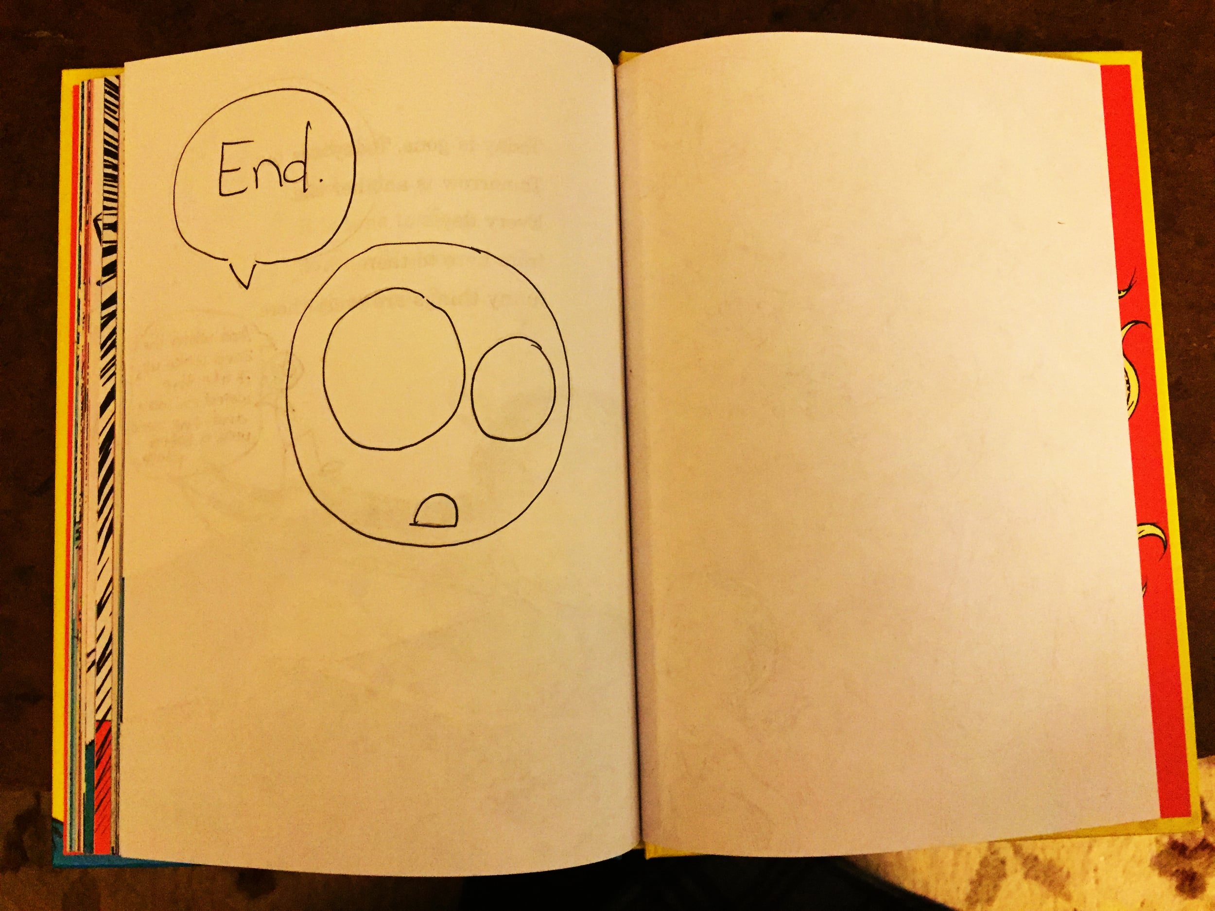

To find and follow Abby's performative appearances, you can find her on Instragram and twitter at @abbyleetrott.
Carly Butler Joins Handwritten as Curator of Life's Letters

Handwritten is wildly happy to announce its newest curator, Carly Butler, who will be heading up a new column called Life's Letters.
The column comes from a discovery, which turned into journey, blog, and premise for a book: 110 love letters written from her grandmother to her grandfather after a chance meeting during World War II. The trajectory of her life took an irreversible turn: she followed the letters and her heart to London, England, to retrace the steps of her grandmother's letters 67 years later.

At the outset, she didn't intend to write a book, but while in London, she realized something: she was writing her own Life's Letter with each step. So at the conclusion of the physical journey through this past, Carly set out to put down her experience, which has turned into the forthcoming memoir, Life's Letter.
Along the way, something else happened unexpectedly: as people began to find out about her journey through articles, interviews on television, and more, people started sharing their own life's letters with Carly, each as unique and moving. She started receiving requests from universities, organizations, and genealogy clubs to speak on behalf of the power of the pen, which only sent her in further examination of the connective tissue of the physical traces of a past and person. It shined a bright light on a simple truth: every family has a story. But what we don't realize without zooming out, is that so many of these stories are preserved in pen. And so, this is what her column with Handwritten will be about: the stories told through letters about life, lives, and living.
The first post will be on Sunday, January 17th, which aligns with time: the first letter of her grandma's is dated January 17th, 1947. It will also be the first time Carly has published a single, entire letter of her grandmother's. In this column, her own life's letter will provide the base for others, and create a space to collect and recollect unforgettable lives through letters.
We welcome Cary Butler to the Handwritten team, and cannot wait to watch her column unfold.
To tell Carly your story, and submit to her column, you can reach her at: lifesletter@gmail.com.


Carly Butler currently lives in British Columbia, Canada with her husband Adam. She is a photographer and writer by passion, and a customer relations coordinator at a bank by profession. She has a degree from the University of Guelph in International Development and Economics. Her story has been featured in media outlets such as BBC Breakfast, The Times, London's Evening Standard, BuzzFeed, Huffington Post, Today Show, Good Morning America, the Global News, and dozens of other publications.