Handwriting Continues to Prove Its Nimble Nature • A Conversation Mary Savig, with Curator of Manuscripts
"Technologies of communication, from telegrams to texting, have long threatened the written word. And yet, handwriting continues to prove its nimble nature."
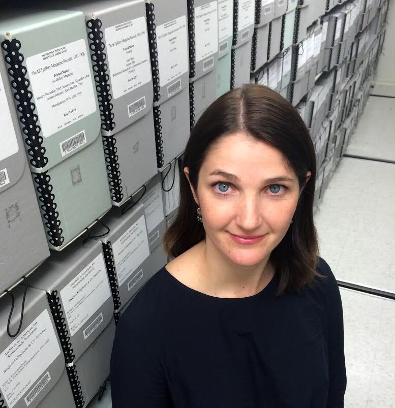
This conversation was a part of our collaboration with The Smithsonian's Archives of American Art, Pen to Panel. Here, we talk with Curator of Manuscripts Mary Savig about the creation of their latest anthology, which was the root of our collaboration, Pen to Paper.

SAY MADGES: I read in the review on the Smithsonian website that the idea for the exhibition and eventually this book came from a discussion amongst colleagues about how easily recognizable A.D. Reinhardt's handwriting is. Are there some other artists whose handwriting you can spot from across the room? Georgia O'Keefe's handwriting is so distinctive!
MARY SAVIG: Yes, Georgia O’Keeffe’s lyrical, bold handwriting shouts for attention and is impossible to forget. Hans Hofmann and Maxfield Parrish also boast distinct penmanship: Hofmann’s handwriting is twiggy but deliberate, and there is no confusing it for another artist’s hand. Parrish’s graceful penmanship doesn’t jump off the page like the others, but its inimitable elegance is as recognizable as his paintings.
SAY: What factored into your decision about which artists, and their letters, to feature?
MARY: The artist’s handwriting had to intrigue me. It was also important to represent the broad scope and scale of American art, from the nineteenth century through the present, as well as artists from different geographical regions who worked in various media, like sculpture, photography, graphic arts, abstract painting, landscape painting, and crafts. The book includes outsider artists and conceptual artists, feminists and immigrants, and more. As a whole, this selection reflects the depth of resources at the Archives of American Art.
SAY: In your introduction to the book you talk a lot about the historical development of handwriting in the U.S. Obviously you've researched this topic quite a bit — what was the most surprising or interesting thing you learned?
MARY: Much ink has been spilled on handwriting’s tenuous relationship with technology. “Once upon a time, before there were electronic typewriters, or tape records, or Xerox machines, boys and girls had to write by hand,” began a New York Times article lamenting the current state of penmanship in 1967. Technologies of communication, from telegrams to texting, have long threatened the written word. And yet, handwriting continues to prove its nimble nature. The craft of handwriting has flourished online, especially on social media. Artists, thinkers, and makers alike are experimenting with penmanship in innovative ways. Along these lines, the Archives continues to digitize and make our vast handwritten records available online for new generations to discover.
SAY: What's your favorite letter in the book?
MARY: Don’t make me choose! My answer really depends on the day and since it’s a sunny Friday morning, I’m thinking of a charming letter by the Reverend Howard Finster. Liza Kirwin, deputy director at the Archives of American Art, writes, “Reverend Howard Finster was a consummate entertainer and an old-timey Bible-belt evangelist. His handwriting, most often in block capitals, was like his preaching — purposeful, emphatic, and an integral part of his art, his “sermons in paint.” This description encapsulates the spirit of the book.
SAY: Who transcribed all of these letters? The book cites Transcription Center volunteers. How did people tackle the less legible ones?
MARY: Transcription Center volunteers helped with the bulk of transcriptions (a few of the letters had been previously transcribed). The volunteers are especially amazing at deciphering difficult hands. Many of them have compared translation to solving a puzzle: you have to be able to discern whether the faintest line might indicate a dash, a period, or a dotted i, while keeping in mind the bigger picture of the letter because it holds so many context clues.
SAY: You note that for this book the writers focused on visual content over verbal. Why was it important that they do that? What were you hoping would emerge in the contributors' essays as a result?
MARY: Many of the writers had spent months, often years, in the Archives of American Art scouring these letters for details like the locations of artworks, sale records, notable collaborations, and the like. The goal of this project was to get the writers to step back from the content and instead approach the letter as if it’s a painting or a sculpture. What might the curves, dashes, and density of line tell us about the artist? I was always fascinated and often surprised by the diversity of responses. What emerged from this project is that primary sources, and handwritten letters in particular, remain relevant and poised for interpretation. I hope this book prompts others to look at our materials with a fresh perspective.

Pen to Paper: Artists' Handwritten Letters • A Review by Say Madges
"Designed by Princeton Architectural Press, the book operates much like a gallery exhibition, privileging the visual over the verbal.”

BY SAY MADGES
Borne from an offhand observation between Smithsonian’s Archives of American Art colleagues about the instant recognizability of minimalist painter A.D. Reinhardt’s handwriting, Pen to Paper: Artists’ Handwritten Letters, inspires reverential curiosity. In this carefully considered book, Curator of Manuscripts Mary Savig regards letter-writing as an art, paying special attention to how each artist addresses formal properties of line and space, as well as what we can infer from these decisions about their creative processes and everyday lives.
Proceeding alphabetically from Bernice Abbott through Grant Wood, and spanning the decades from the 1830s to the 1970s, this thoughtful compendium tells the history of art in America in the words of the artists who shaped it: through correspondences both professional and personal, from negotiations with art collectors and curators to revelations about their art and attendant aspirations.


For this project, Savig sought out curators, professors, historians, artists, and archivists alike to read not just between the lines, but to read into each line, inviting 56 different minds to investigate the interplay between language and art in short essays included alongside each letter. As she explained in an interview with us: the goal was to get the writers (many of whom had previously pored over these manuscripts for citations in art catalogs and dissertations) “to step back from the content and instead approach the letter as if it’s a painting or a sculpture. What might the curves, dashes, and density of line tell us about the artist?”
She hoped that providing examples and interpretations of artists’ handwriting would offer new frameworks for understanding their work — and she was right. “What emerged from this project,” Savig summarized, “is that primary sources, and handwritten letters in particular, remain relevant and poised for interpretation.”

Designed by Princeton Architectural Press, the book operates much like a gallery exhibition, privileging the visual over the verbal so that we may take in the high quality images as art objects before reading the accompanying “wall text” that complements and situates them. While each entry deserves thoughtful consideration, their enigmatic, artistic value may be grasped in a glance, making the collection ripe for paging through at any pace and in any order. Full verbatim transcriptions are included in the back of the book so that readers may experience each letter’s gestalt before delving into character-based, historical, or cultural analysis.
In order to demonstrate just how closely intertwined the written word is with visual art, Savig selected a wide range of artists and traditions. Artists’ idiosyncrasies impress themselves on the page, leaving a tangible trace from which we may draw parallels between artist’s pen, personality, and practice. We see how, in a letter from Howard Finster, sketches of Mount Rushmore-ish busts of important figures punctuate the otherwise breathless string of blocky san serifs, recalling his emphatic speech as a Baptist preacher as well as what he termed his “sermons in paint.” Senior Curator at Smithsonian American Art Museum Eleanor Harvey notes how Frederic Edwin Church’s calligraphic pen strokes echo his brushwork, “in which the rapid back and forth of his brush delineates the contour of a landscape with lyrical flair.”
Seemingly trivial details such as the consistency of letterforms and their organization on the page, or the evident ease or burden with which each letter was composed communicate a surprising amount of personal information as well.
As Savig notes in the book’s introduction: “Artists often code their feelings through handwriting.” We can learn a great deal about the level of affection and familiarity between the letter writer and recipient, the writer’s emotional or professional investment in the contents, and even their current mood. Henry Ossawa Tanner’s anger radiates in his 1914 letter to Eunice Tietjens that responds to an article presuming Tanner’s racial identity and relating it to his success. “Now am I a Negro?” Tanner demands in determined script after a paragraph of underlined phrases, crossouts, and emphasized quotations that undermine that claim. In drafts of a condolence letter written between October 8 and 9, 1968 to Teeny Duchamp just one week after Marcel Duchamp’s death, Joseph Cornell’s handwriting chokes up with ineffable grief. Entire paragraphs are violently slashed out with vertical ink bars, and his script stutters through the recounting of a dream that marks the last time Cornell “saw” Marcel.


Pen to Paper's letters run the gamut from personal chronicles and affectionate notes to philosophical treatises and meditations on the intersection between race, gender, and class in the art world. Some comments are profound, such as Marcel Duchamp’s first utterance of “readymade” to explain his transformation of everyday objects into art to his sister, and others are more banal — “sending this by carrier moose,” Ivan Albright teasingly signs off a letter to Earle Ludgin. In some cases, the letters bear ignorance of their future significance.
When Grant Wood squiggled a frame around an ebullient, red-penciled “Hurray!” at the top of a letter to Zenobia Ness, he couldn’t have known he should be celebrating his imminent fame in addition to the fact that the Art Institute of Chicago decided to hang two of his paintings, including the iconic American Gothic. The parenthetical postscript “(How are you Jackson?)” in Lee Krasner’s aerogram to Jackson Pollock during their trial separation carries chillingly prophetic weight when considering it was likely their last communication before he died in a drunken car crash a few weeks later.
From the whimsical floral doodles surrounding the word “darling” in Rockwell Kent’s letter to his wife Sally to the Asian calligraphy-inspired characters of A.D. Reinhardt, these missives offer extensive proof of the expressive and aesthetic capabilities of handwriting, while engendering a unique familiarity with figures who previously loomed larger than life in our consciousnesses.
By preserving and presenting these ephemera, the book emphasizes process over product, with redactions and insertions of text betraying an artist working through ideas—evidence no longer available in a world dominated by digital modes of communication in which individuality is often obscured by the opacity of typed text. Additionally, the book’s smattering of penmanship styles reflect trends in handwriting, as the ornamental cursive of Thomas Eakins (above), son of a 19th century handwriting instructor, is replaced by the uniform efficiency of the Palmer Method, as seen in Andy Warhol’s comically curt biography offered to the managing editor of Harper’s.
This quiet collection poses a direct challenge to anyone who associates archival materials with must, dust, and irrelevance. The unmistakably human element of handwritten letters elevates what today may be merely cursory communication — an email or text message — to a kind of art that evokes the presence of the person who penned them, and leaves behind a physical relic of the relationship between letter writer, recipient, and the world at large. Appropriately in the book’s introduction, Savig encourages us not to ring the death knell of handwriting. Instead she invites us to “celebrate how imaginative correspondence now exists in material and digital forms,” providing new access and ways of thinking. Pen to Paper is a distillation of that celebration.

Let the Mind Rule the Eye • A Conversation with Tullis Johnson on Charles Burchfield
Working on Pen to Paper was interesting for me because it brought Burchfield’s handwriting into a larger context. While some artists took time and care in crafting letters to friends, Burchfield had little concern for the elegance and precision of the written word.


SAY MADGES: How did working on this project inform or change the way you think about handwriting?
TULLIS JOHNSON: Charles E. Burchfield wrote prolifically. He kept a journal for more than fifty years, which by the end of his life totaled more than ten thousand pages. He also wrote notes on his sketches for paintings and on loose sheets of paper that were kept in his studio. The letters he wrote to his friends and colleagues constitute a small fraction of the writing that he did throughout his life, and reveal only a small part of what we can learn by examining his handwriting.
Working on Pen to Paper was interesting for me because it brought Burchfield’s handwriting into a larger context. While some artists took time and care in crafting letters to friends, Burchfield had little concern for the elegance and precision of the written word. On August 19, 1914 he wrote in his journal about his feelings on the subject:
“Let the mind rule the writing not the eye! The mind should be so intent upon what it is saying, that it forgets the means of transferring it to paper. The artist does not see his brush. Be sure if what you are saying is worthwhile, someone will decipher your hieroglyphics. I do not mean that a man should adopt a crude handwriting to affect eccentricity. A man’s handwriting should be spontaneous. If we all wrote perfectly, there would be less variance of character. Of what avail is it, if a man perfect his handwriting, and [finds] that he has not perfected what he has to say? His only calling must be that of copyist.”
Burchfield was more interested in the content of his work, than on the methods of applying his medium. Reflecting on his experiences teaching, in 1959, he told interviewer John D. Morse at the Archives of American Art, “I couldn’t possibly tell anybody how to paint in watercolor….I told them: ‘Don’t think about the medium. What you’re trying to say is much more important than what you’re saying it with. And if you’re thinking about what you are trying to express, you may use watercolor like nobody else ever used it.”
SAY: Why do you think these letters are so important, and how did you choose which one to discuss? What were the other fan letter responses like?
TULLIS: The letters written by Burchfield, in the collection of the Archive of American Art, are important because they reveal much about the character of the man at various times in his career. The earliest letter, written to Paul Travis (1891-1975) in 1930, is more a letter to a friend than a response to a fan. Travis was a close friend to Burchfield during and after his time at the Cleveland School of Art, who would later accompany him on sketching trips along with other friends from his time in Cleveland.
Burchfield’s letters to Lawrence Fleischman (1925-1997) are even more revealing. Correspondences between these two men, in the collection of the Archives of American Art, span between the years of 1954 and 1964. 1954 was the same year that the Archives were founded, by Fleischman and others. In January and February of 1956, the Whitney Museum of American Art held a retrospective of Burchfield’s work. The letter I chose was written in March of the same year. The friendship that developed over those years, was an important one. Fleischman became an avid collector of Burchfield’s work, and eventually owned more than thirty of his paintings. Fleischman’s Kennedy Galleries would later represent Burchfield’s estate after the artist’s death.
SAY: Have you always suspected a link between an artist's handwriting and their art? If so, when did you first notice or consider this connection?
TULLIS: On October 8, 1913 Burchfield wrote in his journal:
“I often wonder what I am naturalist or artist, for the pursuit of one hinders the other - I seem always to be deciding which it shall be - Of course it must be an artist, for I must live, but I am hoping for a day when I can give myself entirely up to Nature.”
Burchfield’s handwriting has always been an important part of the study of his work. In an interview conducted at his home in 1959, John D. Morse inquired about whether the journals might eventually end up at the Archives of American Art. Burchfield declined, suggesting that they would end up with his estate. In 2000, more than ten thousands pages were donated, by the foundation set up in the artist’s name, to the Burchfield Penney Art Center in Buffalo, New York.
In 2006 an even larger collection of over 25,000 objects from the artist’s studio was donated as well. I took part in the inventory of a large part of that collection. Included are sketches and studies for paintings, but there are also a large number of notes, written in the artists hand on loose sheets of paper. The sketches themselves also include notes on changes that should be made to the final paintings.
Even Burchfield’s doodles contain handwriting, often revealing critical insights into the artist and his work. Some contain simple things, like a score for a card game played with his wife. One doodle includes the title of the book The Sense of Wonder by Rachel Carson. There has always been a link between Charles Burchfield’s handwriting and his art. He was aware of it early in his life, and scholars that study his work, during and after his lifetime, have been aware of it as well.
SAY: What do you think we can learn about Charles Burchfield from studying these letters that we couldn't from mere biographical record?
TULLIS: You can learn a lot about an artist by studying their writing, but different kinds of documents can reveal different things. Studio notes and notations on sketches are written as notes to one’s self. Journals and diaries are written with no particular audience in mind. They contain memories and musings on the activities of the day. They also present a great deal of autobiographical information about the writer. Correspondence however, are always written with a particular audience in mind, and each letter reveals something different about the character of the man.
SAY: You included Burchfield's quote about letting "the mind rule the writing, not the eye" in your essay in Pen to Paper, and again here. What do you think he meant by referring to his writing as "hieroglyphics"? Do you consider handwriting, in the sense that it is a drawn character system, to be visual art?
TULLIS: Handwriting surely can be visual art, and with certain artists it definitely is. In Charles Burchfield’s case, handwriting is a part of his art. It is most dramatically so with his monogram“CEB” which he used to sign his works starting in the 1920s. Handwriting is also an important part of many of his sketches, although the ideas that are communicated are more important than the handwriting itself. He wrote “Of what avail is it, if a man perfect his handwriting, and [finds] that he has not perfected what he has to say?” For Burchfield himself, handwriting itself was not visual art, but rather a means for communicating ideas. Viewers today however, often find his handwriting to be quite exciting and worthy of examination. In 2013 the Burchfield Penney Art Center commissioned Richard Kegler, co-founder of Buffalo based P22 Type Foundry to create a Burchfield font to honor the artist. Today the font is often used in exhibitions, to highlight many of the dramatic statements that Burchfield made in his journals, sketches or notes.
SAY: Where do you think we could find qualitatively similar information and insight about an artist and their work today now that people use snail mail for personal correspondence less frequently? Do you think there's a comparable medium or mode of communication in use?
TULLIS: Today the personal letter is quite rare, and the bulk of communication is done by digital means. This being the case, the best place to find qualitatively similar information on an artist and their ambitions is through social media. Many artists use Twitter and Instagram to share their work. In 2012 at the Burchfield Penney Art Center we launched a program on our website called “In His Own Words” where each day an entry from Burchfield’s journals is posted with an image of one of his paintings or drawings. In this way we are using contemporary communication tools to reach thousands and give them access to this otherwise inaccessible information from the past.


Tullis Johnson, curator and manager of archives at the Burchfield Penney Art Center, has organized multiple exhibitions of contemporary and historical significance, including the nationally touring exhibition, Charles Burchfield : Weather Event, which received the Award of Commendation at Museums in Conversation from the Museum Association of New York. Through his writing on Charles Burchfield, he is an emerging Burchfield Scholar. Respected for placing the work of Burchfield into a contemporary context, Johnson’s scholarship continues to break new ground in the understanding of the artist. His exhibition Blistering Vision: Charles E. Burchfield’s Sublime American Landscapes is currently on view at the Burchfield Penney Art Center in Buffalo, New York. Johnson received his B.F.A. from the Visual Studies Department at the University at Buffalo earning the Eugene Gaier Award for Excellence in Print Making.
James McNeill Whistler and Work-Effacing Work • A Conversation With Lee Glazer
“This project reminded me of the actual, physical connection between writing, writer, and words.”

James McNeill Whistler (153) letter to Charles Bowen Bigelow, October 5, 1891
BY SAY MADGES
American Impressionist and portraitist ex-pat James McNeill Whistler espoused that art should be "an effortless expression of aesthetic principles," and his loose scrawl seems to echo that claim. Lee Glazer, Associate Curator of American Art at the Freer Gallery of Art and Arthur M. Sackler Gallery, however, counters in Pen to Paper that these letters indicate a more controlling figure. Written in the early 1890s, the documents on display here formed part of Whistler's anti-piracy campaign that intended both to protect and promote his art and art criticism in The Gentle Art of Making Enemies.
This conversation was a part of our collaboration with The Smithsonian's Archives of American Art, Pen to Panel, which celebrated the launch of their latest anthology, Pen to Paper.

SAY MADGES: How did working on this project inform or change the way you think about handwriting?
LEE GLAZER: The entire Whistler correspondence—some 9000 documents—has been digitized, edited, and transcribed by the Whistler scholars at the University of Glasgow. I rely on that digital edition—so easy to search, to skim, to search! I rely on it in my day-to-day work as a curator of a collection (the Freer Gallery of Art) dominated by Whistler’s work. But this project reminded me of the actual, physical connection between writing, writer, and words. It’s especially telling in the context of someone like Whistler, who was such a clever writer and for whom words were his weapon of choice in his battles against the (to his mind, at least) unappreciative British public. His handwriting has this insouciant, off-the-cuff look that belies the careful thought and intense labor that preceded the final draft. Very similar, in fact, to his art, where, as he said, “work effaces work.”


MADGES: Why do you think these letters are so important, and how did you choose which to discuss?
GLAZER: These letters aren’t necessarily the most important in the Whistler corpus. They were more or less chosen for me, based on the holdings of the Archives of American Art. But, they are quite telling: written in the early 1890s, they were part of a concerted campaign that Whistler mounted to retain control over the publication and distribution of The Gentle Art of Making Enemies, a compendium of some of his pronouncements on art and art critics.
MADGES: What did you learn or what do you think others could learn about James McNeill Whistler from studying these letters that you couldn't from mere biographical record?
GLAZER: The handwriting in the letters is light and dashing, but beneath the surface is a determination to exert total control. They demonstrate Whistler’s idea that art should appear effortless, betraying no struggle or obvious strain of labor.
MADGES: Do you consider handwriting as visual art, writing, some combination, or something else entirely?
GLAZER: I don’t consider it visual art--but there is certainly a level or art and/or artifice about handwriting that makes it distinct from printed words. When we’re looking at printed words on a page, content and form exist as more or less at the conceptual level. The words themselves, as physical marks or presences recede--unless a lot of attention is paid to graphic design or there is a deliberately emotive use of typography. Handwriting certainly isn’t an unmediated form of personal expression – it conforms to certain conventions that change over time, it can be manipulated for effect, but I do think that it can tell us something about the writer that goes beyond the words themselves.
MADGES: Where do you think we could find qualitatively similar information and insight about an artist and their work today now that people use snail mail for personal correspondence less frequently? Do you think there's a comparable medium or mode of communication in use?
GLAZER: I think that we need look no farther than email and social media: the hand is absent, but there are lots of stylistic tics in “autograph” digital messages. Looking at patterns in these kinds of messages may well become the 21 st-century version of handwriting analysis.


Lee Glazer is curator of American art at the Smithsonian’s Freer Gallery of Art and Arthur M. Sackler Gallery where she has organized numerous exhibitions including, most recently, Chinamania and Peacock Room REMIX: Darren Waterston’s Filthy Lucre. She is the author of A Perfect Harmony: The American Collection in the Smithsonian’s Freer Gallery of Art and co-editor of James McNeill Whistler in Context, East West Interchanges in American Art, and Palaces of Art: Whistler and the Art Worlds of Aestheticism.
Thomas Eakins's Precise Pen • Akela Reason
"To the nineteenth-century mind, good penmanship and draftsmanship were seen as interrelated skills that reflected clarity of thought."


BY AKELA REASON
As the son of a writing master and a graduate of Philadelphia’s Central High School, Thomas Eakins understood the link between writing and drawing. Eakins learned his elegant copperplate hand from his father, a skill that was reinforced at Central in his drawing classes. To the nineteenth-century mind, good penmanship and draftsmanship were seen as interrelated skills that reflected clarity of thought. In fact, writing masters like Eakins’s father, Benjamin, often completed complex drawings crafted from the written text as a demonstration of their skill and confident control of the pen.
Official writing in the days before typewriters and photocopiers required the work of a professional writing master who would plot out the text to the scale appropriate for the document. The work of such writing in many ways mirrored Eakins’s own preparatory process as he plotted out his compositions with the same care, making few changes to his designs once they were established.
In order to prepare for his paintings, Eakins made some pencil sketches, detailed perspective drawings, and oil sketches to work out color and composition. He also used photographs to plot specific figures in his paintings. None of this work was visible to the art-going public, who saw only his finished works. Similarly, Eakins carefully drafted official correspondence in his elegantly trained hand, with all of the mental work coming before the pen was set to the final draft. These letters were usually brief and mistake-free. For his family and friends, however, he was much more carefree in his writing. His hand is casual, and one can see him thinking through cross-outs and insertions of text.
There is a clear divide between Eakins's public and private writing, just as there is between his public and private artwork. Occasionally Eakins injected his art with his formal, artful penmanship by adding his carefully crafted signature. These signatures flow in an elegant cursive that resembles his signature on formal documents, and they are plotted in perspective so that they become part of the painting, which gives some idea of the labor that Eakins took such pains to hide.
While none of his works, written or painted, appear effortless, Eakins rarely revealed his thought process the outside eye, making his work appear uncannily precise.


Akela Reason holds a Ph.D. in Art History from the University of Maryland. She is Associate Professor of History at the University of Georgia and the author of Thomas Eakins and the Uses of History, University of Pennsylvania Press, 2010.
This essay was a part of our collaboration with The Smithsonian's Archives of American Art, Pen to Panel.
Lenore Tawney postcard to Maryette Charlton (1969) • Smithsonian Archives of American Art

FROM THE SMITHSONIAN ARCHIVES OF AMERICAN ART
Lenore Tawney postcard to Maryette Charlton, February 16, 1969. Maryette Charlton papers. Archives of American Art, Smithsonian Institution. This letter will be featured in Smithsonian's forthcoming book, Pen to Paper: Artists’ Handwritten Letters from the Smithsonian’s Archives of American Art (Princeton Architectural Press, 2016).
Thank you to Mary Savig, Curator of Manuscripts, for opening up the Smithsonian Archives of American Art for a Handwritten celebration.
Maxfield Parrish letter to Cecilia Beaux, July 11, 1909 • Smithsonian Archives of American Art

FROM THE SMITHSONIAN ARCHIVES OF AMERICAN ART
Maxfield Parrish letter to Cecilia Beaux, July 11, 1909. Cecilia Beaux papers. Archives of American Art, Smithsonian Institution. This letter will be featured in Smithsonian's forthcoming book, Pen to Paper: Artists’ Handwritten Letters from the Smithsonian’s Archives of American Art (Princeton Architectural Press, 2016).
Thank you to Mary Savig, Curator of Manuscripts, for opening up the Smithsonian Archives of American Art for a Handwritten celebration.
Eero Saarinen letter to Aline Saarinen, 1953 • Smithsonian Archives of American Art

FROM THE SMITHSONIAN ARCHIVES OF AMERICAN ART
Eero Saarinen letter to Aline Saarinen, 1953. Aline and Eero Saarinen papers. Archives of American Art, Smithsonian Institution. This letter will be featured in Smithsonian's forthcoming book, Pen to Paper: Artists’ Handwritten Letters from the Smithsonian’s Archives of American Art (Princeton Architectural Press, 2016).
Thank you to Mary Savig, Curator of Manuscripts, for opening up the Smithsonian Archives of American Art for a Handwritten celebration.
Winslow Homer letter to Thomas B. Clarke, January 4, 1901 • Smithsonian Archives of American Art

FROM THE SMITHSONIAN ARCHIVES OF AMERICAN ART
Winslow Homer letter to Thomas B. (Thomas Benedict) Clarke, January 4, 1901. Winslow Homer collection. This letter will be featured in Smithsonian's forthcoming book, Pen to Paper: Artists’ Handwritten Letters from the Smithsonian’s Archives of American Art (Princeton Architectural Press, 2016).
Thank you to Mary Savig, Curator of Manuscripts, for opening up the Smithsonian Archives of American Art for a Handwritten celebration.