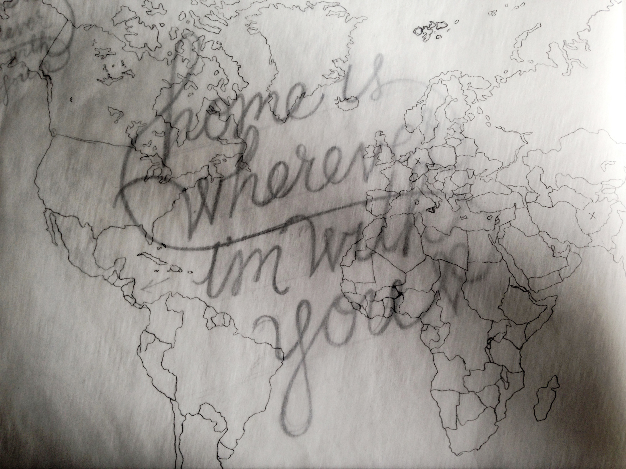
Home Is Wherever I'm With You
Bretty Rawson
The final and fourth week of images of Bina Viven Santos' exhibition, Not Your Average Ordinary.
Since we aren't on every social media site, let us come to you. Enter your email below and we'll send you our monthly handwritten newsletter. It will be written during the hours of moonrise, and include featured posts, wild tangents, and rowdy stick figures.
Keep the beautiful pen busy.
Brooklyn, NY
USA
Handwritten is a place and space for pen and paper. We showcase things in handwriting, but also on handwriting. And so, you'll see dated letters and distant postcards alongside recent studies and typed stories.
search for me
Filtering by Tag: Bina Vivien Santos

The final and fourth week of images of Bina Viven Santos' exhibition, Not Your Average Ordinary.


The third installment of Bina Vivien Santos' exploration, Not Your Average Ordinary.
BY BINA VIVIEN SANTOS
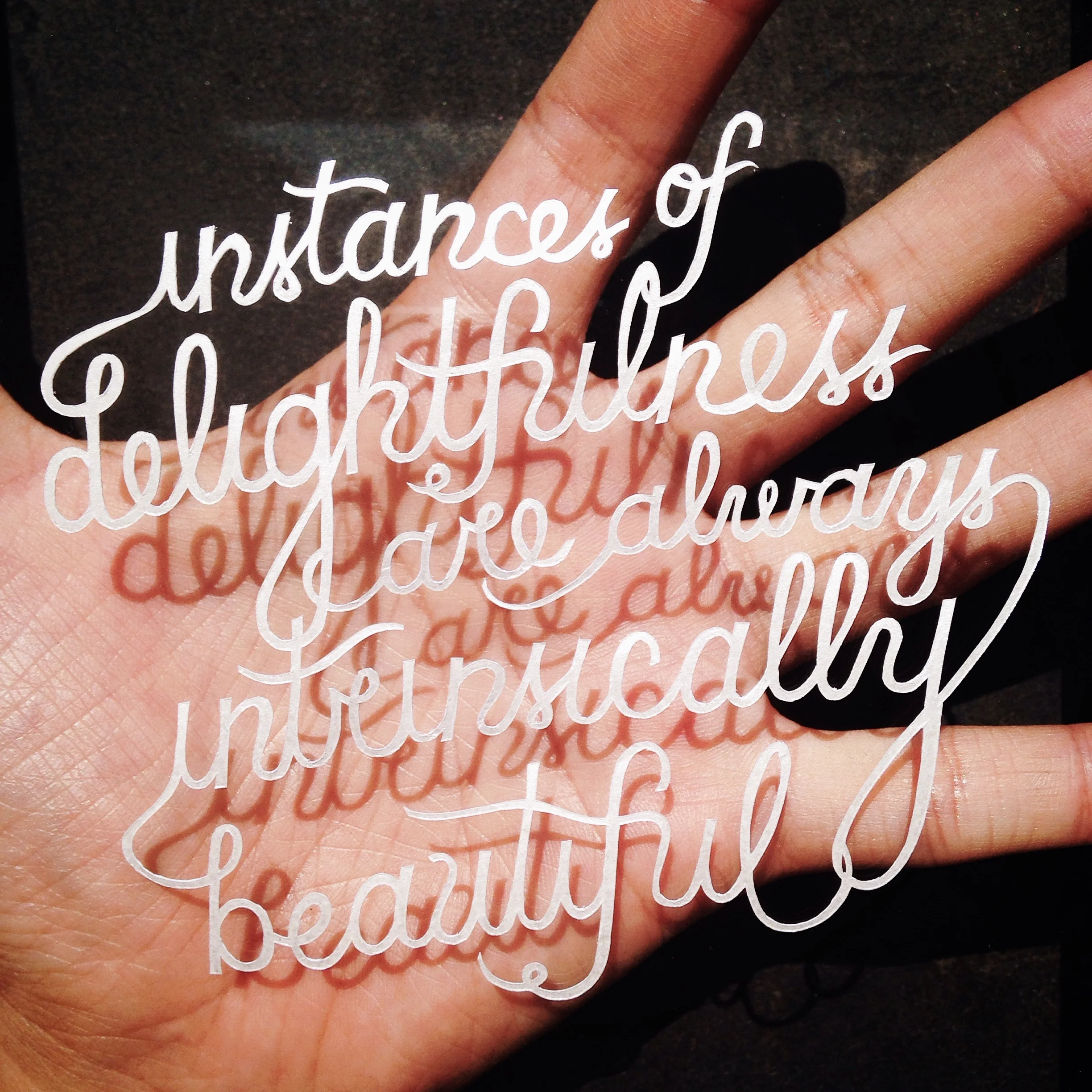
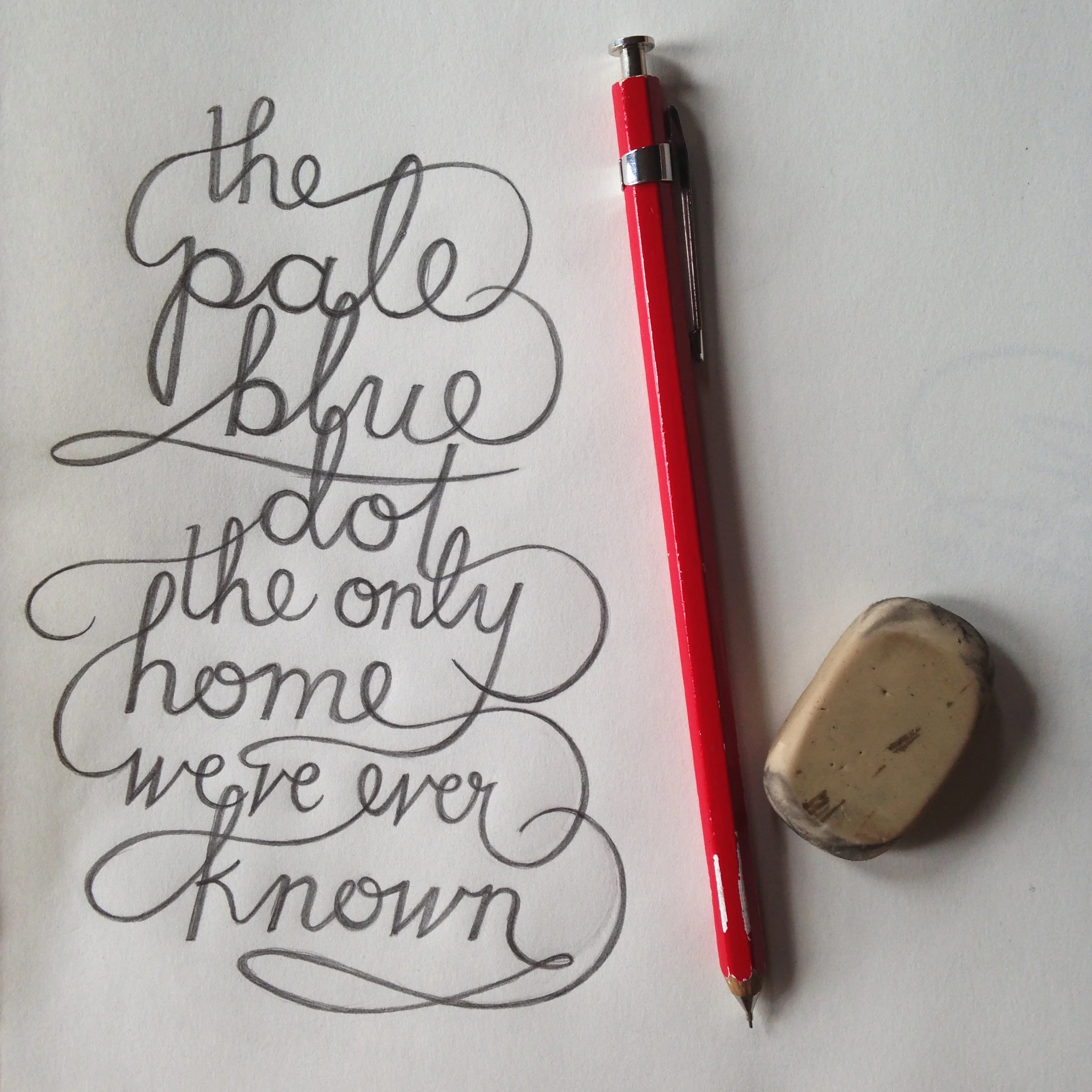
Just as fun as it is to play detective, it is equally fun to intentionally create meaning through design. As a graphic designer, I work with composition and typography, finding creative ways to marry the two into something significant. The same applies to my calligraphy cutouts, however without the convenient font library at my disposal. Instead, it falls to me to imagine and to create the perfect font. I spend a lot of time sketching out the word or quotation over and over and over, testing out serifs, weights, cursive, shapes, etc. I have in a sense created my own internal font library of styles that I frequently use, but I do try my best to branch out to the new and different, especially if it better complements the words. Is the quotation a proud statement meant for serifed capital letters, or is it delicate and dreamily flows in cursive loops? Or is it passionate and emotional like thickly, messily painted lines with imperfections? I weigh such questions whenever I start a cutout, or even when I come across an interesting bit of text. It’s a great creative exercise for crowded subway rides.

The second installment of Bina Vivien Santos' exploration, Not Your Average Ordinary.
BY BINA VIVIEN SANTOS
I am a firm believer that handwriting communicates a lot about a person. The curls of the g’s, the loops of the o’s can be as expressive as the actual words that are written. I can see the excitement in little quakes in my sister’s penmanship when she gives me good news. I can remember stress in my own cramped journals from college around final exams. I read love in birthday cards, and sometimes the rush of I-almost-forgot-but-I-didn’t. Handwriting is so unique to each person and can be affected so much by circumstance and situations. It’s fun to play detective to find these secret messages hidden in the lines and curves.
Just as fun as it is to play detective, it is equally fun to intentionally create meaning through design. As a graphic designer, I work with composition and typography, finding creative ways to marry the two into something significant. The same applies to my calligraphy cutouts, however without the convenient font library at my disposal. Instead, it falls to me to imagine and to create the perfect font. I spend a lot of time sketching out the word or quotation over and over and over, testing out serifs, weights, cursive, shapes, etc. I have in a sense created my own internal font library of styles that I frequently use, but I do try my best to branch out to the new and different, especially if it better complements the words. Is the quotation a proud statement meant for serifed capital letters, or is it delicate and dreamily flows in cursive loops? Or is it passionate and emotional like thickly, messily painted lines with imperfections? I weigh such questions whenever I start a cutout, or even when I come across an interesting bit of text. It’s a great creative exercise for crowded subway rides.


I am a creative person. This seems like an obvious statement for any artist, but the truth is I can’t claim to have any particular allegiance to one art medium or form. I swing from painting, to graphic design, to photography, to stop motion film, to whatever next strikes my fancy, the unifying thread between them all being that they allow me to imagine and create things.
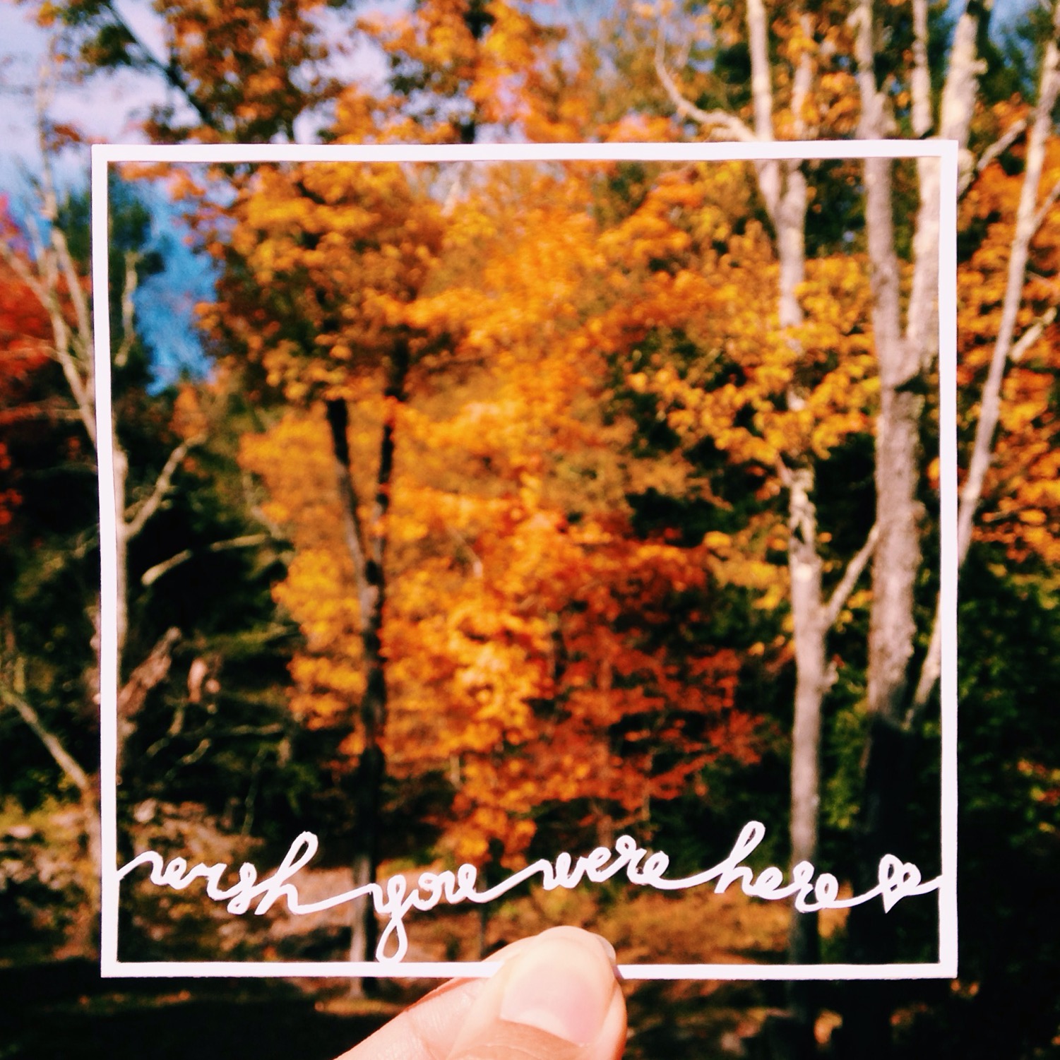
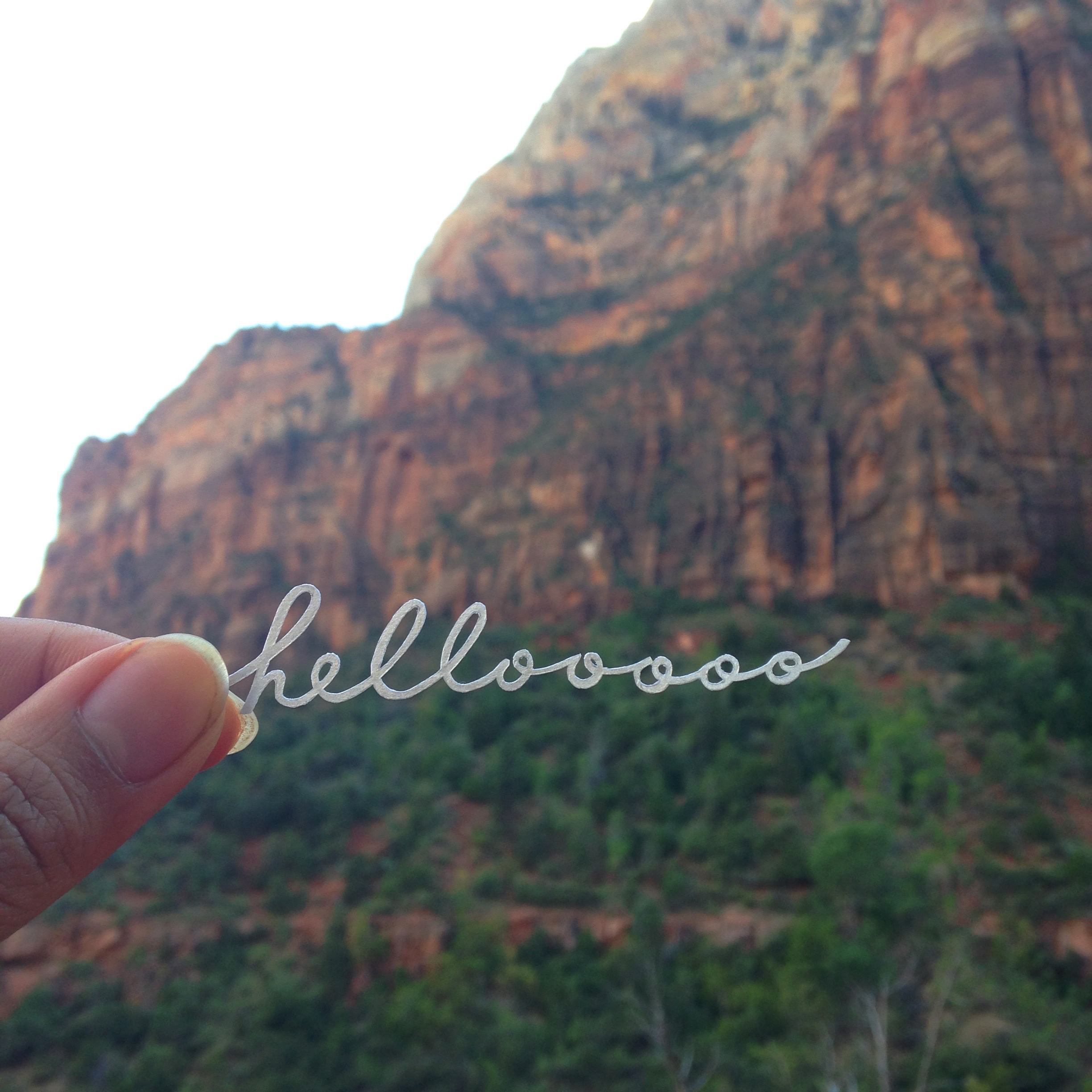
While the materials may vary, there are commonalities and patterns in my artwork. They are intricate and detailed, clean and controlled, simple and often with an element of whimsy. I draw inspiration from traveling and everyday minutiae, which I almost painstakingly observe for hiccups of oddity or flashes of notableness, sort of like finding the extraordinary within the ordinary. It is in these small details from moments within moments within moments that I find the spark for a new project.
One of my favorite mediums is paper. It can be cut, layered, and shaped, lending itself very easily to whatever I imagine it to be. Lately, I’ve been using it to create calligraphy cutouts. It started first with individual words, then gradually grew to phrases and quotations. I pick these words based on the imagery and sentiments they inspire, which I then express through the design of the lettering, and the context of the composition. For instance, I created my first calligraphy cutout when I was homesick, and it was the outline of a bear with “California” inside of it, in a curly cursive script that echoed a childhood of practicing penmanship over dotted lines.
I like the challenge of translating intangible things into something visual and tactile. And especially with words, which are read and spoken and heard, transforming them into something that can be touched and that has tangible characteristics gives them not only physical dimension, but another layer of meaning.


