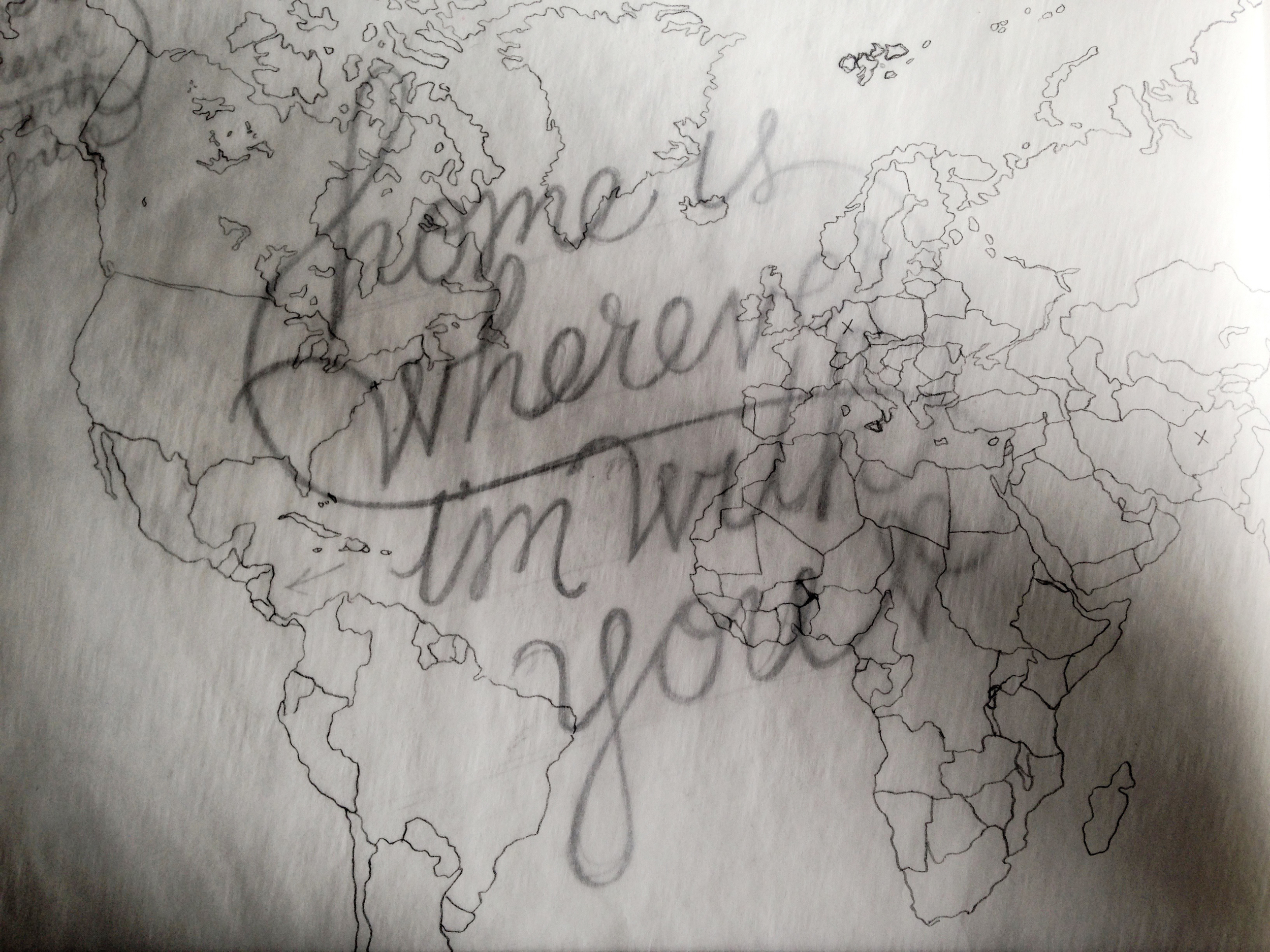
Home Is Wherever I'm With You
Bretty Rawson
The final and fourth week of images of Bina Viven Santos' exhibition, Not Your Average Ordinary.
Since we aren't on every social media site, let us come to you. Enter your email below and we'll send you our monthly handwritten newsletter. It will be written during the hours of moonrise, and include featured posts, wild tangents, and rowdy stick figures.
Keep the beautiful pen busy.
Brooklyn, NY
USA
Handwritten is a place and space for pen and paper. We showcase things in handwriting, but also on handwriting. And so, you'll see dated letters and distant postcards alongside recent studies and typed stories.
search for me
Filtering by Tag: graphic design

The final and fourth week of images of Bina Viven Santos' exhibition, Not Your Average Ordinary.


The third installment of Bina Vivien Santos' exploration, Not Your Average Ordinary.
BY BINA VIVIEN SANTOS
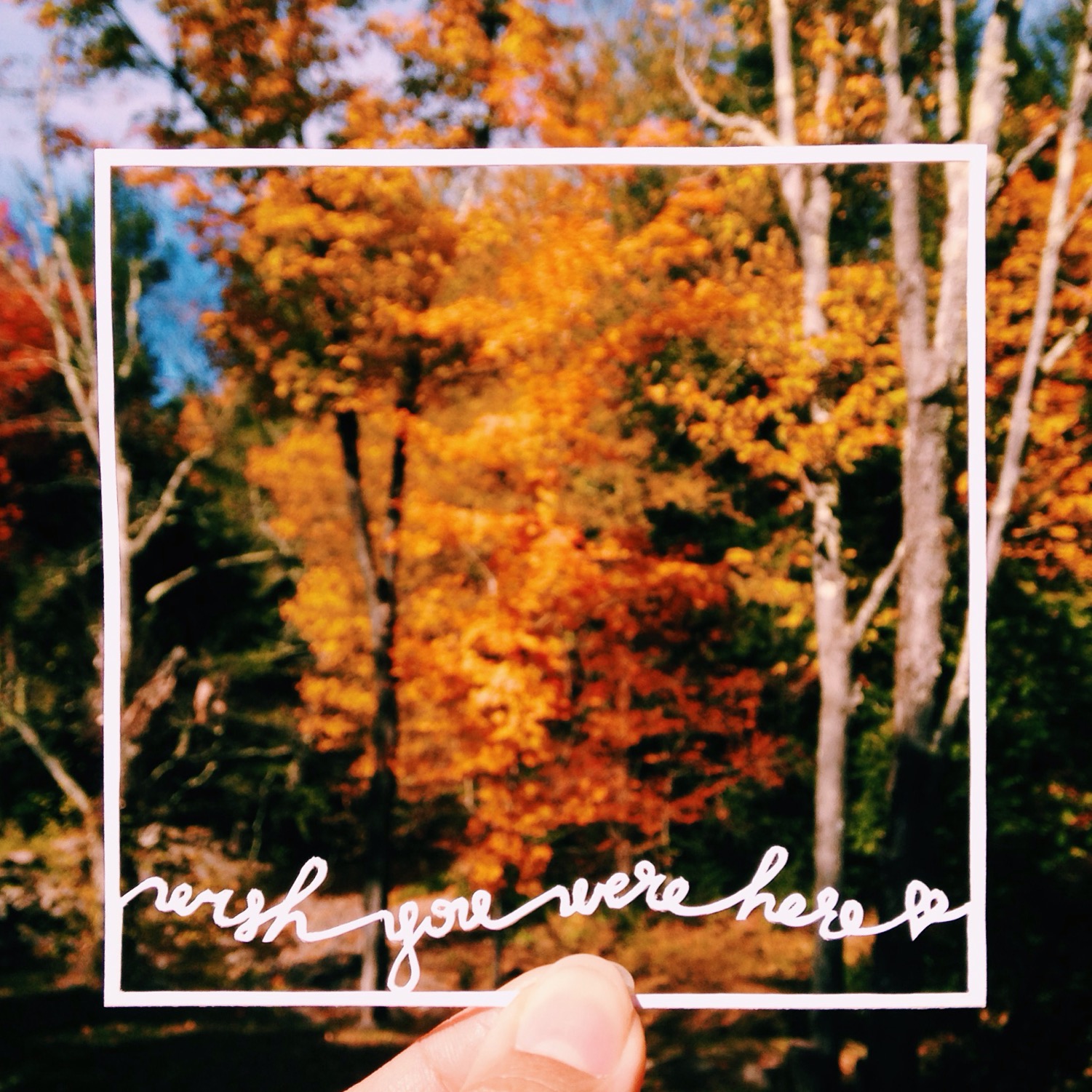
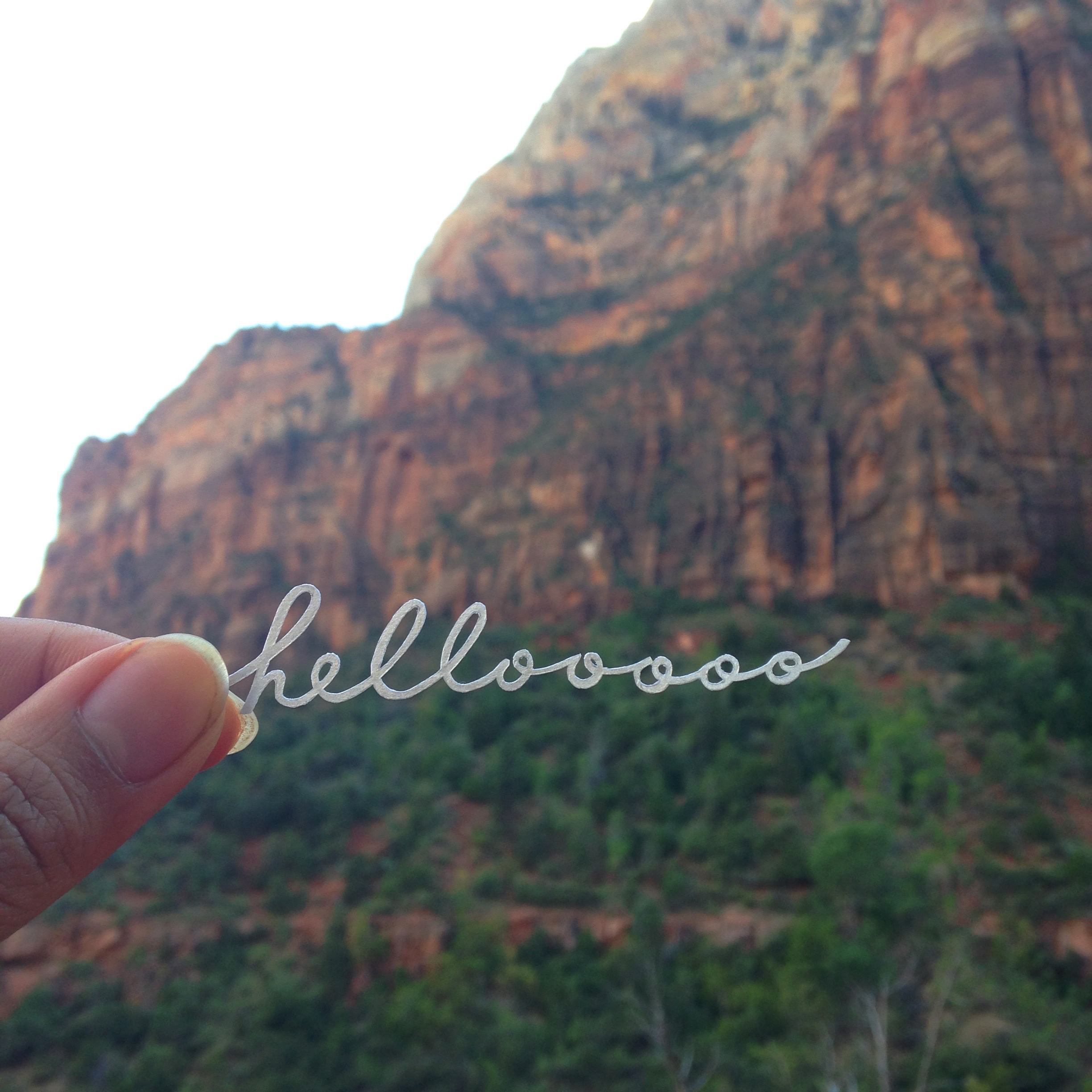
Just as fun as it is to play detective, it is equally fun to intentionally create meaning through design. As a graphic designer, I work with composition and typography, finding creative ways to marry the two into something significant. The same applies to my calligraphy cutouts, however without the convenient font library at my disposal. Instead, it falls to me to imagine and to create the perfect font. I spend a lot of time sketching out the word or quotation over and over and over, testing out serifs, weights, cursive, shapes, etc. I have in a sense created my own internal font library of styles that I frequently use, but I do try my best to branch out to the new and different, especially if it better complements the words. Is the quotation a proud statement meant for serifed capital letters, or is it delicate and dreamily flows in cursive loops? Or is it passionate and emotional like thickly, messily painted lines with imperfections? I weigh such questions whenever I start a cutout, or even when I come across an interesting bit of text. It’s a great creative exercise for crowded subway rides.