
Let the Mind Rule the Eye • A Conversation with Tullis Johnson on Charles Burchfield
Working on Pen to Paper was interesting for me because it brought Burchfield’s handwriting into a larger context. While some artists took time and care in crafting letters to friends, Burchfield had little concern for the elegance and precision of the written word.


SAY MADGES: How did working on this project inform or change the way you think about handwriting?
TULLIS JOHNSON: Charles E. Burchfield wrote prolifically. He kept a journal for more than fifty years, which by the end of his life totaled more than ten thousand pages. He also wrote notes on his sketches for paintings and on loose sheets of paper that were kept in his studio. The letters he wrote to his friends and colleagues constitute a small fraction of the writing that he did throughout his life, and reveal only a small part of what we can learn by examining his handwriting.
Working on Pen to Paper was interesting for me because it brought Burchfield’s handwriting into a larger context. While some artists took time and care in crafting letters to friends, Burchfield had little concern for the elegance and precision of the written word. On August 19, 1914 he wrote in his journal about his feelings on the subject:
“Let the mind rule the writing not the eye! The mind should be so intent upon what it is saying, that it forgets the means of transferring it to paper. The artist does not see his brush. Be sure if what you are saying is worthwhile, someone will decipher your hieroglyphics. I do not mean that a man should adopt a crude handwriting to affect eccentricity. A man’s handwriting should be spontaneous. If we all wrote perfectly, there would be less variance of character. Of what avail is it, if a man perfect his handwriting, and [finds] that he has not perfected what he has to say? His only calling must be that of copyist.”
Burchfield was more interested in the content of his work, than on the methods of applying his medium. Reflecting on his experiences teaching, in 1959, he told interviewer John D. Morse at the Archives of American Art, “I couldn’t possibly tell anybody how to paint in watercolor….I told them: ‘Don’t think about the medium. What you’re trying to say is much more important than what you’re saying it with. And if you’re thinking about what you are trying to express, you may use watercolor like nobody else ever used it.”
SAY: Why do you think these letters are so important, and how did you choose which one to discuss? What were the other fan letter responses like?
TULLIS: The letters written by Burchfield, in the collection of the Archive of American Art, are important because they reveal much about the character of the man at various times in his career. The earliest letter, written to Paul Travis (1891-1975) in 1930, is more a letter to a friend than a response to a fan. Travis was a close friend to Burchfield during and after his time at the Cleveland School of Art, who would later accompany him on sketching trips along with other friends from his time in Cleveland.
Burchfield’s letters to Lawrence Fleischman (1925-1997) are even more revealing. Correspondences between these two men, in the collection of the Archives of American Art, span between the years of 1954 and 1964. 1954 was the same year that the Archives were founded, by Fleischman and others. In January and February of 1956, the Whitney Museum of American Art held a retrospective of Burchfield’s work. The letter I chose was written in March of the same year. The friendship that developed over those years, was an important one. Fleischman became an avid collector of Burchfield’s work, and eventually owned more than thirty of his paintings. Fleischman’s Kennedy Galleries would later represent Burchfield’s estate after the artist’s death.
SAY: Have you always suspected a link between an artist's handwriting and their art? If so, when did you first notice or consider this connection?
TULLIS: On October 8, 1913 Burchfield wrote in his journal:
“I often wonder what I am naturalist or artist, for the pursuit of one hinders the other - I seem always to be deciding which it shall be - Of course it must be an artist, for I must live, but I am hoping for a day when I can give myself entirely up to Nature.”
Burchfield’s handwriting has always been an important part of the study of his work. In an interview conducted at his home in 1959, John D. Morse inquired about whether the journals might eventually end up at the Archives of American Art. Burchfield declined, suggesting that they would end up with his estate. In 2000, more than ten thousands pages were donated, by the foundation set up in the artist’s name, to the Burchfield Penney Art Center in Buffalo, New York.
In 2006 an even larger collection of over 25,000 objects from the artist’s studio was donated as well. I took part in the inventory of a large part of that collection. Included are sketches and studies for paintings, but there are also a large number of notes, written in the artists hand on loose sheets of paper. The sketches themselves also include notes on changes that should be made to the final paintings.
Even Burchfield’s doodles contain handwriting, often revealing critical insights into the artist and his work. Some contain simple things, like a score for a card game played with his wife. One doodle includes the title of the book The Sense of Wonder by Rachel Carson. There has always been a link between Charles Burchfield’s handwriting and his art. He was aware of it early in his life, and scholars that study his work, during and after his lifetime, have been aware of it as well.
SAY: What do you think we can learn about Charles Burchfield from studying these letters that we couldn't from mere biographical record?
TULLIS: You can learn a lot about an artist by studying their writing, but different kinds of documents can reveal different things. Studio notes and notations on sketches are written as notes to one’s self. Journals and diaries are written with no particular audience in mind. They contain memories and musings on the activities of the day. They also present a great deal of autobiographical information about the writer. Correspondence however, are always written with a particular audience in mind, and each letter reveals something different about the character of the man.
SAY: You included Burchfield's quote about letting "the mind rule the writing, not the eye" in your essay in Pen to Paper, and again here. What do you think he meant by referring to his writing as "hieroglyphics"? Do you consider handwriting, in the sense that it is a drawn character system, to be visual art?
TULLIS: Handwriting surely can be visual art, and with certain artists it definitely is. In Charles Burchfield’s case, handwriting is a part of his art. It is most dramatically so with his monogram“CEB” which he used to sign his works starting in the 1920s. Handwriting is also an important part of many of his sketches, although the ideas that are communicated are more important than the handwriting itself. He wrote “Of what avail is it, if a man perfect his handwriting, and [finds] that he has not perfected what he has to say?” For Burchfield himself, handwriting itself was not visual art, but rather a means for communicating ideas. Viewers today however, often find his handwriting to be quite exciting and worthy of examination. In 2013 the Burchfield Penney Art Center commissioned Richard Kegler, co-founder of Buffalo based P22 Type Foundry to create a Burchfield font to honor the artist. Today the font is often used in exhibitions, to highlight many of the dramatic statements that Burchfield made in his journals, sketches or notes.
SAY: Where do you think we could find qualitatively similar information and insight about an artist and their work today now that people use snail mail for personal correspondence less frequently? Do you think there's a comparable medium or mode of communication in use?
TULLIS: Today the personal letter is quite rare, and the bulk of communication is done by digital means. This being the case, the best place to find qualitatively similar information on an artist and their ambitions is through social media. Many artists use Twitter and Instagram to share their work. In 2012 at the Burchfield Penney Art Center we launched a program on our website called “In His Own Words” where each day an entry from Burchfield’s journals is posted with an image of one of his paintings or drawings. In this way we are using contemporary communication tools to reach thousands and give them access to this otherwise inaccessible information from the past.


Tullis Johnson, curator and manager of archives at the Burchfield Penney Art Center, has organized multiple exhibitions of contemporary and historical significance, including the nationally touring exhibition, Charles Burchfield : Weather Event, which received the Award of Commendation at Museums in Conversation from the Museum Association of New York. Through his writing on Charles Burchfield, he is an emerging Burchfield Scholar. Respected for placing the work of Burchfield into a contemporary context, Johnson’s scholarship continues to break new ground in the understanding of the artist. His exhibition Blistering Vision: Charles E. Burchfield’s Sublime American Landscapes is currently on view at the Burchfield Penney Art Center in Buffalo, New York. Johnson received his B.F.A. from the Visual Studies Department at the University at Buffalo earning the Eugene Gaier Award for Excellence in Print Making.
James McNeill Whistler and Work-Effacing Work • A Conversation With Lee Glazer
“This project reminded me of the actual, physical connection between writing, writer, and words.”

James McNeill Whistler (153) letter to Charles Bowen Bigelow, October 5, 1891
BY SAY MADGES
American Impressionist and portraitist ex-pat James McNeill Whistler espoused that art should be "an effortless expression of aesthetic principles," and his loose scrawl seems to echo that claim. Lee Glazer, Associate Curator of American Art at the Freer Gallery of Art and Arthur M. Sackler Gallery, however, counters in Pen to Paper that these letters indicate a more controlling figure. Written in the early 1890s, the documents on display here formed part of Whistler's anti-piracy campaign that intended both to protect and promote his art and art criticism in The Gentle Art of Making Enemies.
This conversation was a part of our collaboration with The Smithsonian's Archives of American Art, Pen to Panel, which celebrated the launch of their latest anthology, Pen to Paper.

SAY MADGES: How did working on this project inform or change the way you think about handwriting?
LEE GLAZER: The entire Whistler correspondence—some 9000 documents—has been digitized, edited, and transcribed by the Whistler scholars at the University of Glasgow. I rely on that digital edition—so easy to search, to skim, to search! I rely on it in my day-to-day work as a curator of a collection (the Freer Gallery of Art) dominated by Whistler’s work. But this project reminded me of the actual, physical connection between writing, writer, and words. It’s especially telling in the context of someone like Whistler, who was such a clever writer and for whom words were his weapon of choice in his battles against the (to his mind, at least) unappreciative British public. His handwriting has this insouciant, off-the-cuff look that belies the careful thought and intense labor that preceded the final draft. Very similar, in fact, to his art, where, as he said, “work effaces work.”


MADGES: Why do you think these letters are so important, and how did you choose which to discuss?
GLAZER: These letters aren’t necessarily the most important in the Whistler corpus. They were more or less chosen for me, based on the holdings of the Archives of American Art. But, they are quite telling: written in the early 1890s, they were part of a concerted campaign that Whistler mounted to retain control over the publication and distribution of The Gentle Art of Making Enemies, a compendium of some of his pronouncements on art and art critics.
MADGES: What did you learn or what do you think others could learn about James McNeill Whistler from studying these letters that you couldn't from mere biographical record?
GLAZER: The handwriting in the letters is light and dashing, but beneath the surface is a determination to exert total control. They demonstrate Whistler’s idea that art should appear effortless, betraying no struggle or obvious strain of labor.
MADGES: Do you consider handwriting as visual art, writing, some combination, or something else entirely?
GLAZER: I don’t consider it visual art--but there is certainly a level or art and/or artifice about handwriting that makes it distinct from printed words. When we’re looking at printed words on a page, content and form exist as more or less at the conceptual level. The words themselves, as physical marks or presences recede--unless a lot of attention is paid to graphic design or there is a deliberately emotive use of typography. Handwriting certainly isn’t an unmediated form of personal expression – it conforms to certain conventions that change over time, it can be manipulated for effect, but I do think that it can tell us something about the writer that goes beyond the words themselves.
MADGES: Where do you think we could find qualitatively similar information and insight about an artist and their work today now that people use snail mail for personal correspondence less frequently? Do you think there's a comparable medium or mode of communication in use?
GLAZER: I think that we need look no farther than email and social media: the hand is absent, but there are lots of stylistic tics in “autograph” digital messages. Looking at patterns in these kinds of messages may well become the 21 st-century version of handwriting analysis.


Lee Glazer is curator of American art at the Smithsonian’s Freer Gallery of Art and Arthur M. Sackler Gallery where she has organized numerous exhibitions including, most recently, Chinamania and Peacock Room REMIX: Darren Waterston’s Filthy Lucre. She is the author of A Perfect Harmony: The American Collection in the Smithsonian’s Freer Gallery of Art and co-editor of James McNeill Whistler in Context, East West Interchanges in American Art, and Palaces of Art: Whistler and the Art Worlds of Aestheticism.
Dan Flavin's Art & Life • A Conversation with Tiffany Bell
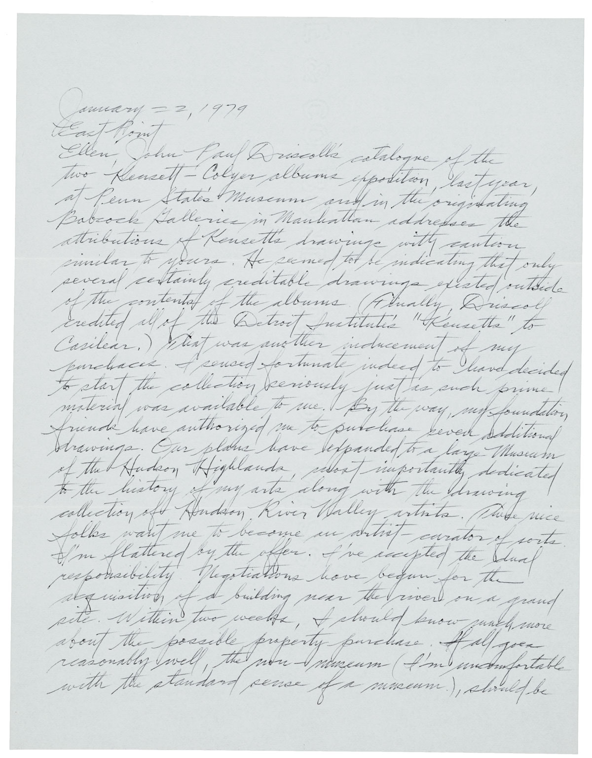
"Flavin’s early text is so difficult to read, you almost feel shut out. He has all these flourishes, especially the way he ends a word. It’s very sad when this kind of information becomes inaccessible."

SARAH MADGES: How did you get involved with this project?
TIFFANY BELL: I got a call from Mary [Savig] because she noticed my work on the Dan Flavin catalogue raisonné. I make use of the archives on a regular basis and so she asked if I would write about one of Flavin's letters that they had because his writing is so unique.
MADGES: How did you decide which letter to talk about?
BELL: She [Savig] asked me to choose one and I was already familiar with this one because it was available online. I was also interested in it because the content of the letter reflected his handwriting. It describes his interest in 19th century drawings and landscape art, and Ellen [Ellen Johnson, the letter's recipient] had a collection of these John Frederick Kensett drawings.
His handwriting is quite formal considering how innovative his art is. It was interesting to me that it looked so perfect, exactly the way it had been taught to him.
I also knew the artist and knew he took writing seriously; he took serious care...I think he had some idea his letters would be studied at some point. He was interested in the collected writings of Cezanne and would use some of them in lectures. He was very interested in traditional writing like that, capturing the artist's life, and so I thought this letter projected that aspect of his personality.
MADGES: Why do you think archives should be public access? Why are these letters, these archival documents, important?
BELL: It’s invaluable for the kind of research I do. I think archives should absolutely be public access--and there is so much online now, which is so exciting. Even the postmarks on letters tell you where the artist was on a certain date. It’s invaluable for putting together someone’s biography.
But now, with all of these emails exchanged instead--I don't know if or how they will be saved. The quantity of material might be overwhelming to sift through. A lot was done through phone calls, so a lot has been lost there too. My work on Agnes Martin — although not entirely relevant to this conversation — her letters in the Archives of American Art are completely essential as far as learning who people in her circle were, what she thought about her art, and where she would show it. There's no other way to find this information out because she didn't keep a record of anything. Flavin kept his stuff as a record, knowing; he was prepared for people to access his writing.
MADGES: You noted in your essay that Flavin’s art resisted associations with the handmade, and yet he took such care with his penmanship. What were his journal entries like compared to his letters? You said that his letters were copied from what he wrote in his journal--did you notice any edits made between first and second draft?
BELL: His final page has no crossouts, and his letters were often typed. There are more crossouts and edits in his journals. You can really see him working through a thought.
MADGES: A kind of related question here, but what did you learn or what do you think others could learn about Dan Flavin from studying his letters that you couldn’t from biographical record?
BELL: Access to letters gives access and insight into thinking. You get to see how he presents himself to people.
MADGES: Did he write for the duration of his career?
BELL: He started in the 60s--the journals begin in 1961 or ‘62 and he kept them going through the 80s. As a young artist he was very interested in recording what he was doing as an artist. Early letters reach out to people who might be interested in buying or showing his work. I think he already knew Ellen Johnson when he wrote to her--when Flavin made his fluorescent light works they were always untitled, but were often dedicated to people. One of them was dedicated to Ellen Johnson.
MADGES: How do you feel about the fact that the U.S. Core Curriculum no longer requires handwriting instruction?
BELL: I was shocked. I even feel sorrow because I type so much now and I very much miss the way writing by hand connects you to your thought in a different way. When you actually write something down it enhances your ability to think through the idea. The fact that handwriting is slower means you stay with the thought longer.
It’s concerning that kids growing up today might not be able to read letters, read these manuscripts. Flavin’s early text is so difficult to read, you almost feel shut out. He has all these flourishes, especially the way he ends a word. It’s very sad when this kind of information becomes inaccessible.
MADGES: How did working on this project inform or change how you think about handwriting?
BELL: Well first of all, the book is really beautiful. I’m very pleased to be a part of it. It didn’t change how I think, but maybe it reinforced the idea of how wonderful handwritten letters are. Dan Flavin himself understood the beauty and great capacity of what you could convey in a handwritten letter. It’s interesting to look closely at them; you get more sense of personality, occasionally some humor. You can observe how he puts the date and place in each entry and fills the whole page, leaving no margins. He has this very meticulous handwriting that looks angular, even stylized, and always on unlined paper.
MADGES: Do you consider handwriting visual art, writing, or some combination?
BELL: For Flavin, I think it’s a lot like his drawings in some way. He used to carry a notebook around with him all the time and he would use the same pen to sketch. He collected drawings, like he mentioned in the letter: Kensett pieces. Kensett also did ink drawings on paper, often with little notes about where they were drawn and when. Flavin kind of took after him--he recorded the date and time. You can sense the connection to his past art, its influence on him.

Thomas Eakins's Precise Pen • Akela Reason
"To the nineteenth-century mind, good penmanship and draftsmanship were seen as interrelated skills that reflected clarity of thought."


BY AKELA REASON
As the son of a writing master and a graduate of Philadelphia’s Central High School, Thomas Eakins understood the link between writing and drawing. Eakins learned his elegant copperplate hand from his father, a skill that was reinforced at Central in his drawing classes. To the nineteenth-century mind, good penmanship and draftsmanship were seen as interrelated skills that reflected clarity of thought. In fact, writing masters like Eakins’s father, Benjamin, often completed complex drawings crafted from the written text as a demonstration of their skill and confident control of the pen.
Official writing in the days before typewriters and photocopiers required the work of a professional writing master who would plot out the text to the scale appropriate for the document. The work of such writing in many ways mirrored Eakins’s own preparatory process as he plotted out his compositions with the same care, making few changes to his designs once they were established.
In order to prepare for his paintings, Eakins made some pencil sketches, detailed perspective drawings, and oil sketches to work out color and composition. He also used photographs to plot specific figures in his paintings. None of this work was visible to the art-going public, who saw only his finished works. Similarly, Eakins carefully drafted official correspondence in his elegantly trained hand, with all of the mental work coming before the pen was set to the final draft. These letters were usually brief and mistake-free. For his family and friends, however, he was much more carefree in his writing. His hand is casual, and one can see him thinking through cross-outs and insertions of text.
There is a clear divide between Eakins's public and private writing, just as there is between his public and private artwork. Occasionally Eakins injected his art with his formal, artful penmanship by adding his carefully crafted signature. These signatures flow in an elegant cursive that resembles his signature on formal documents, and they are plotted in perspective so that they become part of the painting, which gives some idea of the labor that Eakins took such pains to hide.
While none of his works, written or painted, appear effortless, Eakins rarely revealed his thought process the outside eye, making his work appear uncannily precise.


Akela Reason holds a Ph.D. in Art History from the University of Maryland. She is Associate Professor of History at the University of Georgia and the author of Thomas Eakins and the Uses of History, University of Pennsylvania Press, 2010.
This essay was a part of our collaboration with The Smithsonian's Archives of American Art, Pen to Panel.