I See Students Who Crave the Opportunity to Work with Their Hands • A Conversation With Gail Anderson
Bretty Rawson

Portrait of Gail Anderson, by Paul Davis
BY SARAH MADGES
With decades of teaching, typography, and creative collaboration under her belt, New York-based designer and writer Gail Anderson has a CV worth calling home about — at least, it earned her the holy grail of graphic design achievements, the AIGA medal, in 2008. The design-ecstatic aesthete made her first layout years before her tenure as art director at Rolling Stone, literally cutting and pasting a magazine mockup of the Jackson Five in her childhood bedroom.
She’s been busy ever since, developing identity campaigns for Broadway shows, co-writing typography books with Steven Heller, teaching type fundamentals in the MFA program at SVA, and co-partnering with Joe Newton at their eponymous Anderson Newton Design firm for projects ranging from book jackets to outdoor installations. Despite the ease and efficiency of digital design technology, Anderson swears by taking time to untether from the laptop, insisting that craft is crucial to typography, and slowing down with a pencil and piece of paper is crucial to honing that craft. In November we reviewed her latest book, Outside the Box, which honors this DIY by-hand approach, following the hand-lettering trend from its individual, artful beginnings to its contemporary commercial ubiquity.
I had the chance to talk to her about the book’s composition, as well as handwriting and hand-lettering in general — how it plays into her life as a designer, and design as a whole.

Childhood Sketchpad


Design inspiration from childhood, 1974
SARAH MADGES: What role does the pen and notebook play in your life?
GAIL ANDERSON: I’ve grown increasingly particular about the pens and notebooks I use, since I really enjoy the physical act of writing. I’m a fan of black Pilot Varsity fountain pens and Pilot Precise V7s. And I was extremely loyal to those Japanese Oh Boy notebooks with the thick, ruled paper, even after Chronicle acquired them and put the Oh Boy logo on the front. I have two left that I’m saving for God knows what since they’re now out of production. I moved on to Muji, and then Moleskine, and am now working my way through some Field Notes steno pads. I even keep a paper date book, so clearly the art of writing still means a lot — possibly way too much — to me.
MADGES: You divided your book into four sections — DIY, art, craft, and artisanal. How did you come up with these four categories? Was it always clear you were going to organize the book this way?
ANDERSON: I knew I wanted to have some kind of system to categorize the material. I’ve learned a lot from working with Steve Heller for so many years, so I did what we always do with our books — I spread the work out with someone I trust and we let it sort of organize itself. It’s too confining to categorize stuff in the research stage, but you can’t wait till the design stage either. It was really fun to come up with section titles, and once my design partner, Joe Newton, and I got through that process, I felt like we had the contents of a real book in front of us.

Type Spread from Outside the Box.
MADGES: Do you see a significant difference between what’s considered handwriting and hand-lettering? How would you define the difference — is it intent? Actual artistic design and effort?
ANDERSON: I wrote out Debbie Millman’s foreword by hand and consider that to be handwriting rather than hand-lettering. When I look at it now, though, it seems so deliberate (and some folks have assumed it was a font). Maybe it does have something to do with intent — I’m not quite sure where the line in the sand is.
Broadway theater poster designed at SpotCo
MADGES: Why do you think people respond to hand-drawn lettering? Do you think there will always be a demand for it? Do you imagine it will lose popularity any time soon?
ANDERSON: People connect to branding and advertising that feels intimate and artisanal. It’s somehow less “corporate," even though hand-drawn type is used by just about everyone now. I think Andrew Gibbs from the Dieline said it best in the book’s intro: “In all my years of seeing packaging trends come and go, there is one style that has stood the ultimate test of time: hand-drawn.” I admit that a few years ago, I thought, “Well, how long will this last before we swing all the way back to Helvetica?” But in some form or another, hand-drawn type is here to stay.

Type Directors Club letterpress post card
MADGES: Do you see a similar resurgence in classic or vintage fonts in reaction to the digital age?
ANDERSON: I see students who crave the opportunity to work with their hands — kids who’ve pretty much grown up in front of a computer. While embracing technology is key to their success as designers, they don’t want to feel tied to their laptops. We did a hand-lettering class last week and the students actually started applauding at the end — that’s how hungry they are. And I think they are beginning to seek out classic and vintage fonts, which is such a relief after so many years of all those awful free fonts.
MADGES: Is there a distinct moment or brand that signaled the beginning of the hand-drawn movement’s resurgence? Or was this a gradual, inevitable change in response to an increase in digital and technological saturation?
ANDERSON: I wasn’t plugged in enough to recognize a particular moment, but it certainly seemed like everyone started drawing — and posting — around the same time. I think it’s all about Pinterest and the other sites and blogs where designers started strutting their stuff publicly. It sometimes felt like everyone jumped on the bandwagon without adding a new twist, but the best of the best have carved out their own niches. And yes, I do believe that it was a reaction to technological saturation and the desire to create something seemingly personal and unique.

Jackson Five scrapbook, 1972
MADGES: What first compelled you to typographic design? When did you first start collecting typefaces and fonts?
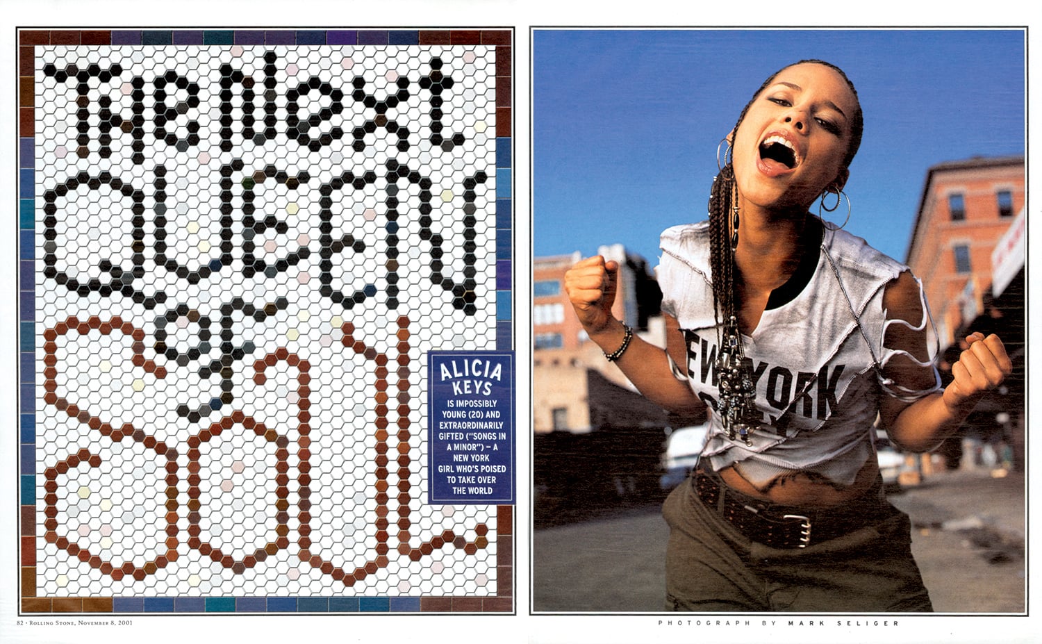
ANDERSON: I started designing magazine layouts as a child, first for The Jackson Five, and then for The Partridge Family. Even then, my pages were filled with my 12-year old version of typography, which was based on Spec and 16 magazines and their Letraset rub-down type. I started saving photostats of typefaces in college, but things really clicked when I worked at Rolling Stone with Fred Woodward. His good taste and sharp eye were instrumental to the growth of my own skills.


MADGES: Marketing research has found that the first piece of mail someone is likely to open has a handwritten address. Do you think this is because of handwriting’s scarcity that it’s perceived as more valuable? Is it more authentic? Personal?
ANDERSON: I’m not in a hurry to open anything that’s got a bulk rate stamp or a mailing label (I hate them on greeting cards). But I’ll give something that has a handwritten address on it a chance, though admittedly I’ve been fooled once or twice by handwriting fonts. I appreciate the idea of someone taking a few minutes to put pen to paper.

Hand-drawn lettering from a cross-stitch book that continues to inspire Anderson

Outside the Box: Hand-Drawn Packaging from Around the World
MADGES: You note in your book that hand-drawn lettering isn’t necessarily popular just because of the attendant sense of nostalgia, but rather because of its established historic design technique. What makes this technique more or less difficult to execute? What are the pros and cons?
ANDERSON: Drawing naive type is one thing—and often not as easy as it looks—but doing what Martin Schmetzer, for example, does just blows me away. There’s a tremendous degree of patience and utter stillness required, but there’s also a touch of genius that is at a whole other level. When I was editing through book images, there were times when I’d just stop in my tracks to stare at pencil sketches that were so incredible that they might as well have been finished pieces. And Martin thought his sketches were “rough”—seriously.
MADGES: I’m similarly amazed that a brand as huge as Chipotle uses handlettering. Do you think it is feasible for any even larger companies to follow that approach? How do you think consumers would respond if McDonalds rebranded with letterpress?
ANDERSON: The idea of a McDonald's “artisan” chicken sandwich rings about as true as the idea of a company like that rebranding with letterpress. But Chipotle’s pretty huge and their incredibly inviting branding brought in a lot of customers, including me. Hatch Show Print does McDonald’s! Ha.

New “Make it Here” SVA poster
MADGES: What does it mean for design and typography that the next generation might not be able to read cursive because it is no longer taught in schools?
ANDERSON: I guess we’ll see a lot more child-like lettering that isn’t an affectation! I see my nieces’ and nephews’ handwriting and it’s just terrifying. But I am a product of Catholic schools in the 1970s, where penmanship was paramount. On the other hand, I also see young designers who can make letterforms into magic on their computers, so perhaps it all evens out. As long as there are cursive typefaces to buy, they’ll just have to learn to read script even if they can’t write it.
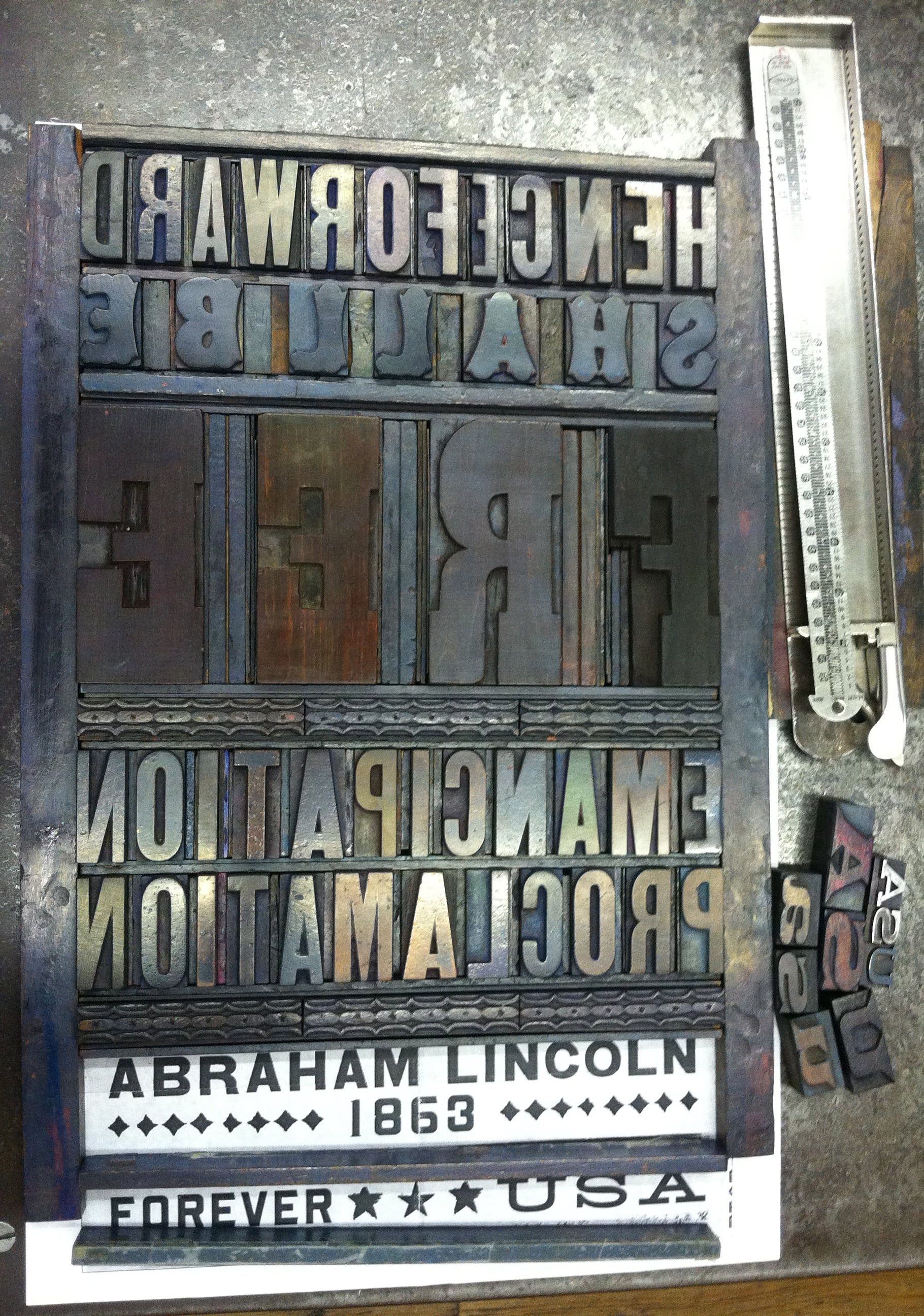
MADGES: Looking at your site, I’m impressed that you are an incredibly versatile and prolific designer. You’ve worked as Art Director at Rolling Stone, an educator at SVA, are on the board of TDC, you designed probably my favorite US Postal stamp — the Emancipation Proclamation. How do you take on these projects — what strings them together? And what’s next?
ANDERSON: I actually just started a new job recently that should keep me challenged for a good long time. I’m now the Director of Design and Digital Media at Visual Arts Press (SVA). My career is tied to a love of working with words, whether it’s designing them or writing them. The Emancipation Proclamation stamp may be my all-time favorite project. I got to design using a piece of history — the first words from the document itself, and was able to set the actual type at Hatch and watch Jim Sherraden print the poster that was then reduced to stamp size. It doesn’t get better than that.